Other visual works
Present my communicate design ability with VI, Logo, poster, business card, postcard, art and illustration.
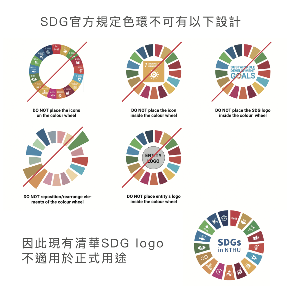
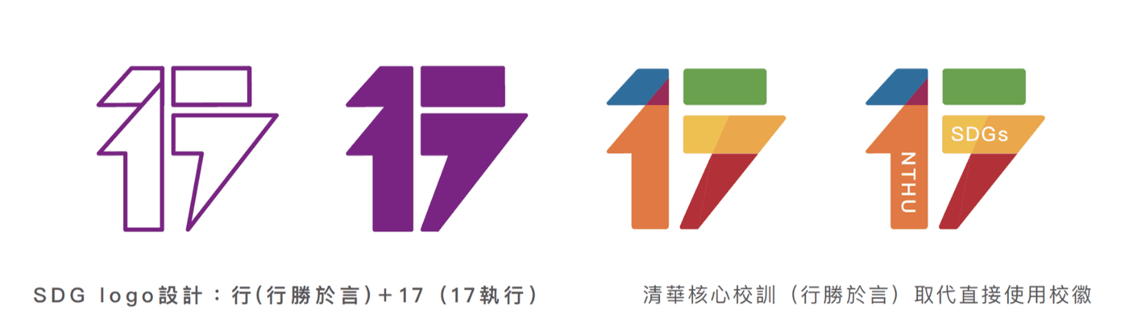
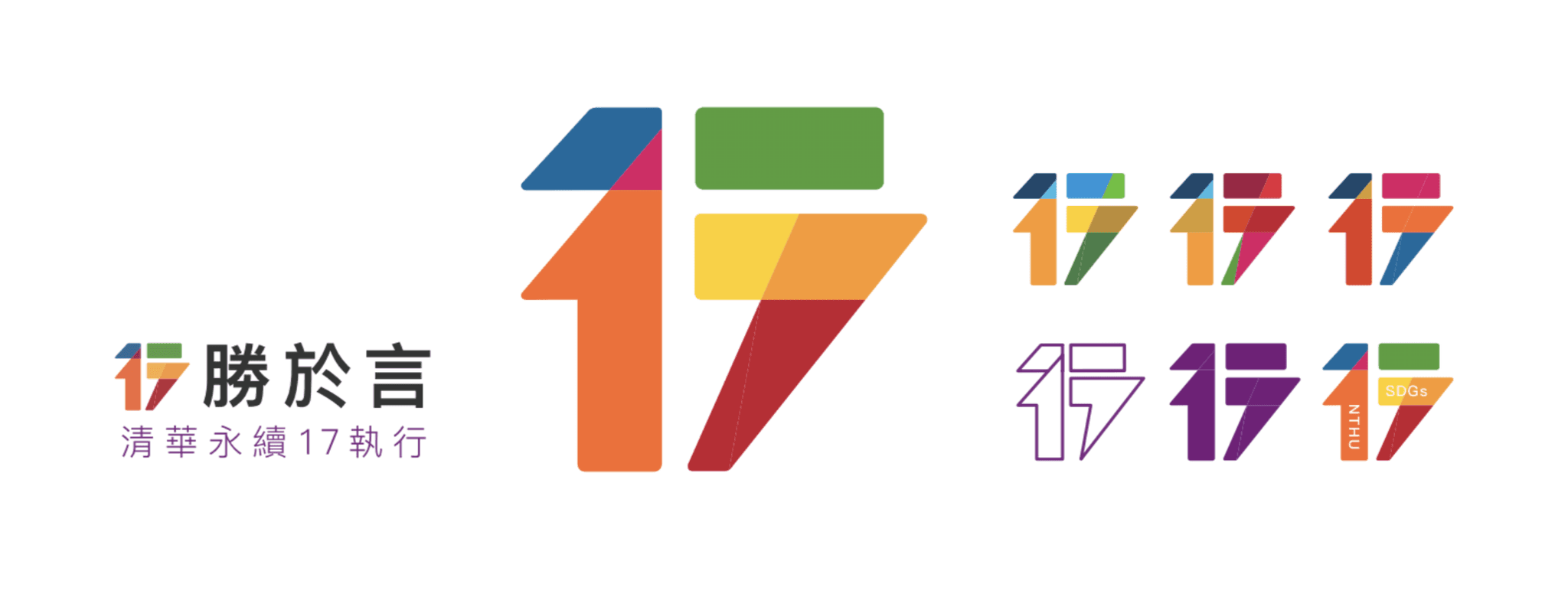
NTHU SDGs logo redesign
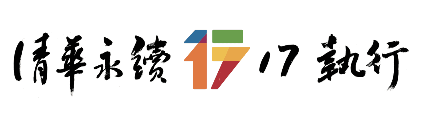

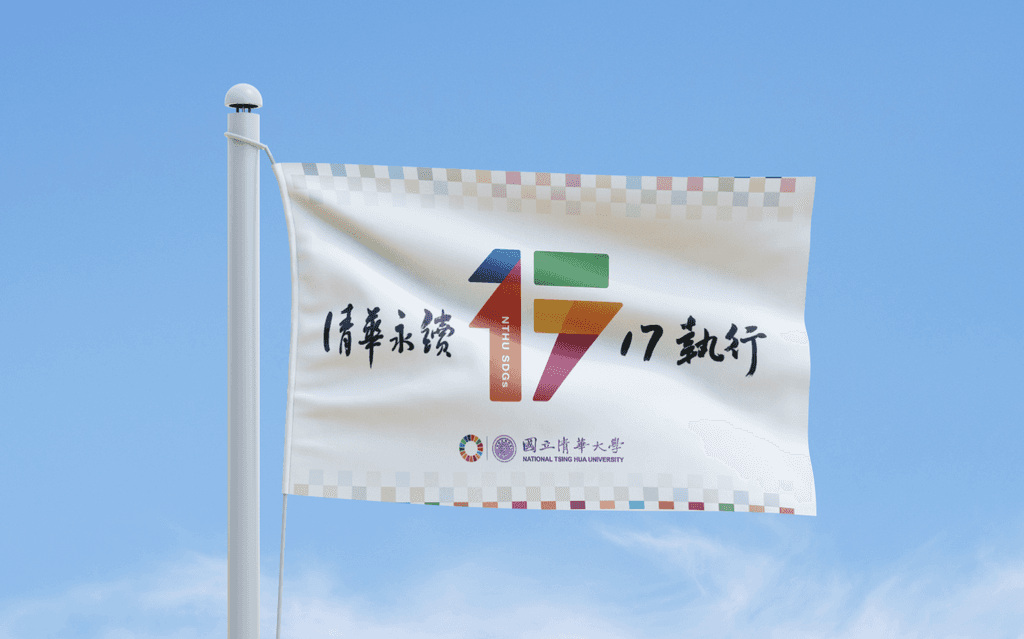
The NTHU SDGs Flag
The CSO (Chief of Sustainable Development) instruct the need of sustainable flags, and used it in all the NTHU's sustainability activities. My design was officially selected among 7 submitted works.
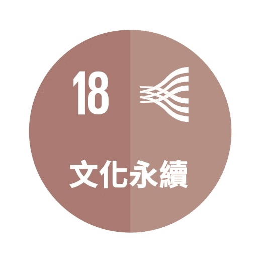
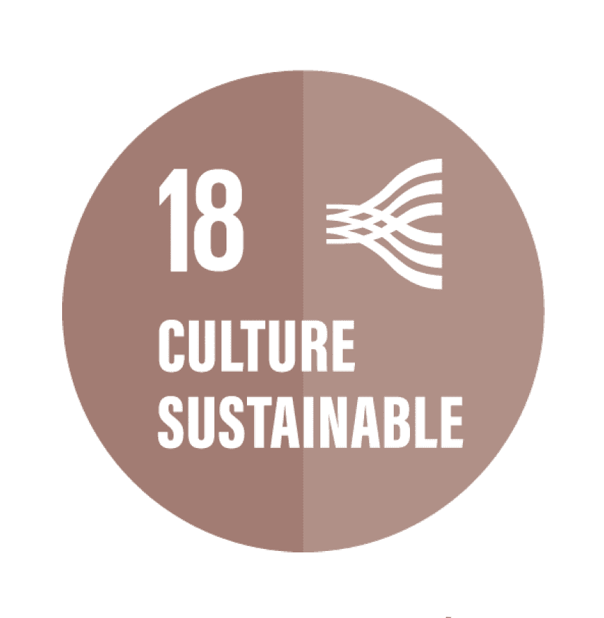
Design logo: SDG 18- Culture Sustainable
NTHU aims to fulfill social responsibility as a university, helping NTHU's faculty and students integrate more cultural elements into their professional development.
Resilience Academy Logo
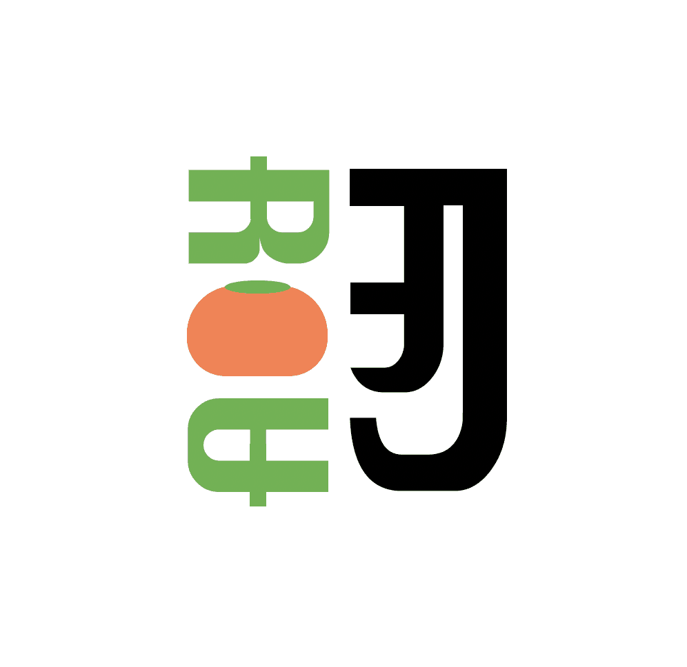
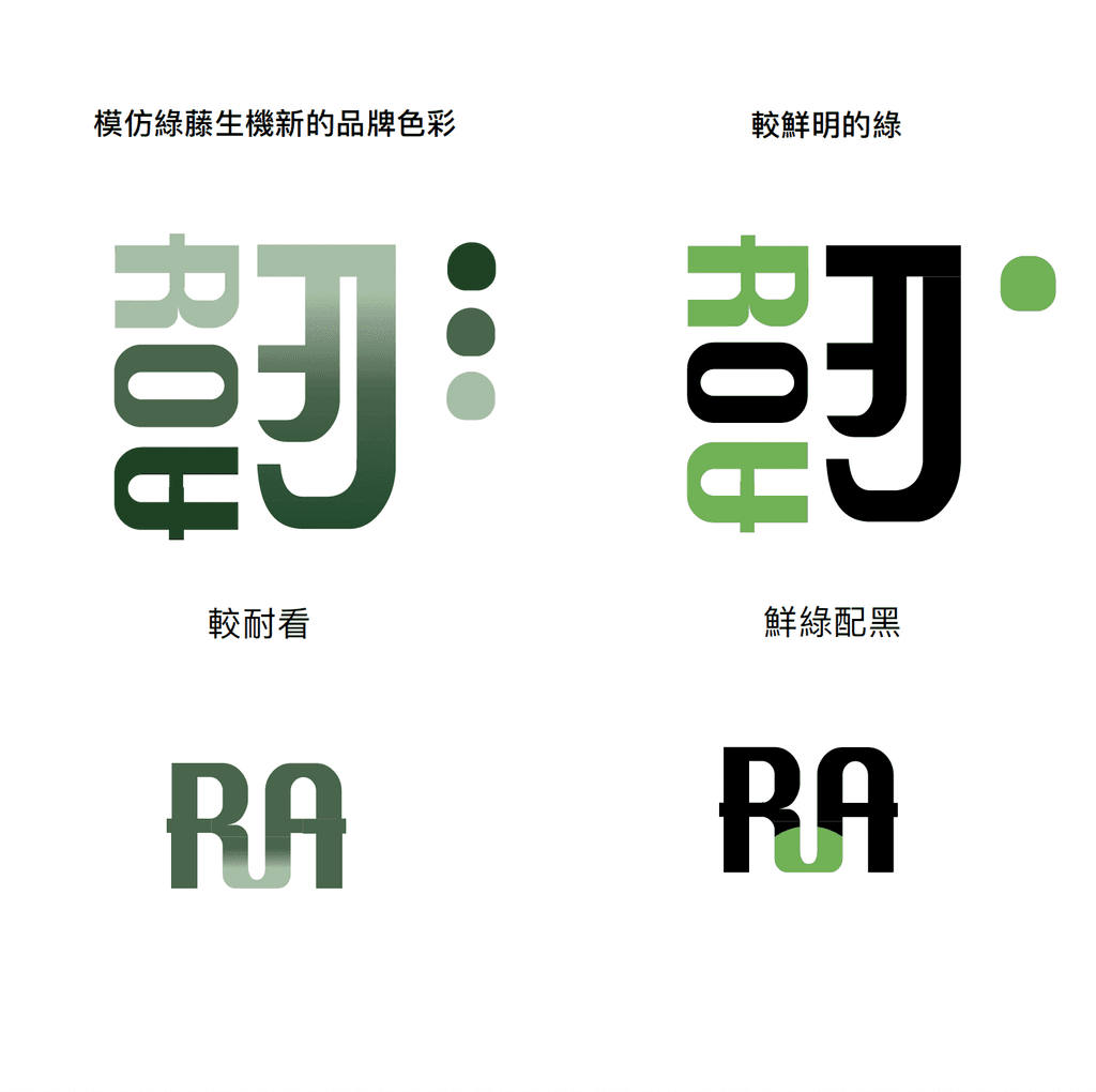
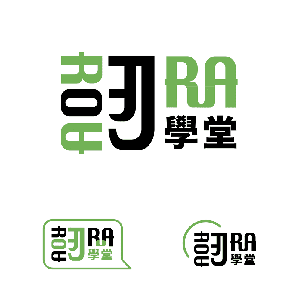
Final Logo design concept
Disassembled the Chinese word "resilience" , 3 letters R, O, A appeared, which is the abbreviation of "Academy of Resilience".
The right side of the word is "刃"(a blade), with leaf replace the dot, visualize a rapid change and flexible adjustment based on culture, environment, and humanities.
The two blue arcs on the upper left represent ripples that spreading energy.
The end points of each stroke retracted one corner of the arc to represent the visual of the toughness of grass.
Other Logo Design
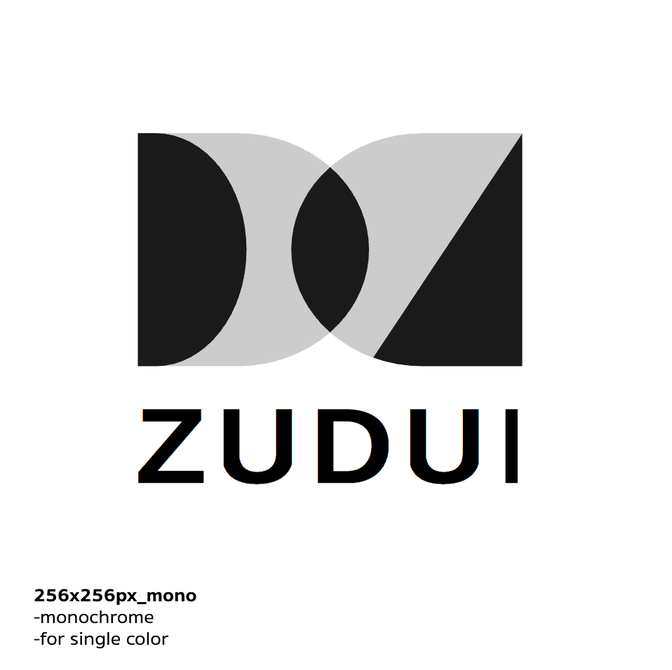
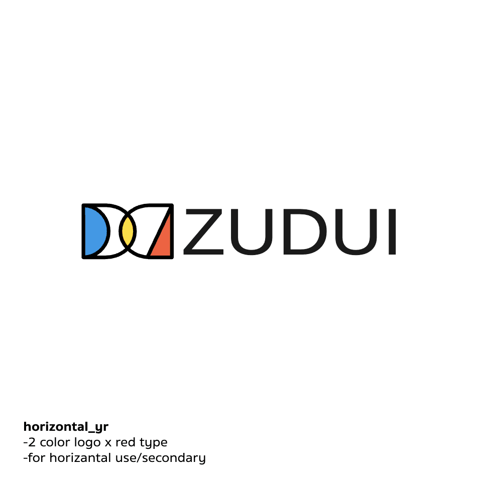
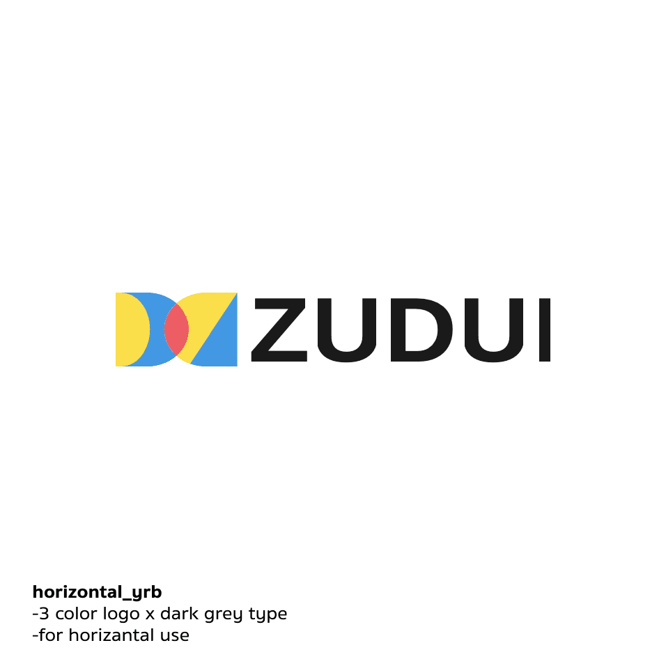
ZUIDUI- Team up App Logo
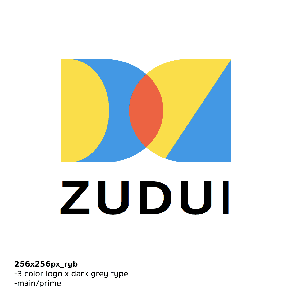
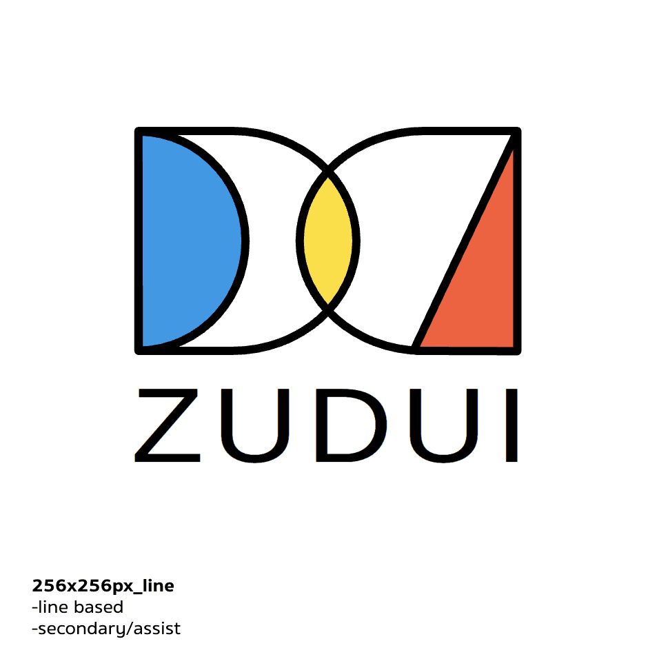

Design concept
ZUDUI as the transliteration of “組隊”, the logo visualize the intersections of collaboration, and combine the shape of letter "Z", "D" and "U".
Application
Completely design logos for different usage scenarios (color & monochrome, square & long, color blocks & lines…)
NTHU Open House projects series- Logo
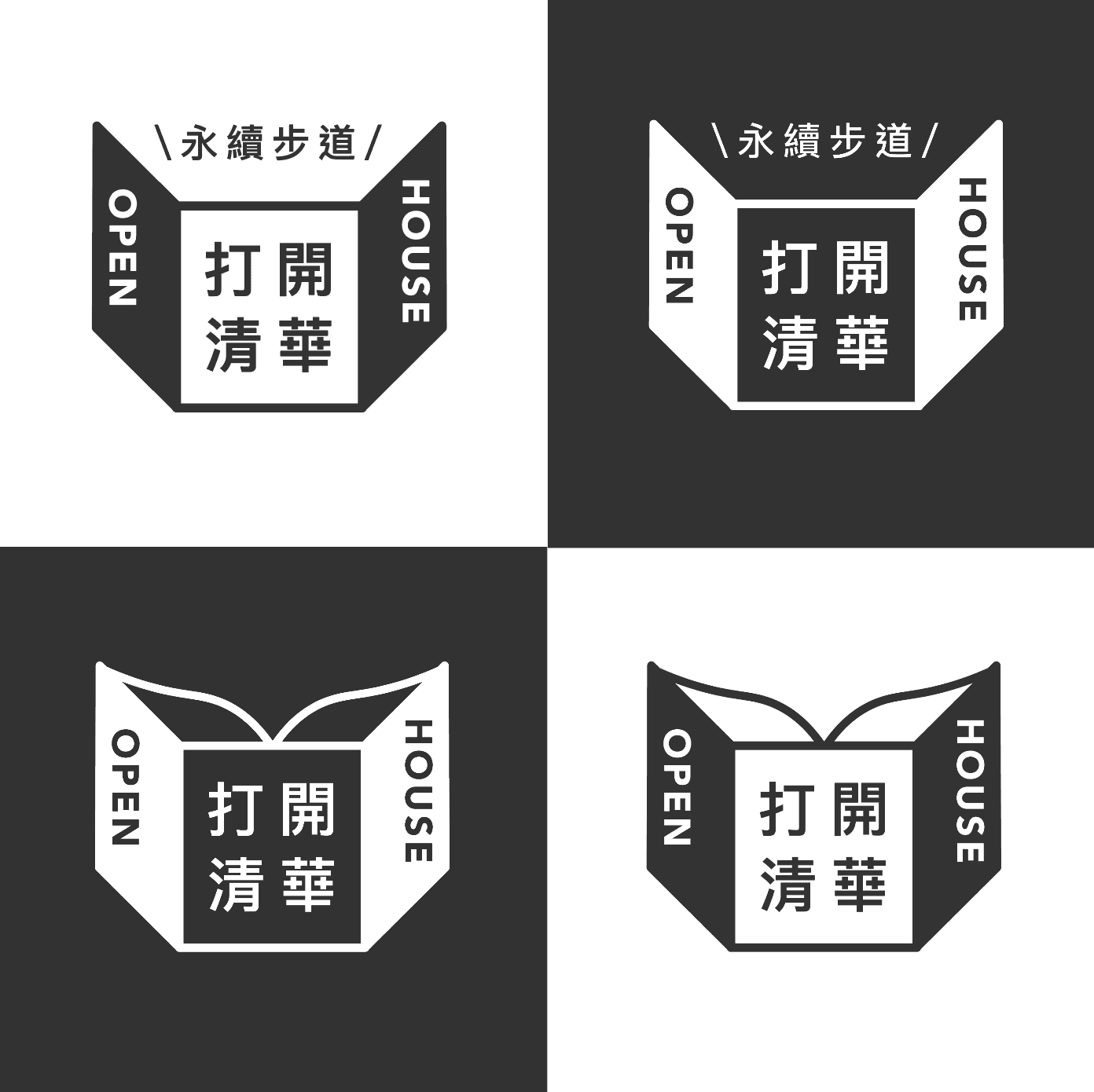
Design concept
Visualizing the meaning of "open", by merging the image of open window and open book.
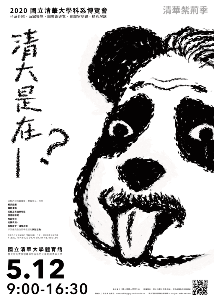
NTHU Department Expo poster-1
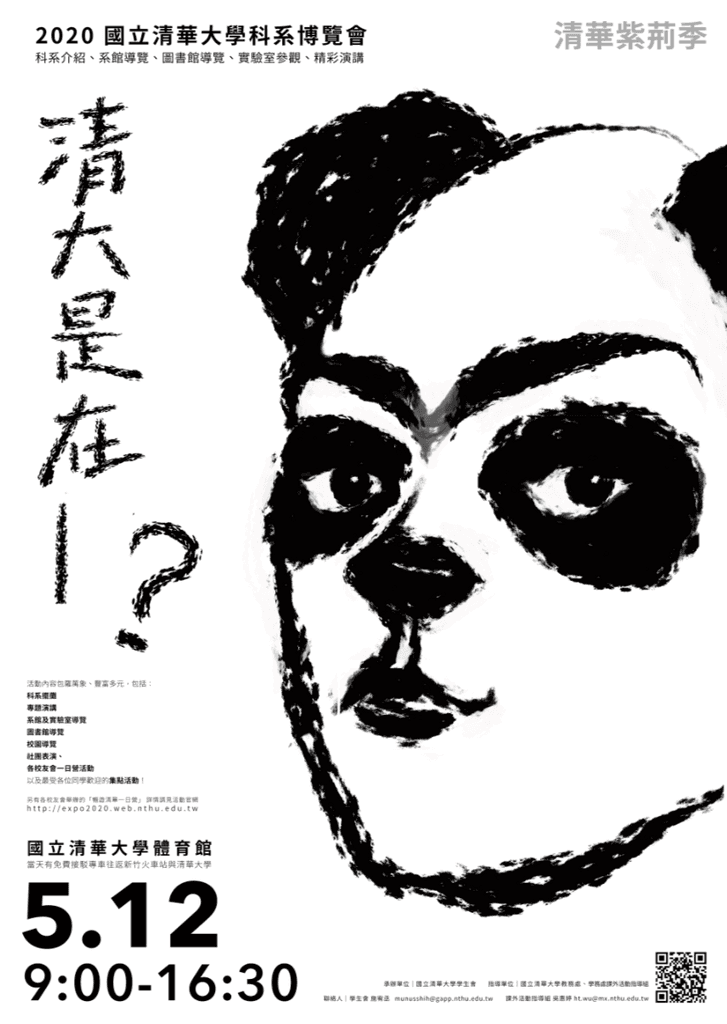
NTHU Department Expo poster-2
NTHU ITM Seminar poster

NTHU ISS Seminar poster
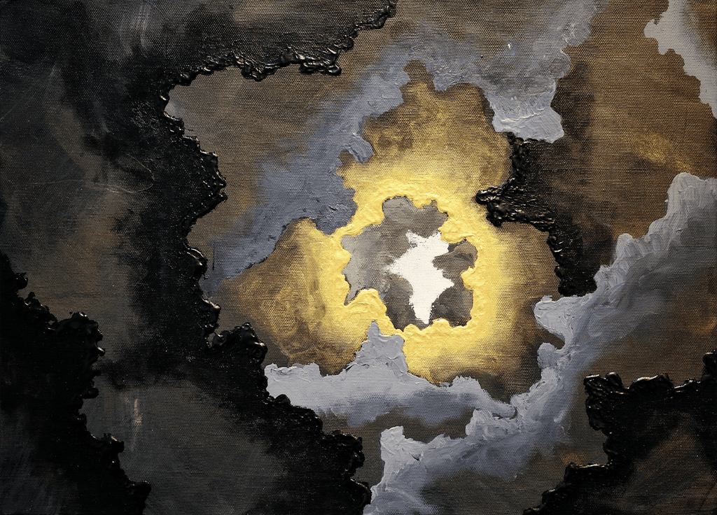
"Unveal"
Year of Creation | 2018
Media | Acrylic
Size | 45cmx33cm
My first collected paintings. Purchased by a visiting professor at the NTHU art group exhibition.
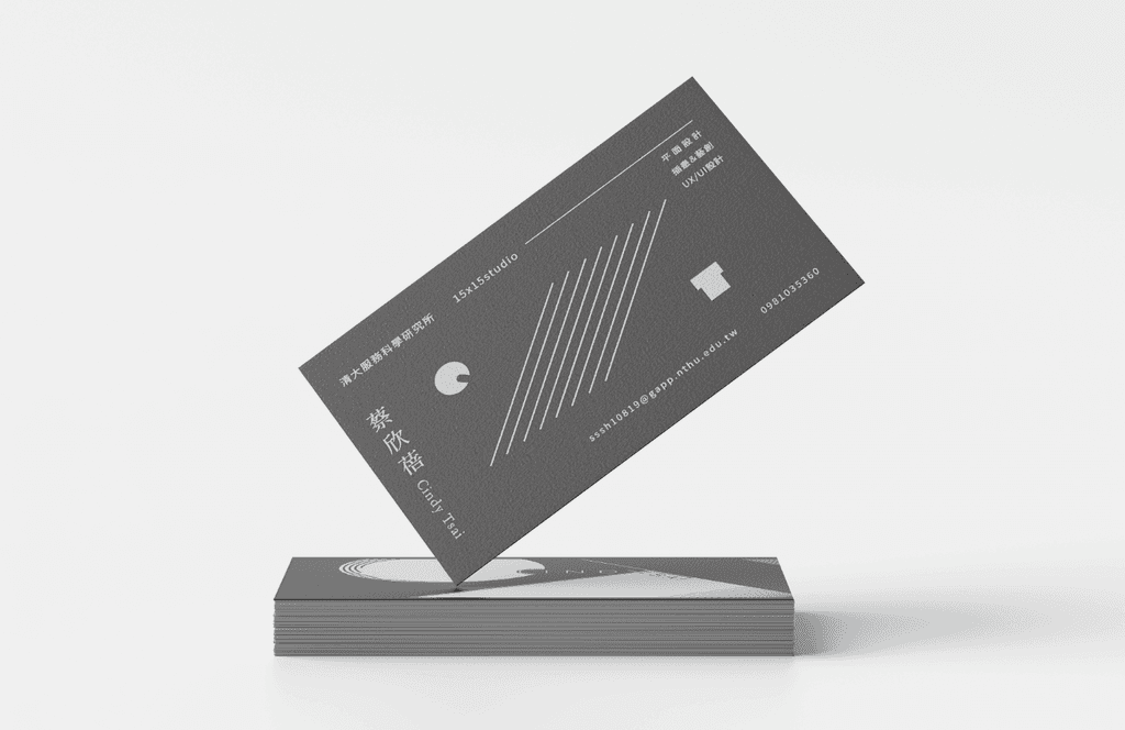
My business card (experimental)
Paper|德國黑卡 180g
Printing|燙雷射箔
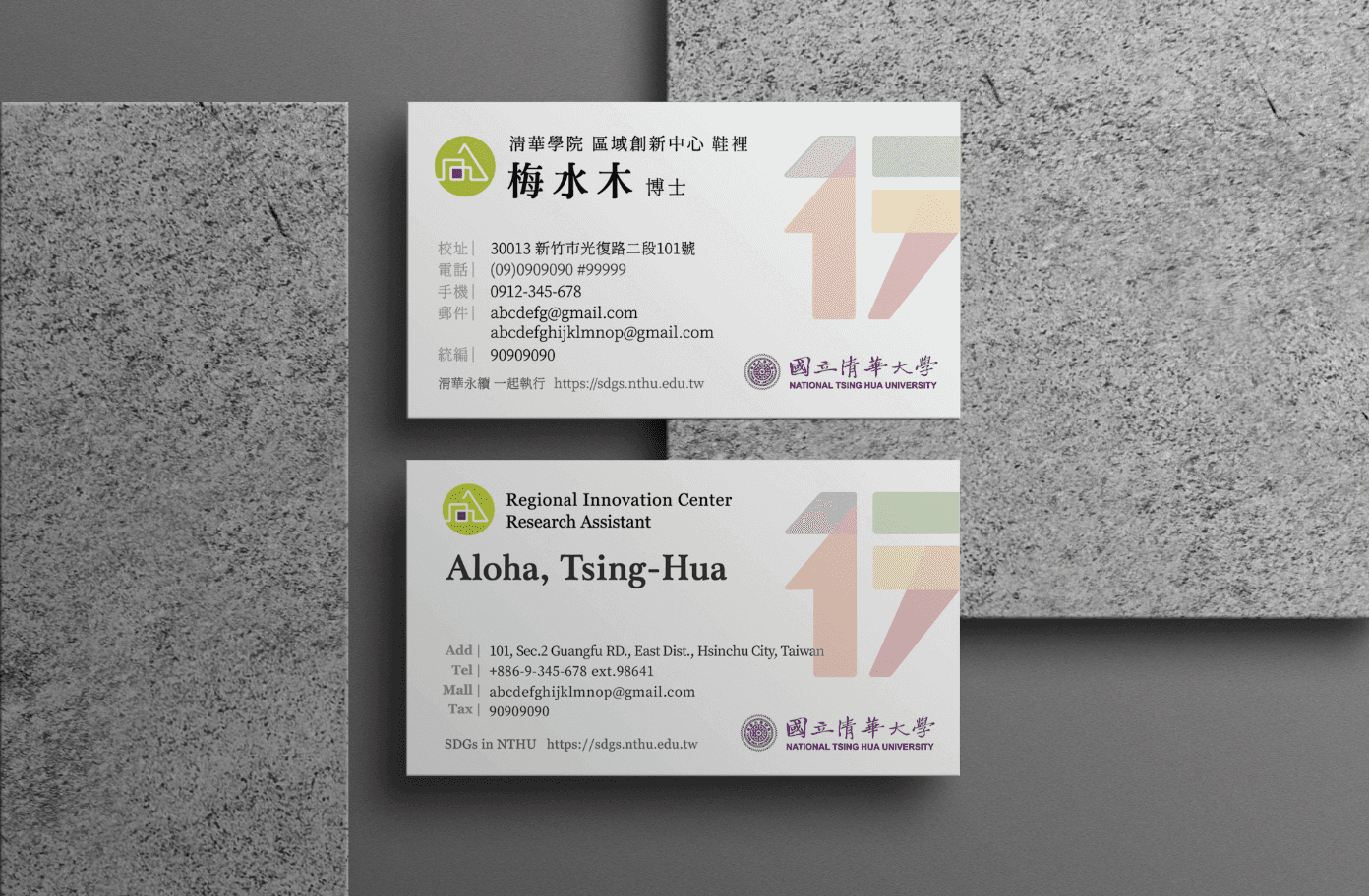
Business card- NTHU RIC
Paper|canvas(細紋紙)
Printing|燙雷射箔
Design business card for NTHU Regional Innovation Center's 7 staffs.
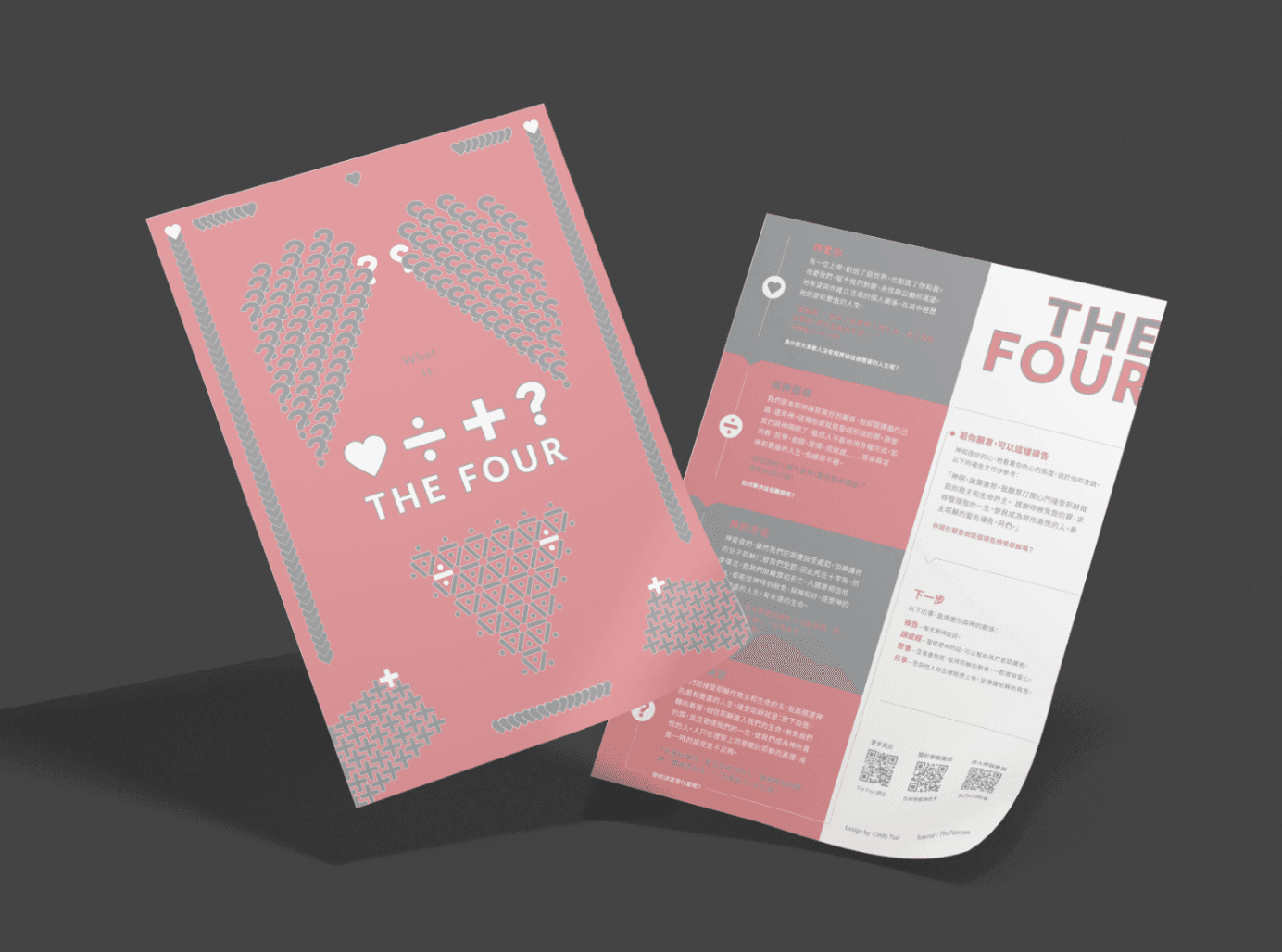
Leaflet- The FOUR
Paper|凝雪映畫100g、日本書籍紙95g
Printing|K版+panton特殊二色
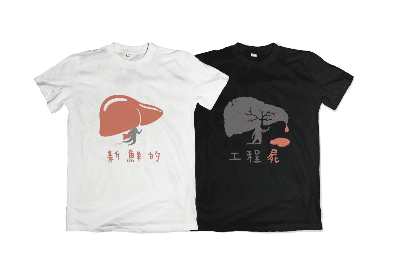
IEEM Camp team uniforms
The camp uniforms designed for high school students are "fresh liver", while the seniors' uniforms are "engineer's liver", showing a sharp and humorous contrast.
Conveying the little joke that engineering is not a field that can be studied casually. The design received a huge response and the uniforms are often seen worn on campus.