

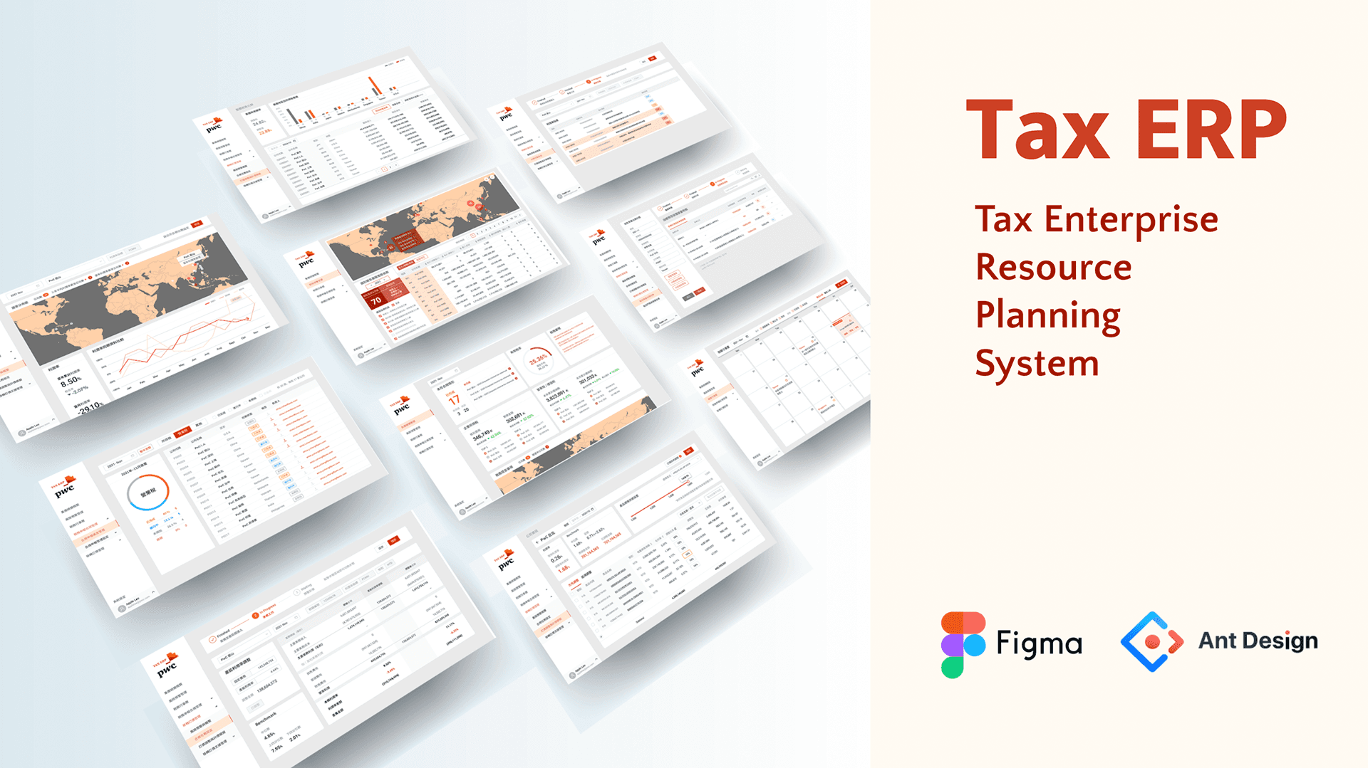
PwC Tax ERP
Classify and connect scattered data lists and interactive functions into systematic tools, like gathering colorful threads into a strong rope with clear textures.
Infographic / Dashboard / UXUI Design / Figma / Ant Design
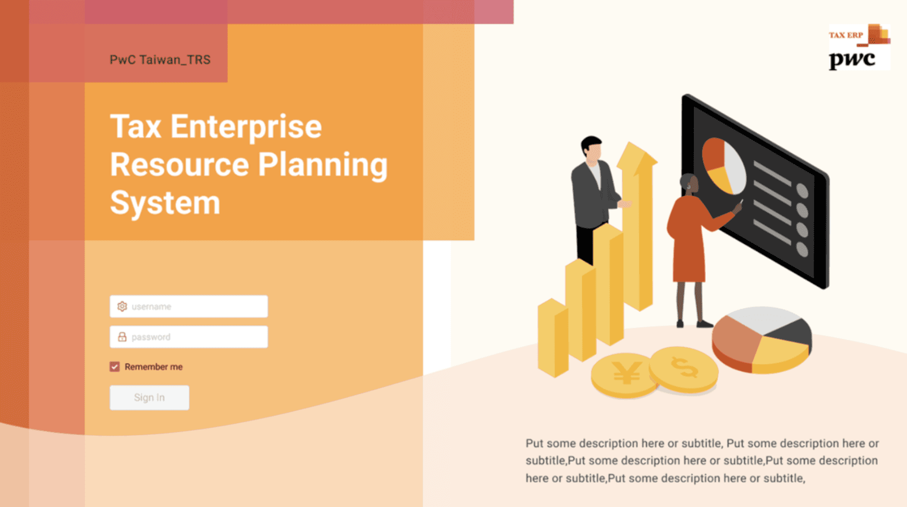
Tax Enterprise Resource Planning System
Role & key partners
Me- UXUI designer / Leader- Assistant Manager / Partner- TRS team / Developer- 3rd party
Collaboration
Receive and discuss wireframe (PPT) with teammates,
design and deliver the UI mockup and prototype, and do further discussion and iteration.
Final come up the whole interact prototype.
Additionally do first version of quality control of the development by 3rd party.
Responsible
UI mockup & Hi-fi prototype for team to presentation.
(Initiative) Upward discuss about the UX and flow problems with team.
Initial quality control of development.
Purpose
Using digital tech., ML, and information design, we provide automated and standardized one-station management services for the collection and reporting of tax information, improving the accuracy and efficiency of corporate operations.
Team
TRS (Tax Reporting & Strategy)
The team's original production platform is Power Bi & Excel, which is difficult to freely adjust and unify the visual and UI, so they let me design the UX/UI aspect.
What I do
Responsible for design the ideas and structures discussed between the team and the customer into an operational and interactive prototype.
Focusing on designing the system into a clearer, useful, unified, and clear IA interface while comply with the company's visual identity specifications (the use of colors, images and icons…etc.).
I often communicated back-and-forth and adjust with the team, I also actively find out UX problems to discuss.
Brief
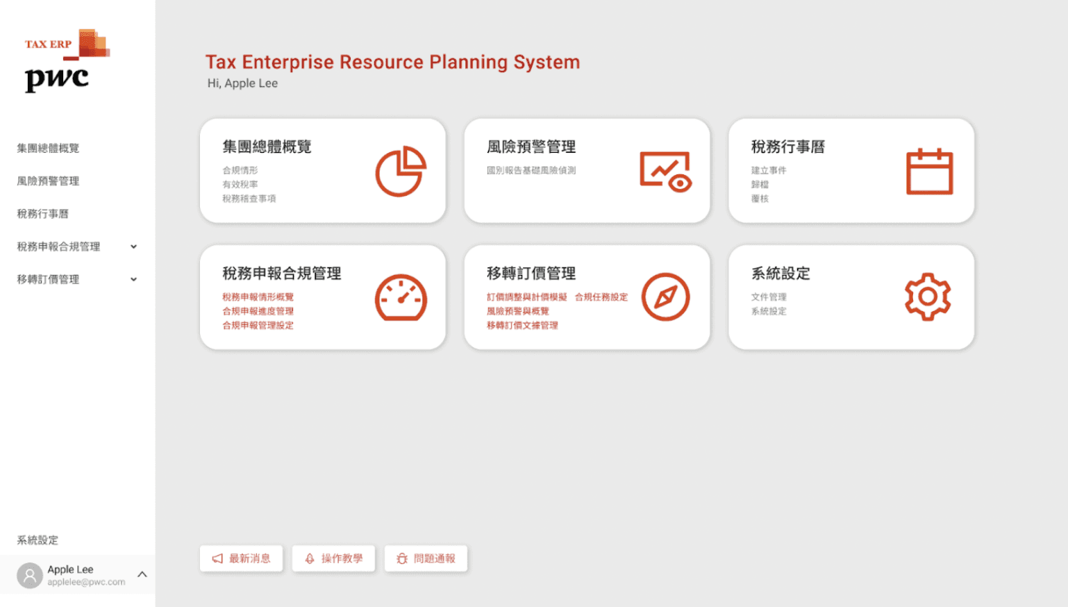
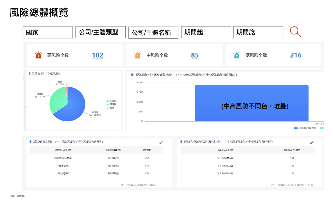
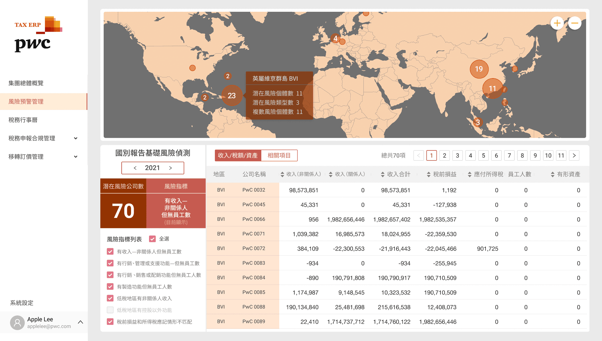
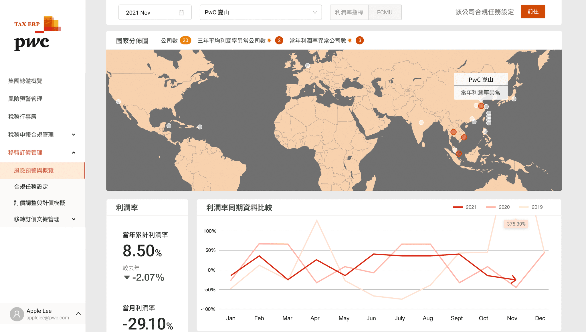
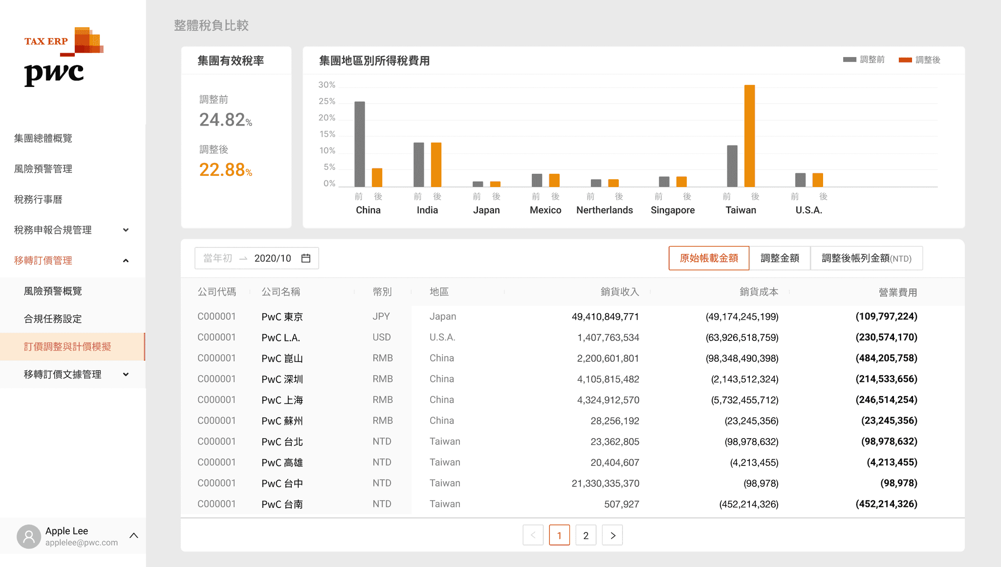
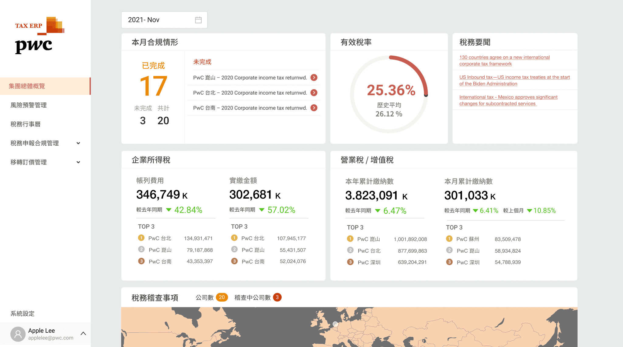
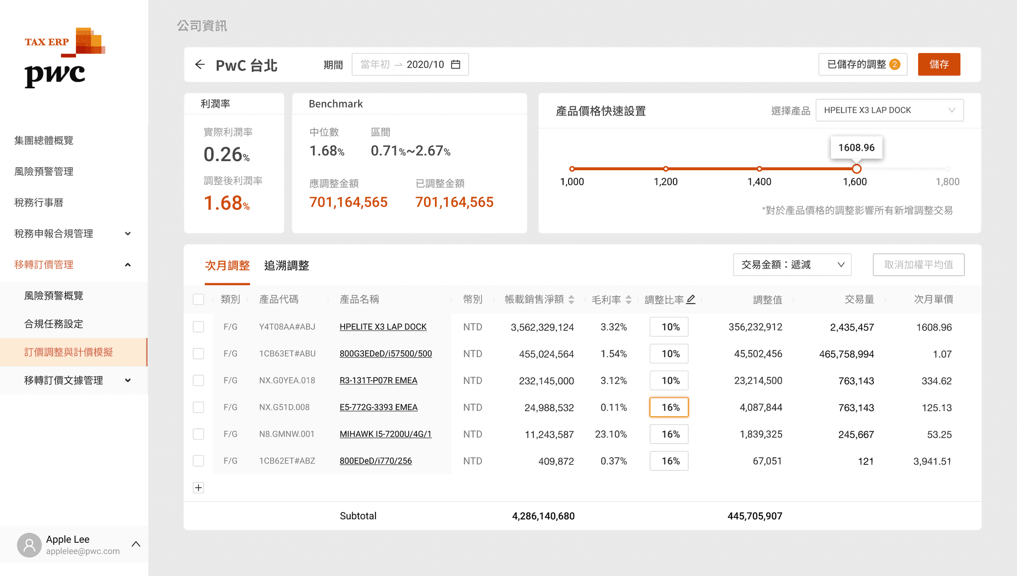
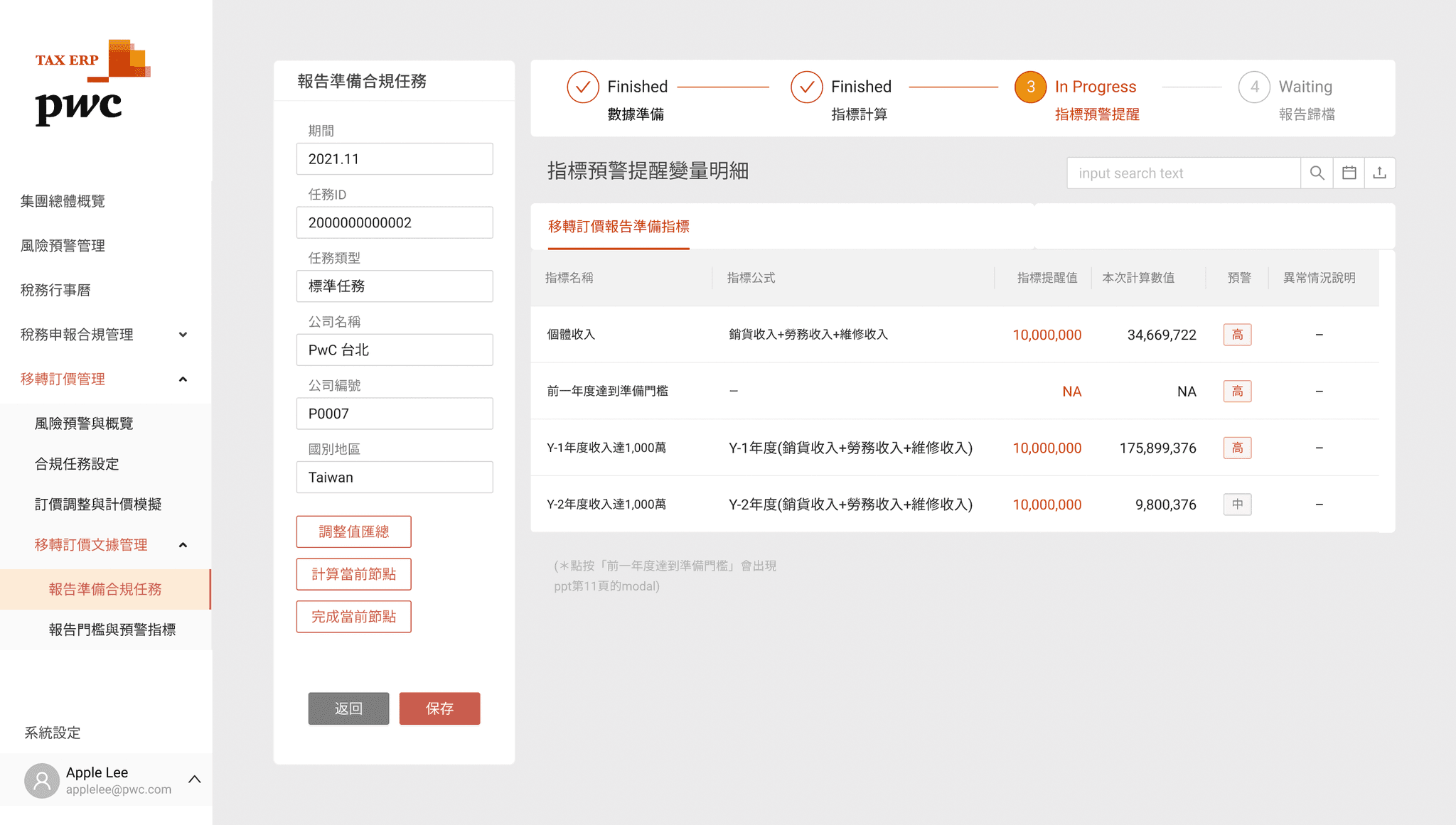
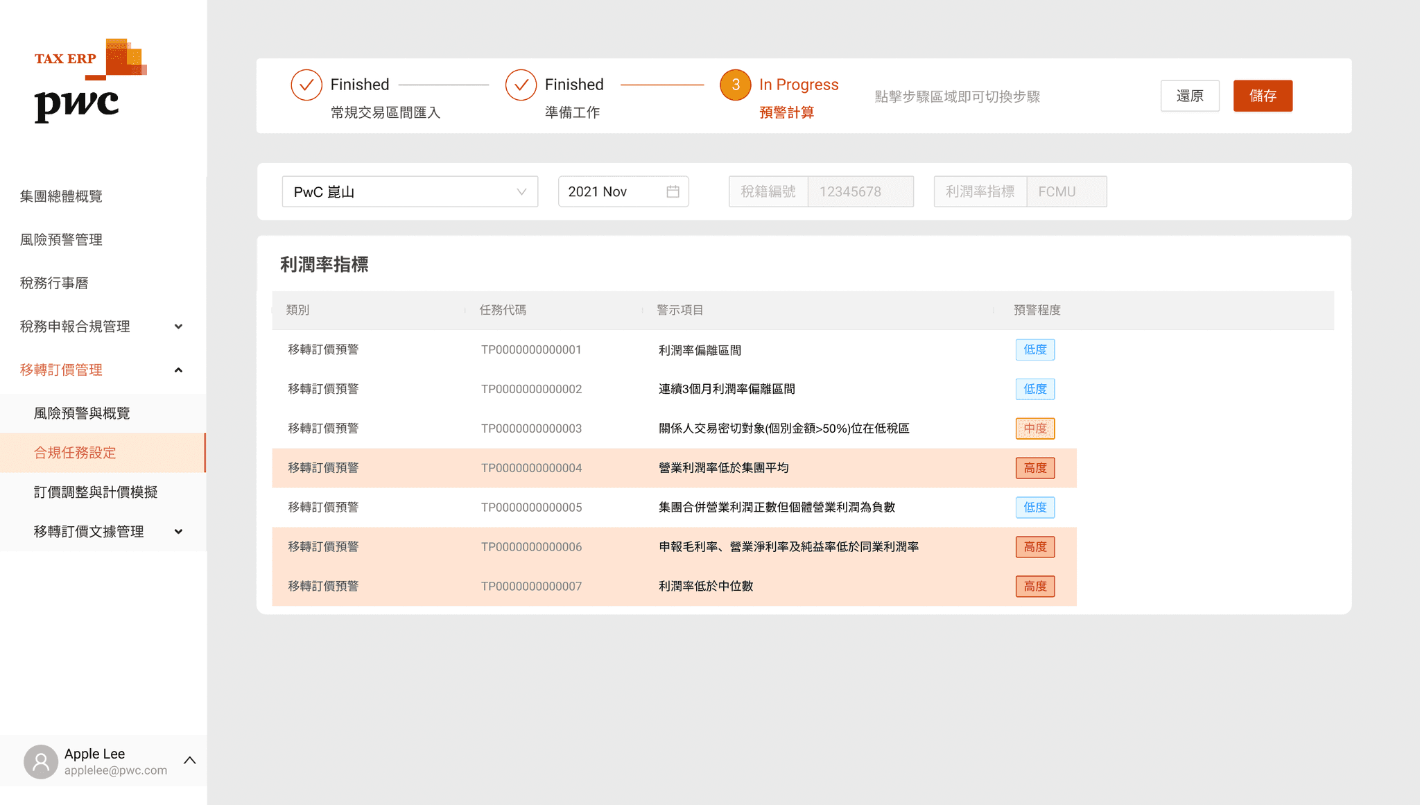
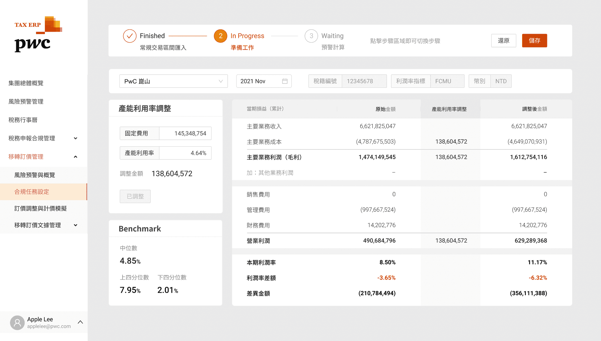
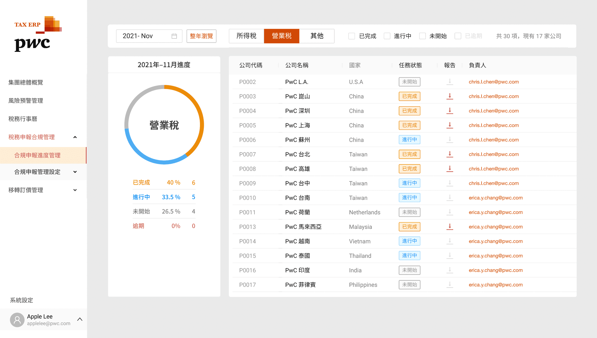
Modular system architecture
Modular, block-card-style functions and Dashboard combination maintain flexibility and scalability to respond to future changes.
One-stop integrated management
Integrate daily work processes such as tax data collection, processing and output. The left menu helps user to switching between various frequently used functions.
Close to the needs of tax users
Focusing on special tax situations, we provide the highly automated data processing and customized systems and modules.
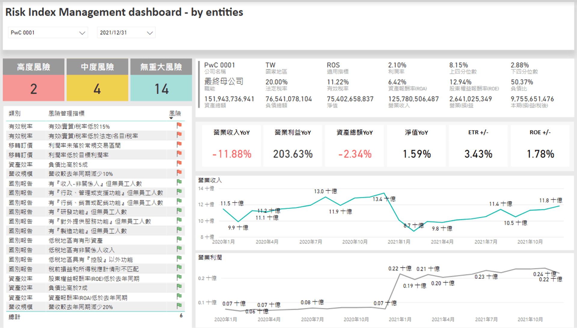
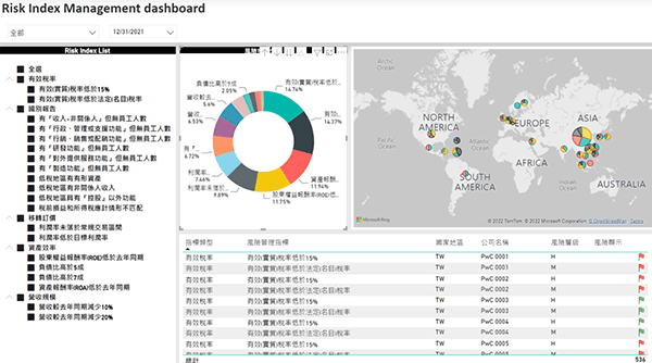
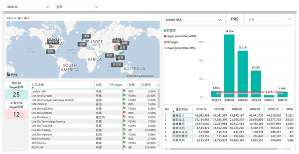
Original service UIs built by power Bi & Powerpoint.
The large amount of information and text, there are design issues that make it difficult to browse and find information comfortably.
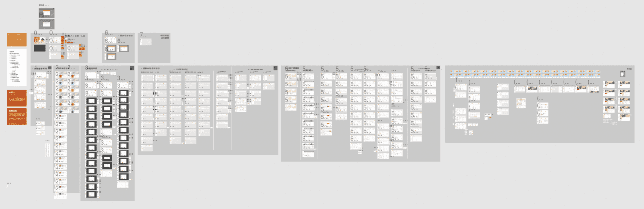
*Due to the confidentiality agreement related to the company's intellectual property, only small pictures are shown, no detailed pictures.
Challenge
There are many modules, complex functions, and professional knowledge threshold, which makes the design of IA, flow, and navigation very challenging. It is the most time-consuming part, the most discussed and revised during the entire internship.
Due to the constraints of schedule, resources, and culture, there is no opportunity to do UXR to understand the users' needs, problems, and behaviors.
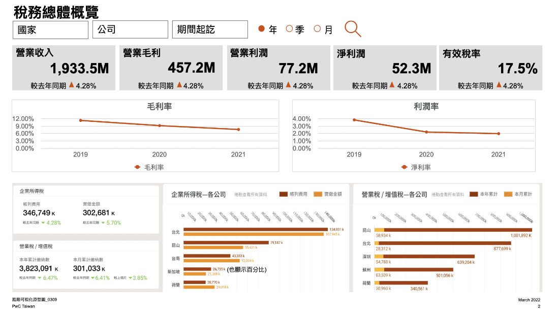
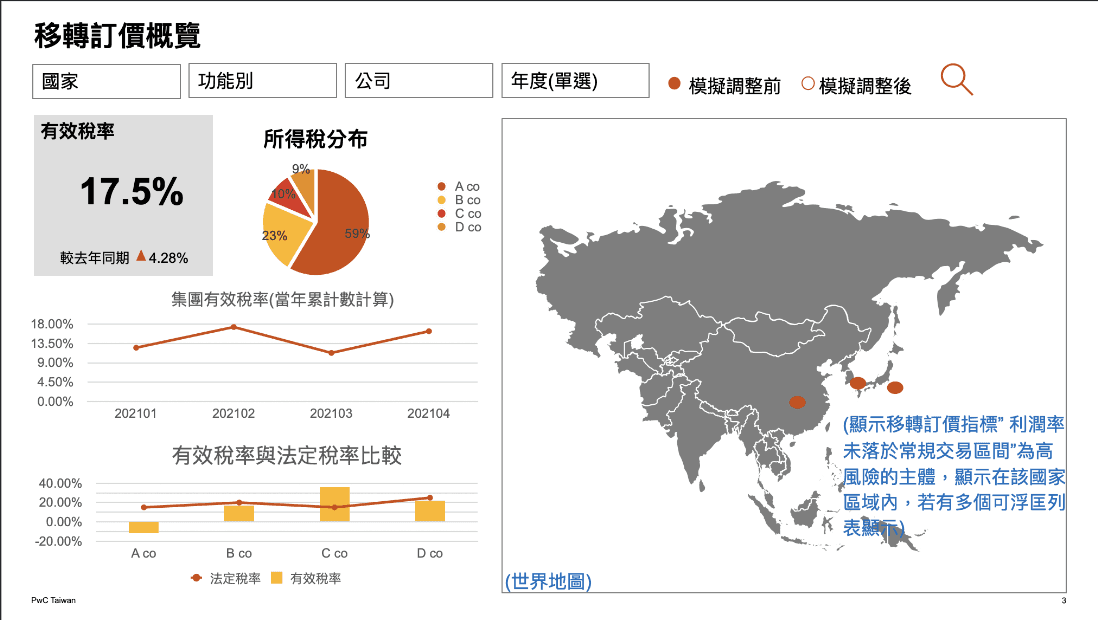
*Due to the confidentiality agreement related to the company's intellectual property, only small pictures are shown, no detailed pictures.
*The images and content on this page are owned by the company. Excerpting, imitation, plagiarism, etc. that infringe on intellectual property rights are prohibited.
Solution
Focus on the hierarchy of information. The main text, subtitles, content, annotations, emphasized words, notes... all need to be clearer to help reading.
Using color theme properly to differentiate criterias of information and as a continuation of company's visual identity.
Using Gestalt properly to reduce the heavy mental loading(e.g. the adjacent informations being too far apart & unclear of layout).
Move the NavBar from top to left, making it more like a professional software rather than a common website. Categories reading from top to bottom is faster and easier than from left to right.
Delivery
After the internship, the team deliver the prototype to a third-party software developer to make an actual product. Since they had its own set of templates and development processes, the team could not directly intervene to do ideal adjustments. The compromise was that the team let me improved the design file as the references for developers.
Learning
The mindset a single designer required
Since I am the only designer on the team, without the leadership and guidance of seniors, I was sometimes confused and take detours. But learning from 0 to 1, step by step, leads to more complete learning and experience. Coupled with the trust of colleagues, I growing up faster through "role playing". I realize that the most powerful way to learn is to “learn by doing”
Consistency
The larger the project, the more effort must be made to maintain consistency.
Constantly check back and forth to see if the design of all parts maintain the same visual language to ensure unified scenarios and functions to avoid confusion or more mental loading.
Simplicity
Constantly thinking and trial-n-error to come up with the lightest, cleanest, most direct design, deleting unnecessary elements and always paying attention to whether there is any visual noise, so that users can intuitively understand and interact smoothly.
Unity
Using the foundation of design (such as Gestalt) to unify the visual and help users understand the product easily.(e.g. Proximity / Unity / Alignment / Contrast / Hierarchy / Tension / Repetition / White Space…)
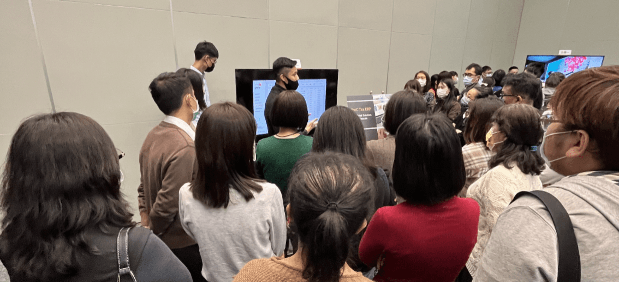
Final Present: Introducing the service to the company’s customers with interactive Hi-fi prototype and pre-recorded videos.