JobBank Resume Editor optomizing

Constantly iterate and try to create a simpler, more convenient and flexible resume filling experience.

In 3 major iterations, each included countless optimization attempts. The main goal is to allow users to have a "what you see is what you get" resume creation experience.

Client

1111 JobBank

Category

Web Design, RWD

Result

Pending

Duration

2 month (overall 5m)

Client

1111 JobBank

Category

Web Design, RWD

Result

Pending

Duration

2 month (overall 5m)

Client

1111 JobBank

Category

Web Design, RWD

Result

Pending

Duration

2 month (overall 5m)

Role & key partners

Me- Product designer / manager- Sr. Product designer
/ PM & SA / Supervisor- Design director

Collaboration
  • ver.1~2- design independently, discuss with PM & PO.

  • ver.3- coop. with manager, discuss with PM & SA.

Responsible
  1. Comparative analysis & UI mockup & Hi-fi prototype for presentation.

  2. Intensively discuss with partners.

  3. (Initiative) Documenting record of discussion details to leave proof of decision.

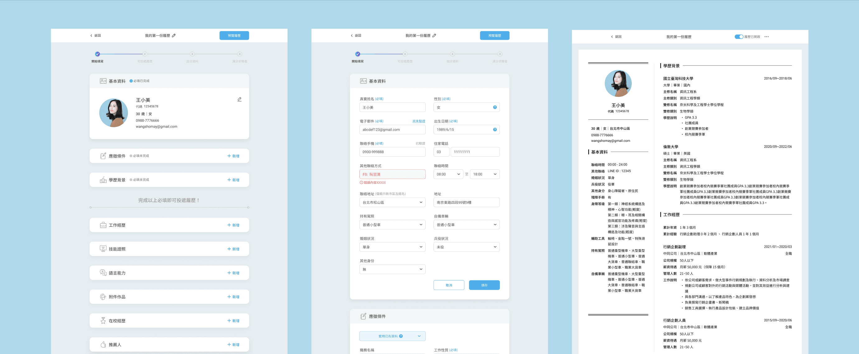
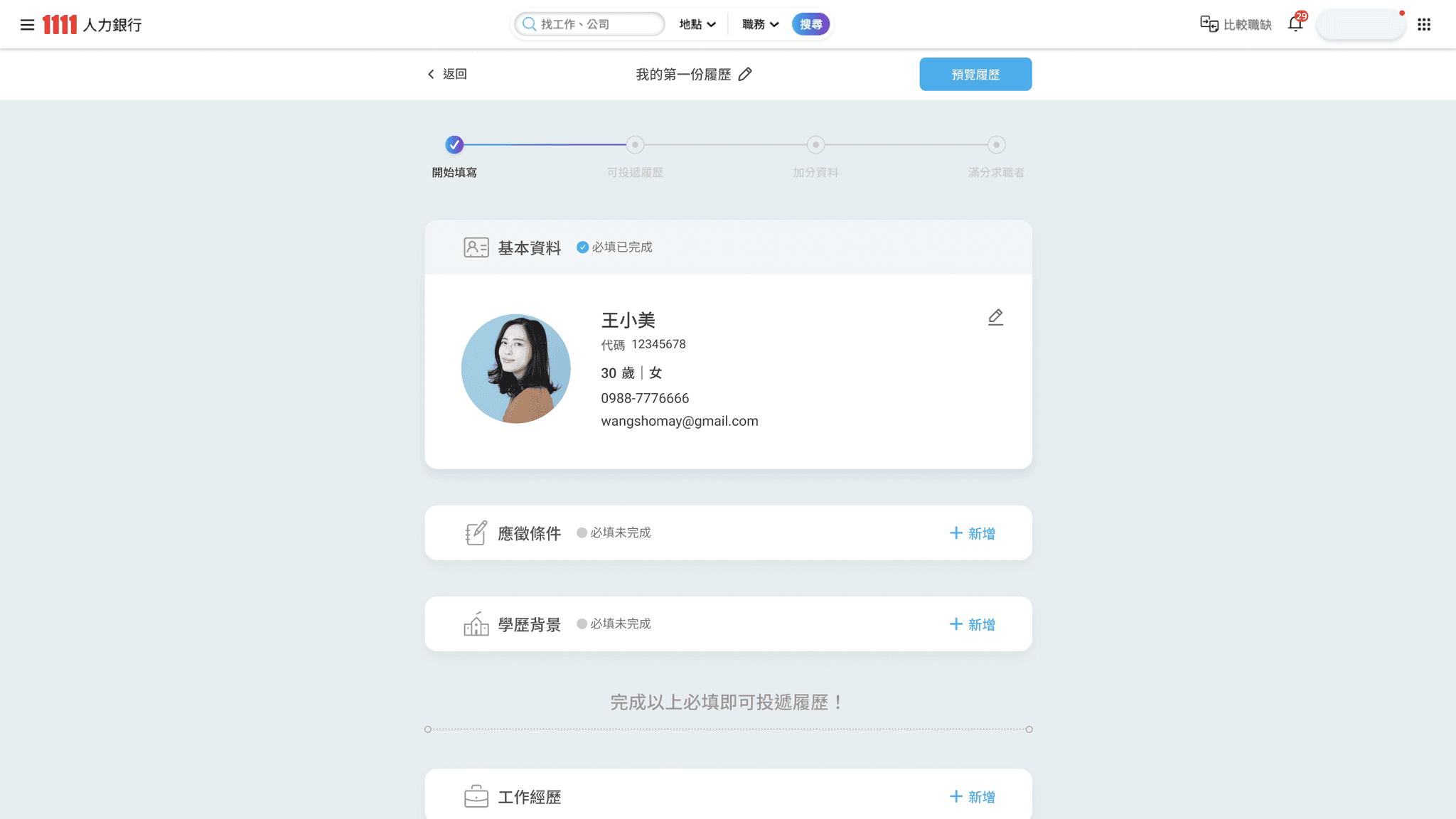
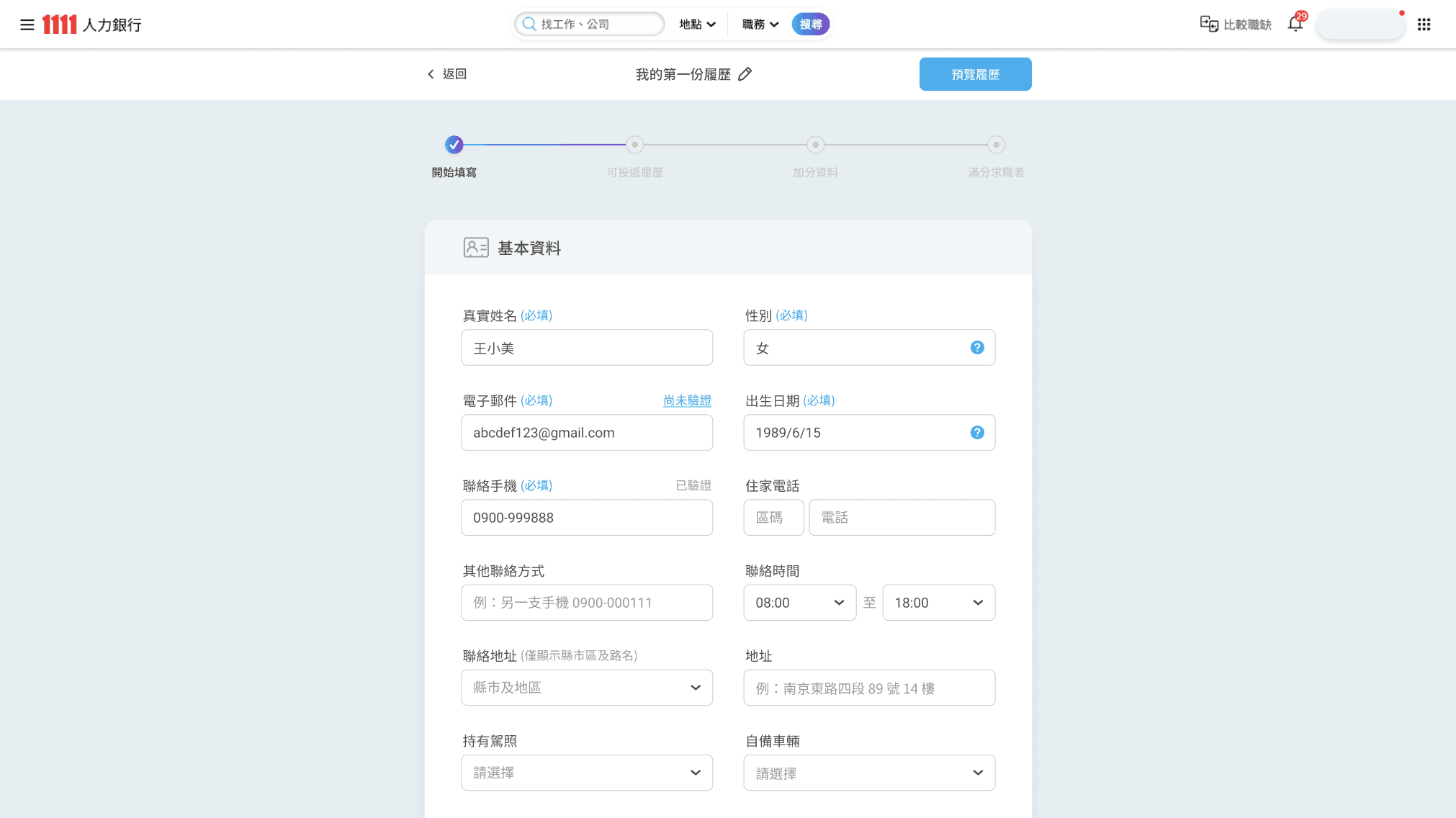
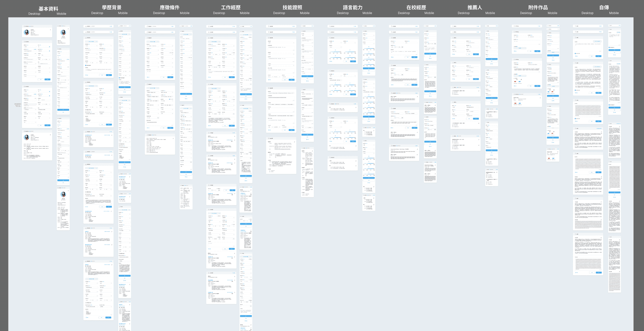
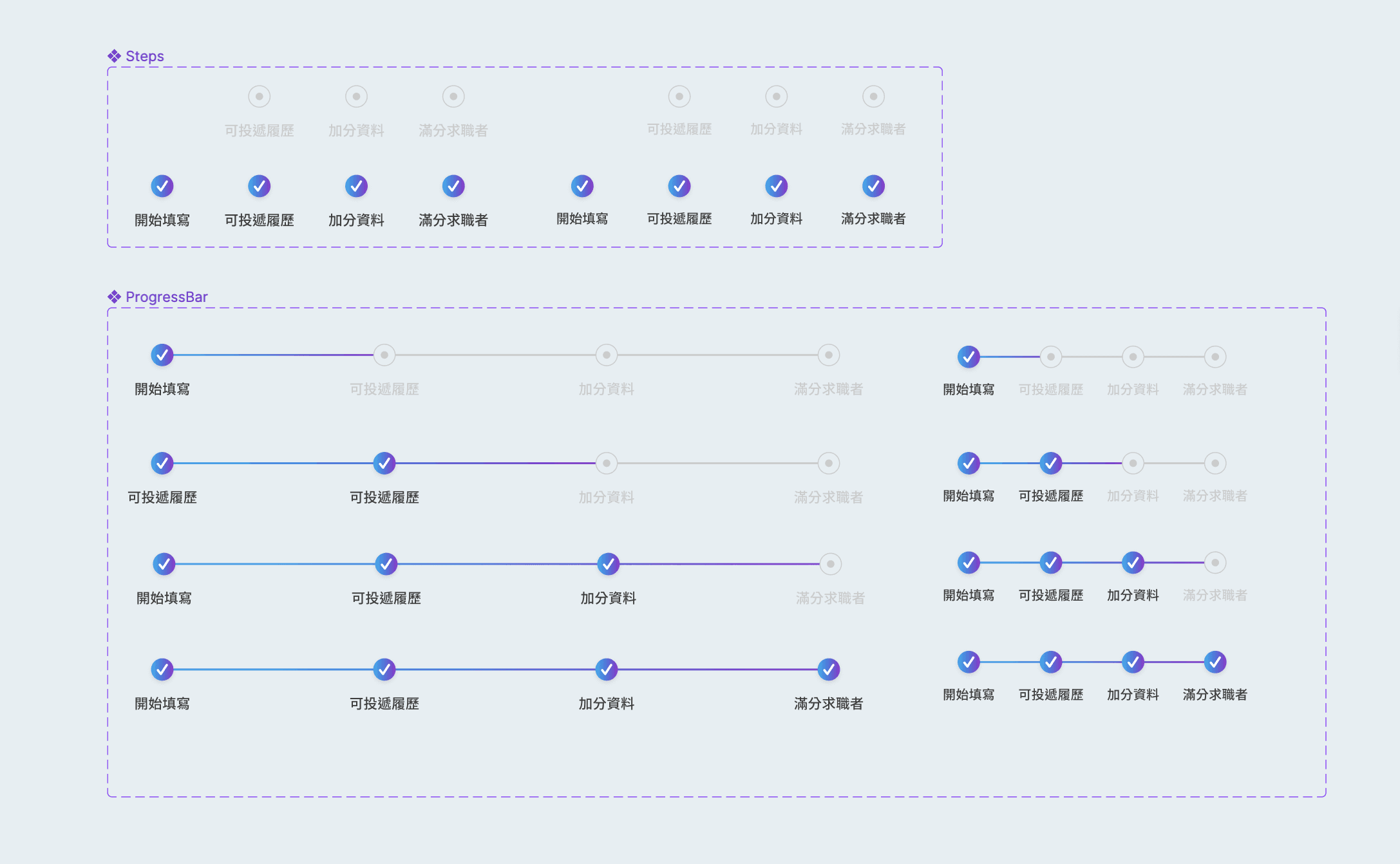
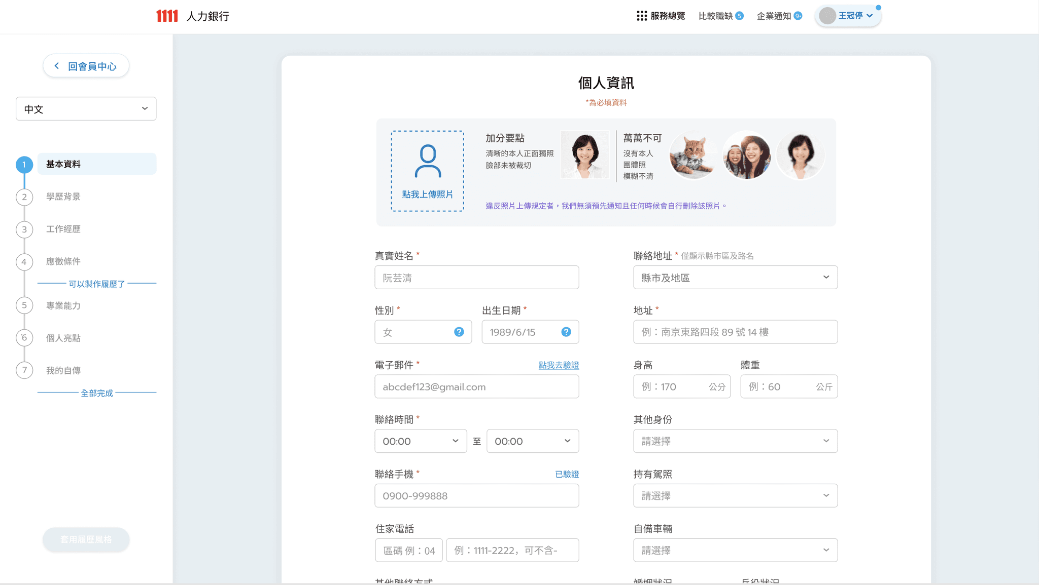
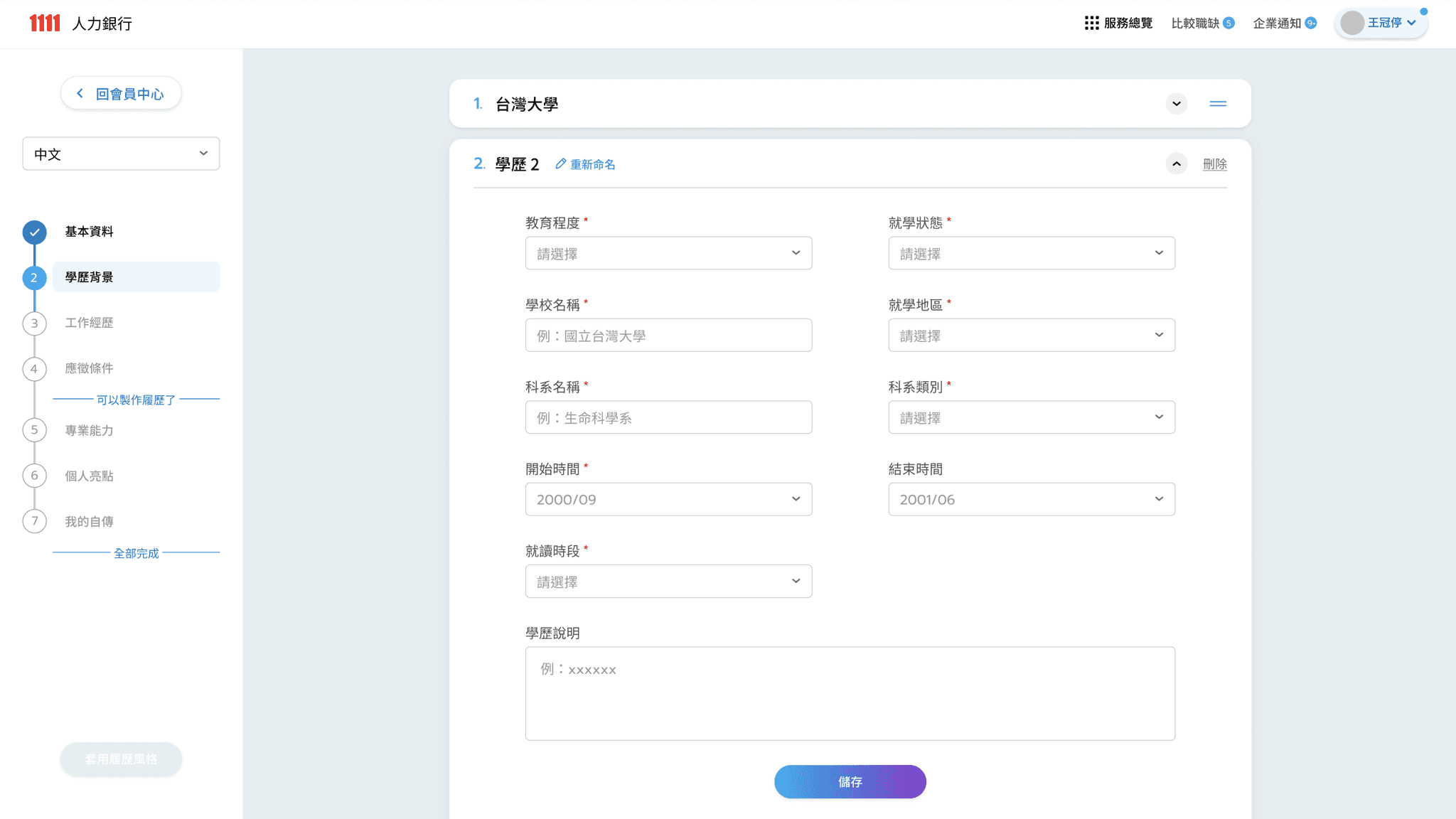
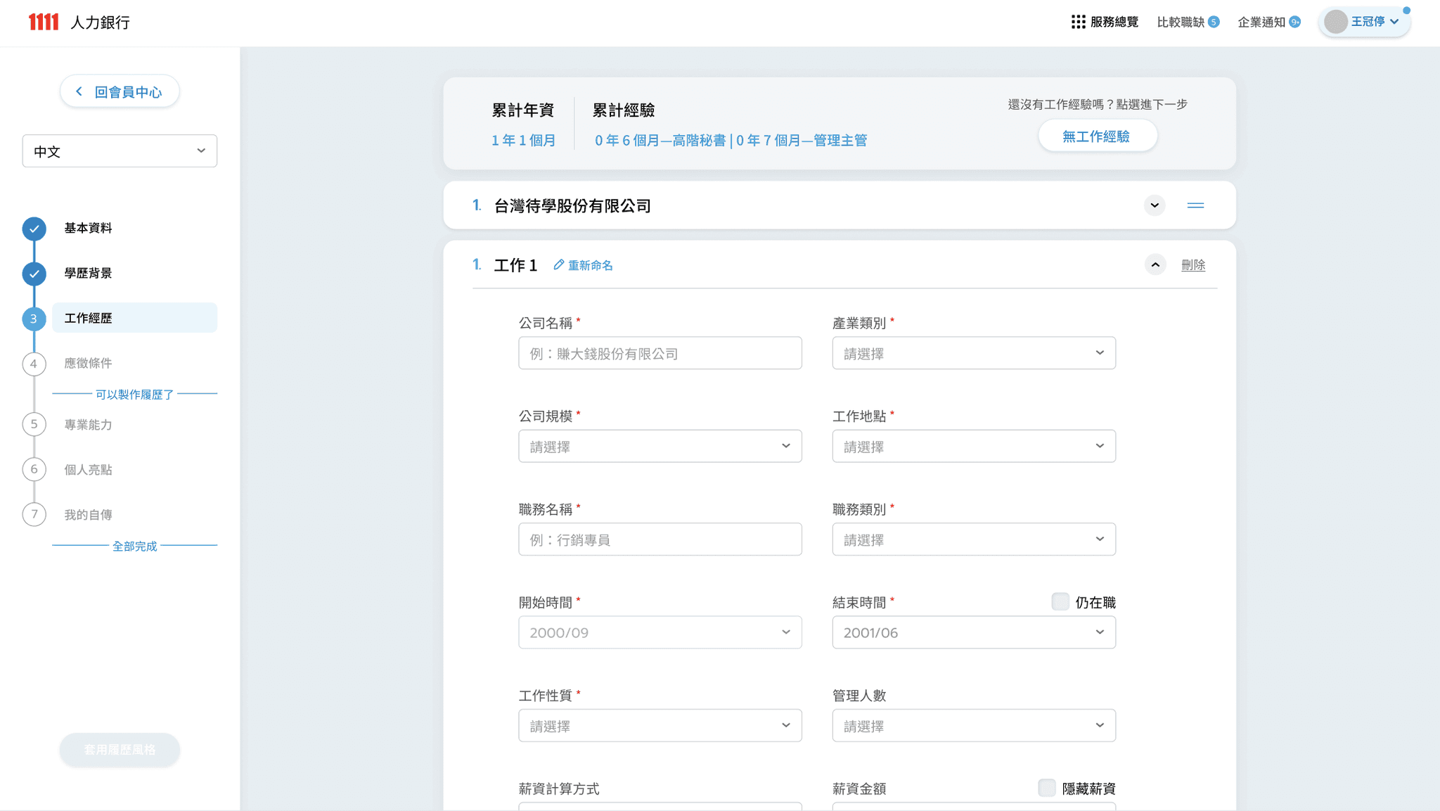
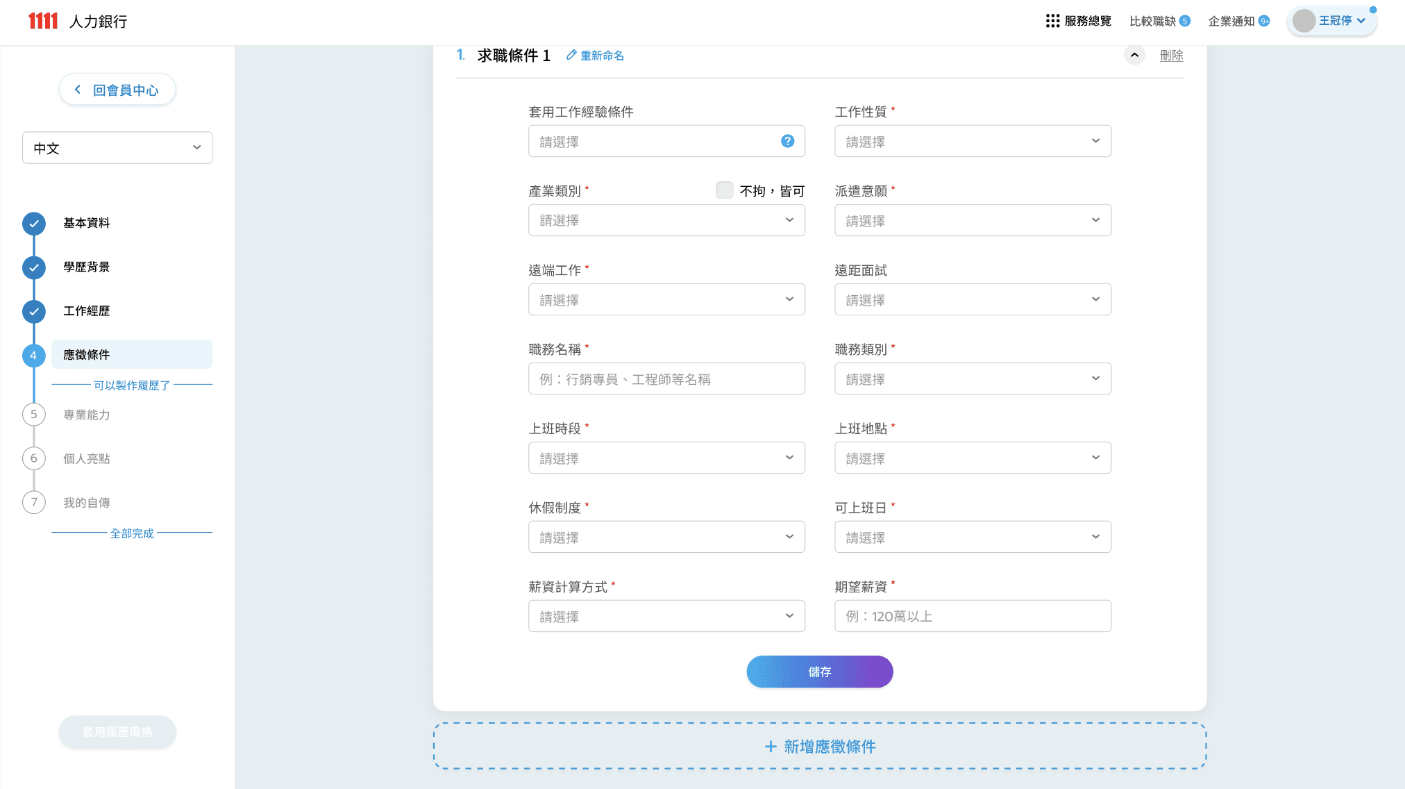
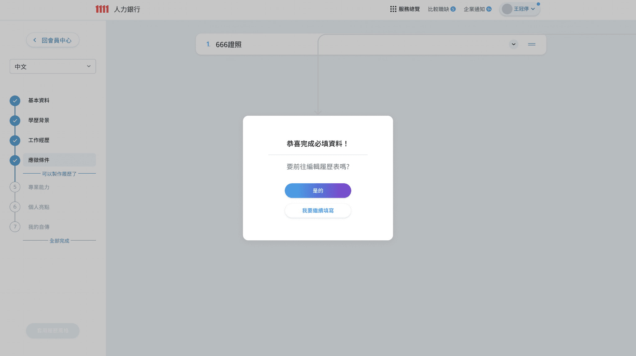
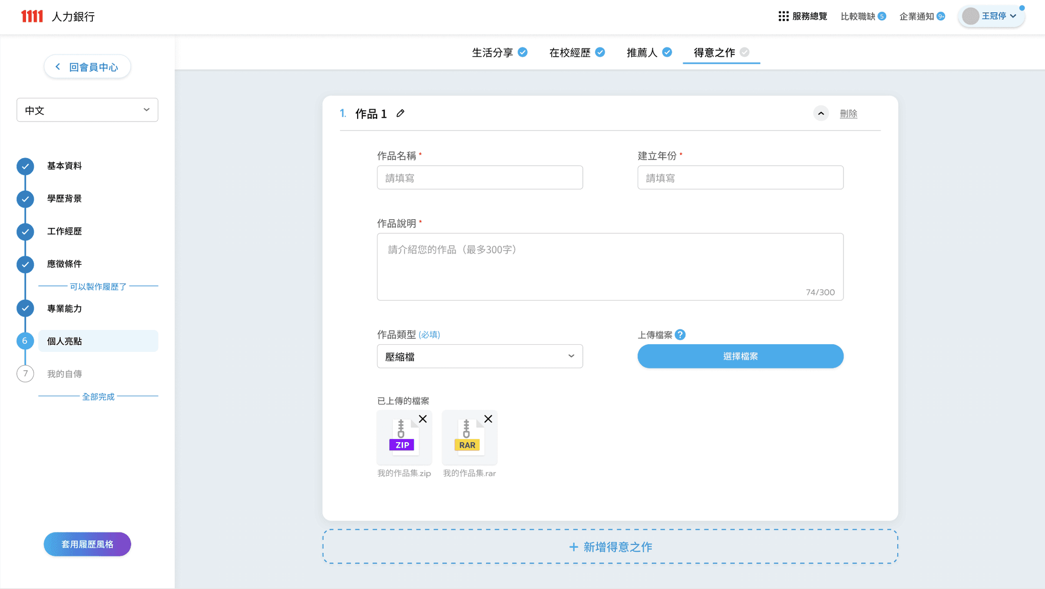
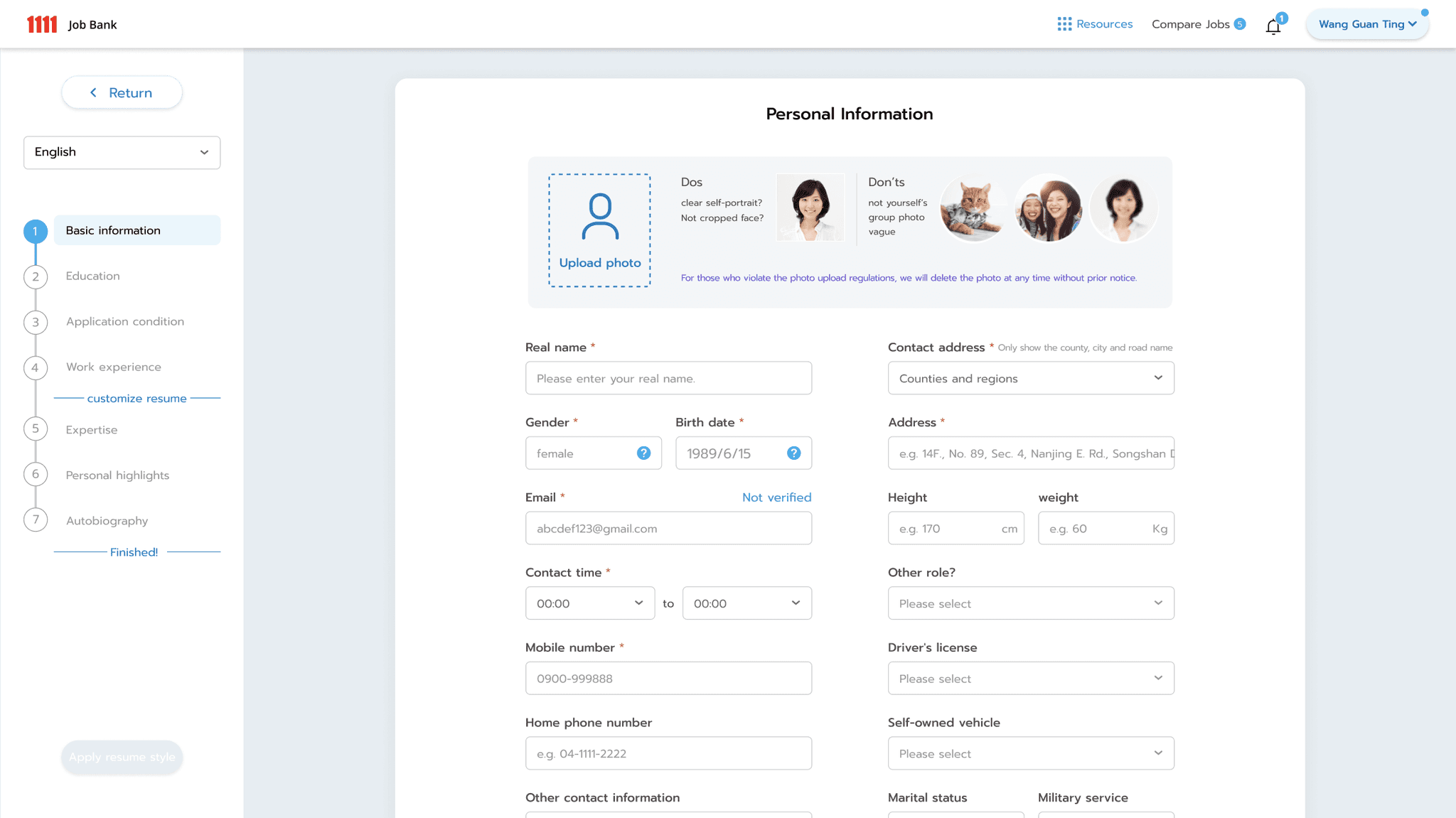
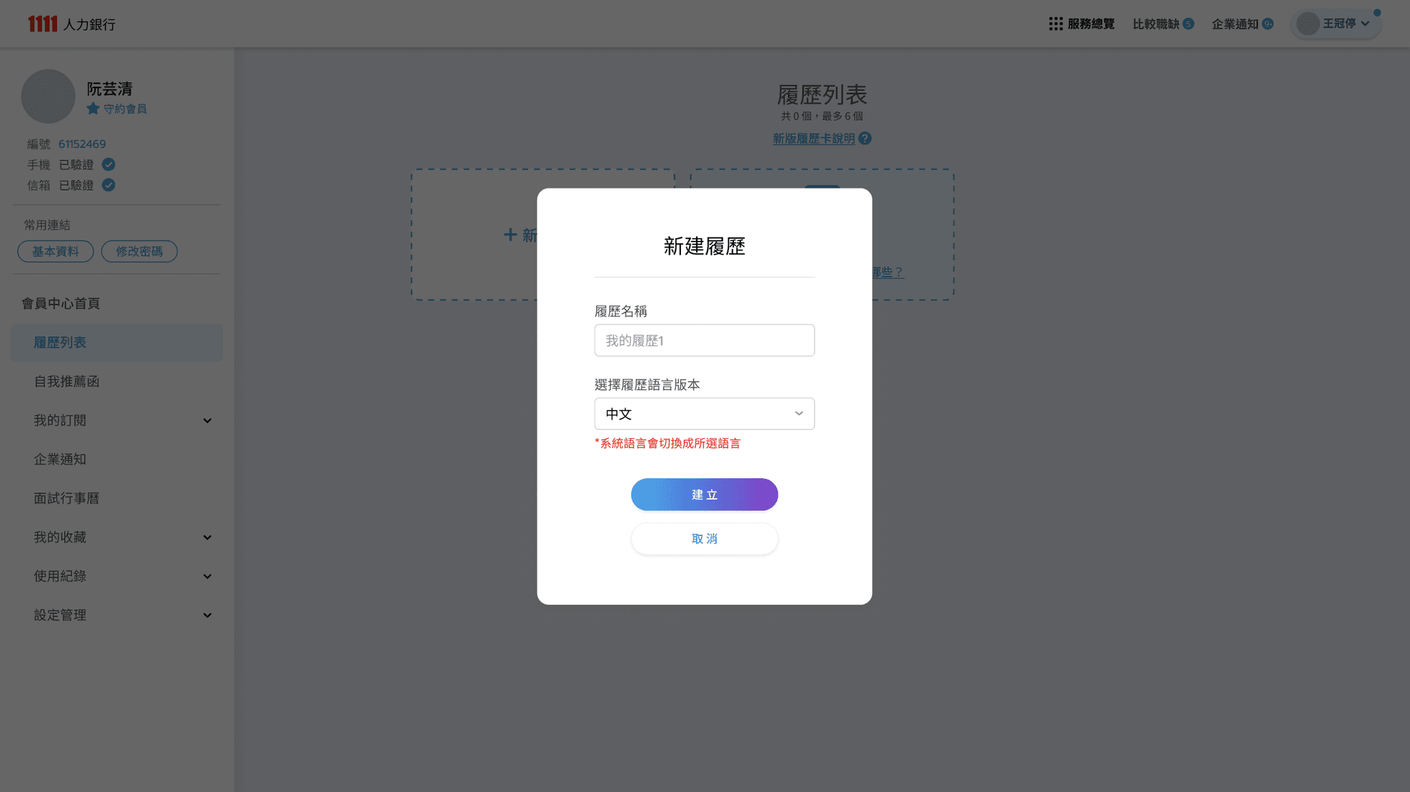
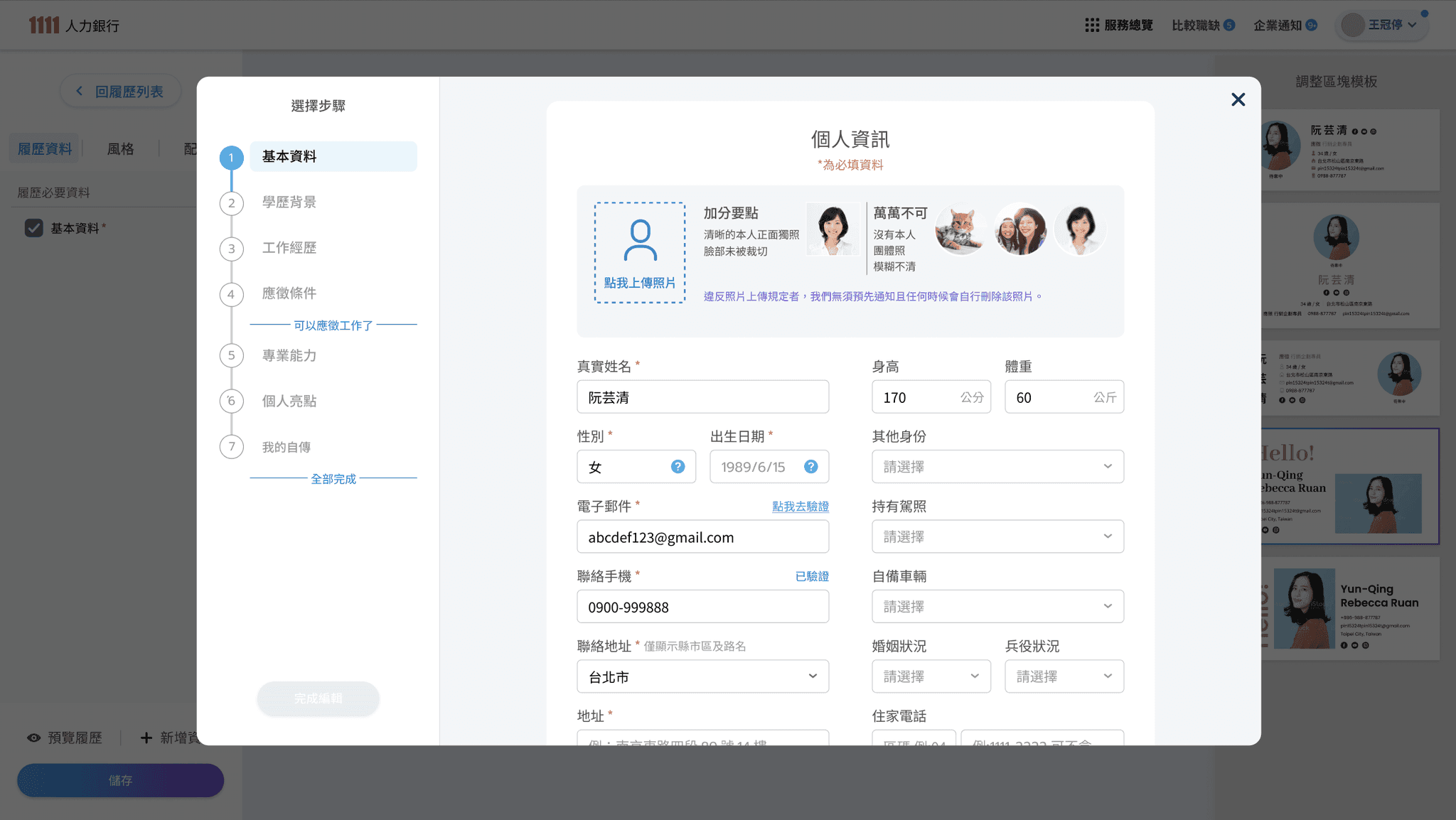
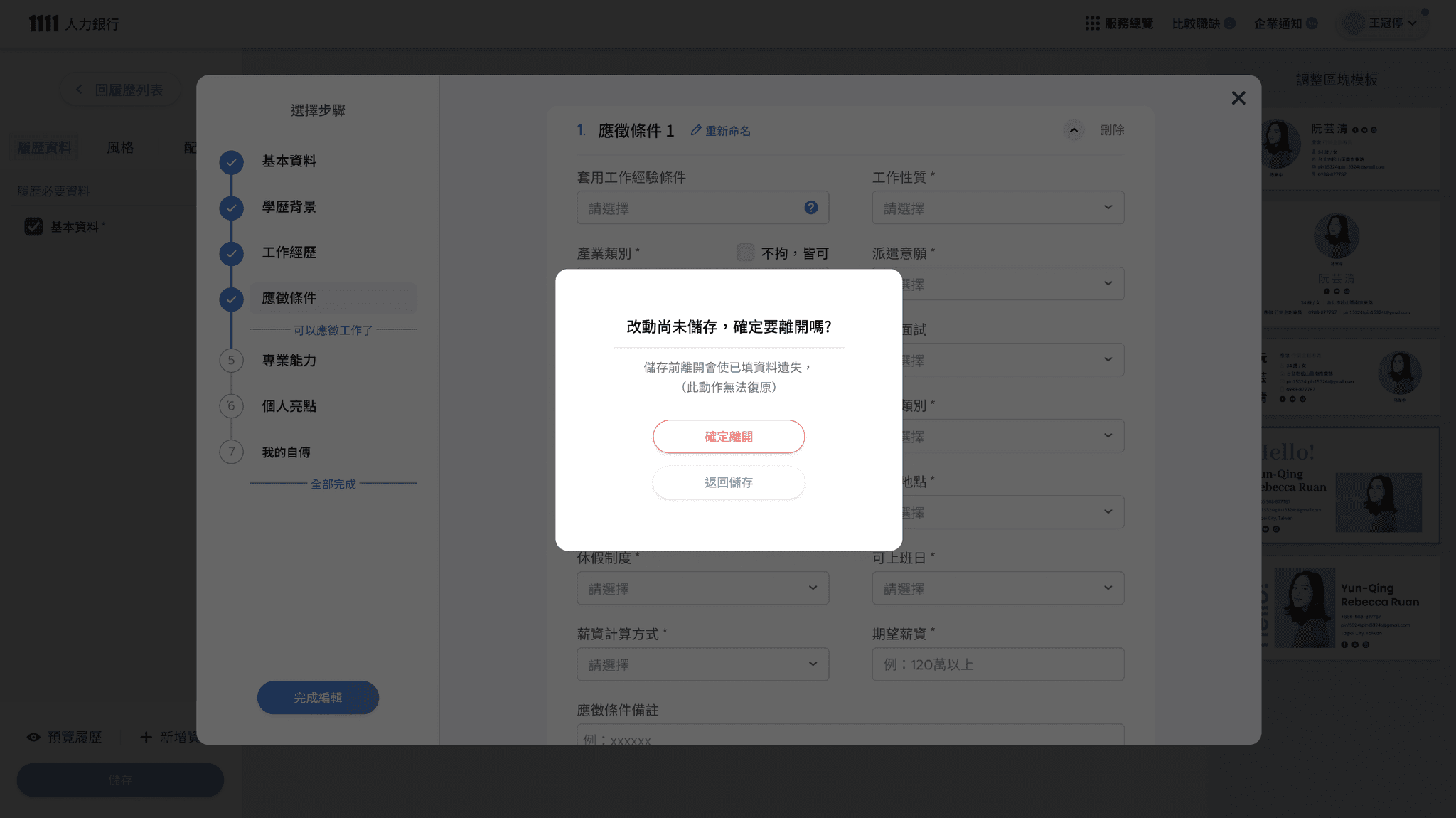
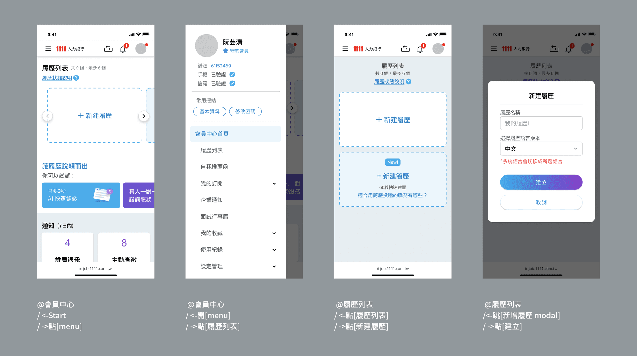
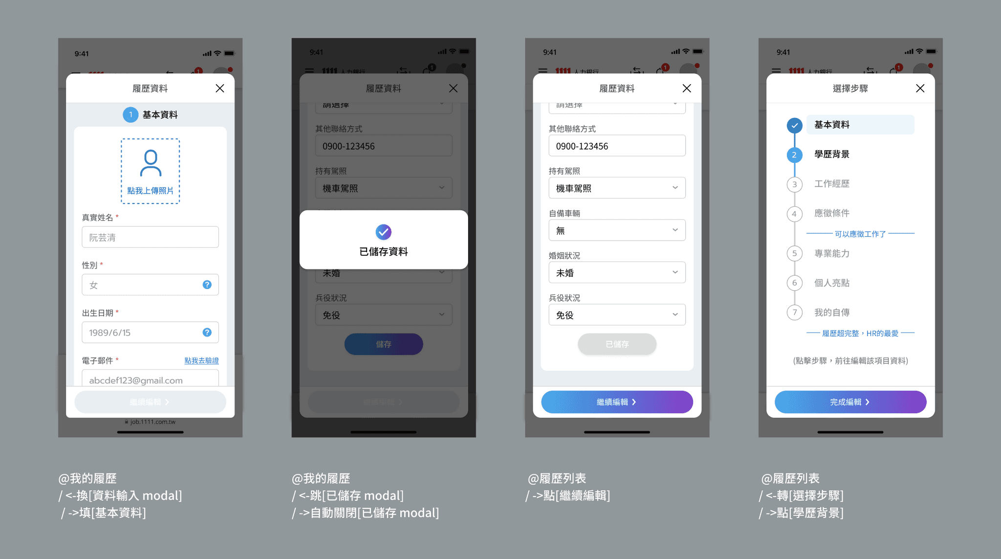
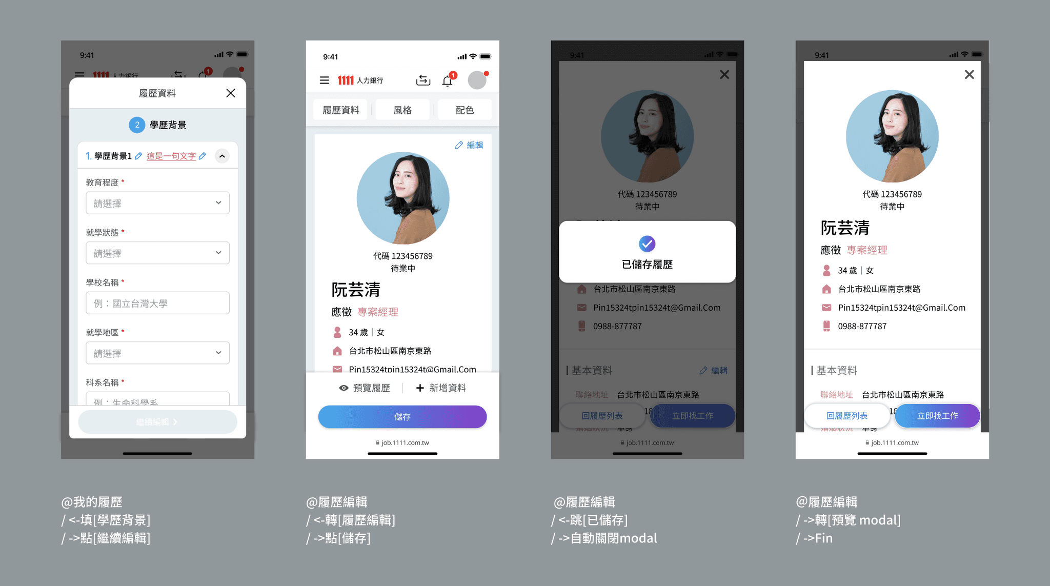
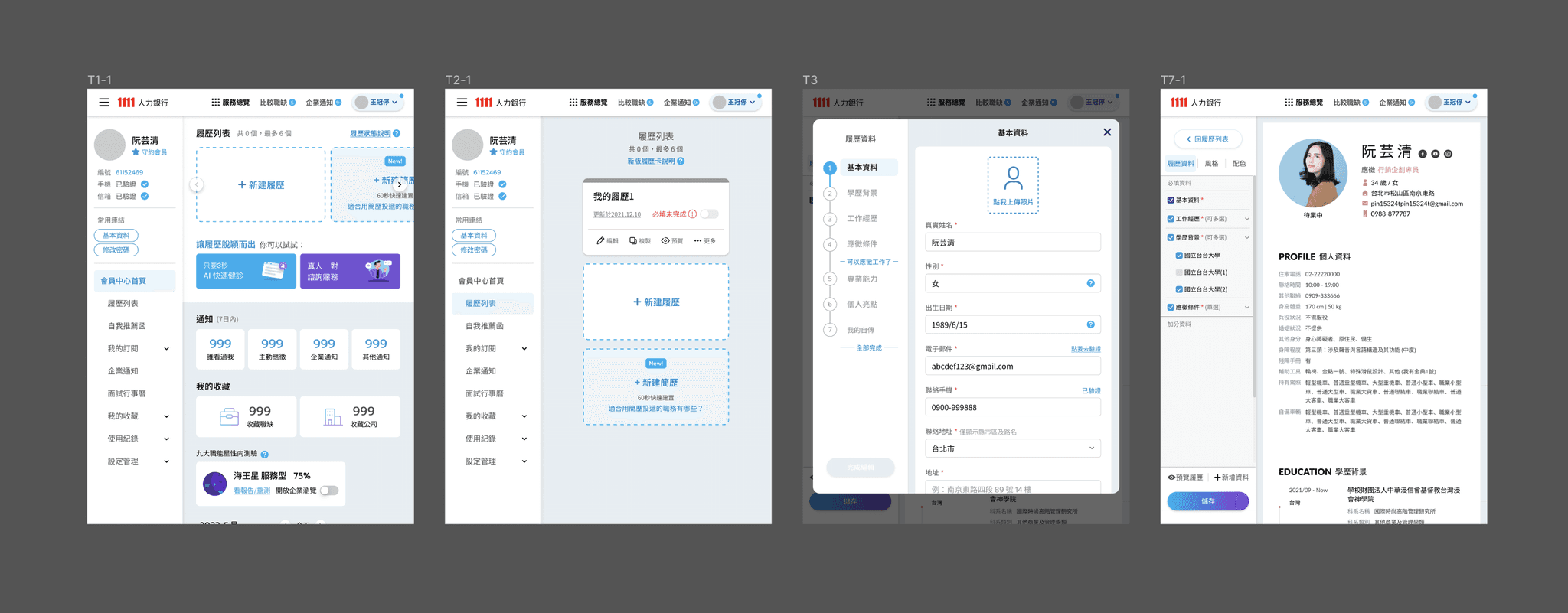
Intro of fill-in flow (v.3)
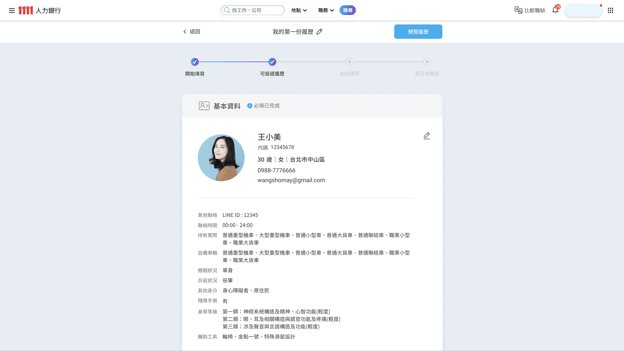
  • Start a new resume
    - Interact with user by modal in member center for convinence.

  • Resume Editor- Blank state
    - with the style of toggle list so that the user can easily see all categories of resume info.

  • Section- Basic Info- Editing
    As first and most important info category, clearly show the default, required and optional information.

  • Section- Basic Info- Finished
    After clicking save Btn, the section turns into a preview state for result viewing.

  • Divider with the status inform
    Let the user know that the filling is completed for now, and they can continue to complete or start apply.

  • Danger action-
    the reconfirm modal popup to prevent the misclicking of deleted info.

  • Clear feedback-
    Give the user certainty and a sense of accomplishment.

  • Preview the Resume
    Users can view how the resume will look when printed, and can share, download and print it.

Background

As the most important service on a job search website, resume-editing optimization is the main task of our team. As the main projects, resume revision in April were already in progress before I joined.
After I joined, I immediately started discussing the process experience and making prototypes.

Challenge

However, due to years of accumulated habits and technical problems, it is necessary to constantly find a compromise between innovative solutions, no changes, and restrictions.
The main difficulty is that I need to understand a very large amounts of different filling mechanisms and data modes and limitations while doing it at full speed.

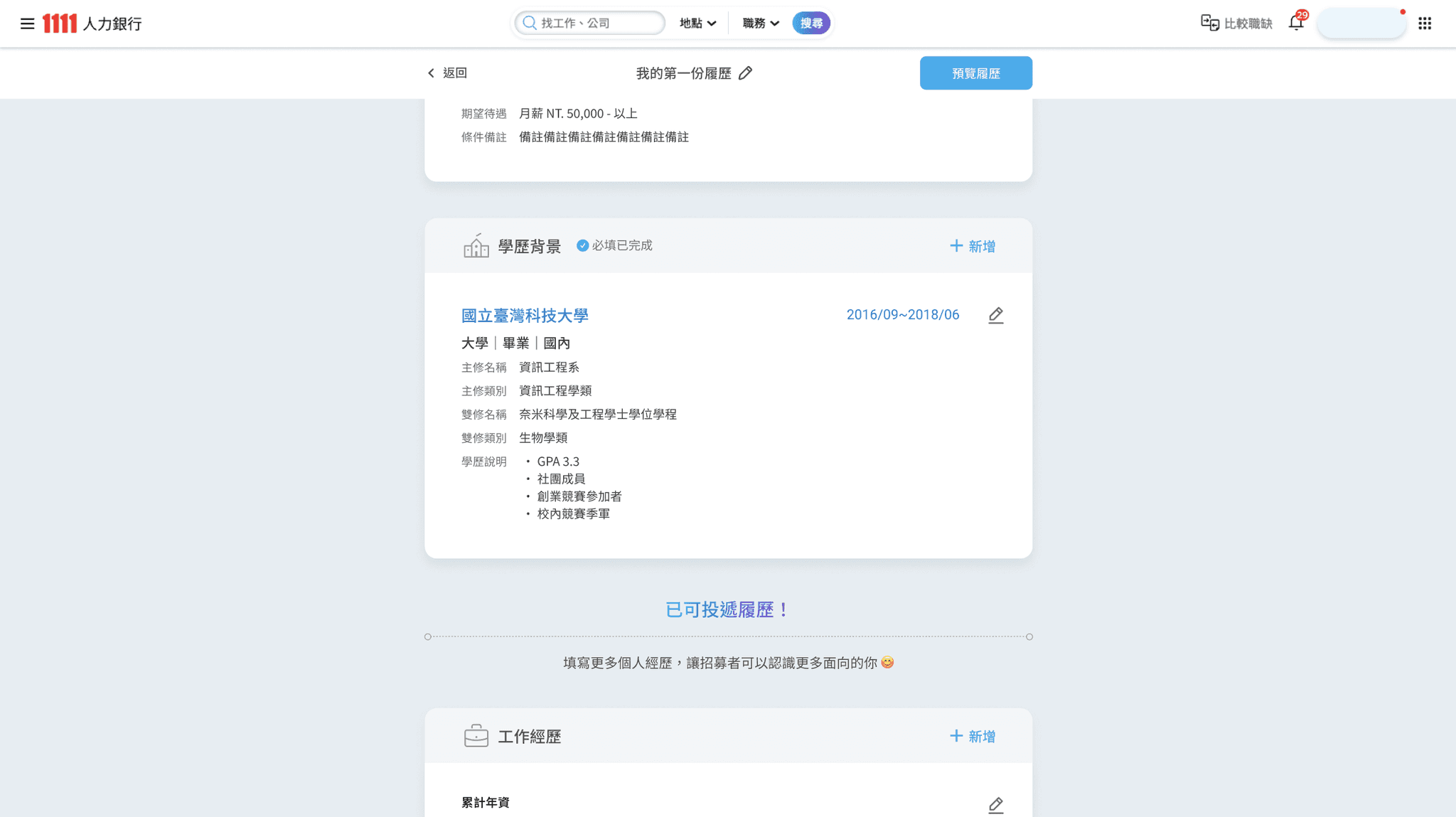
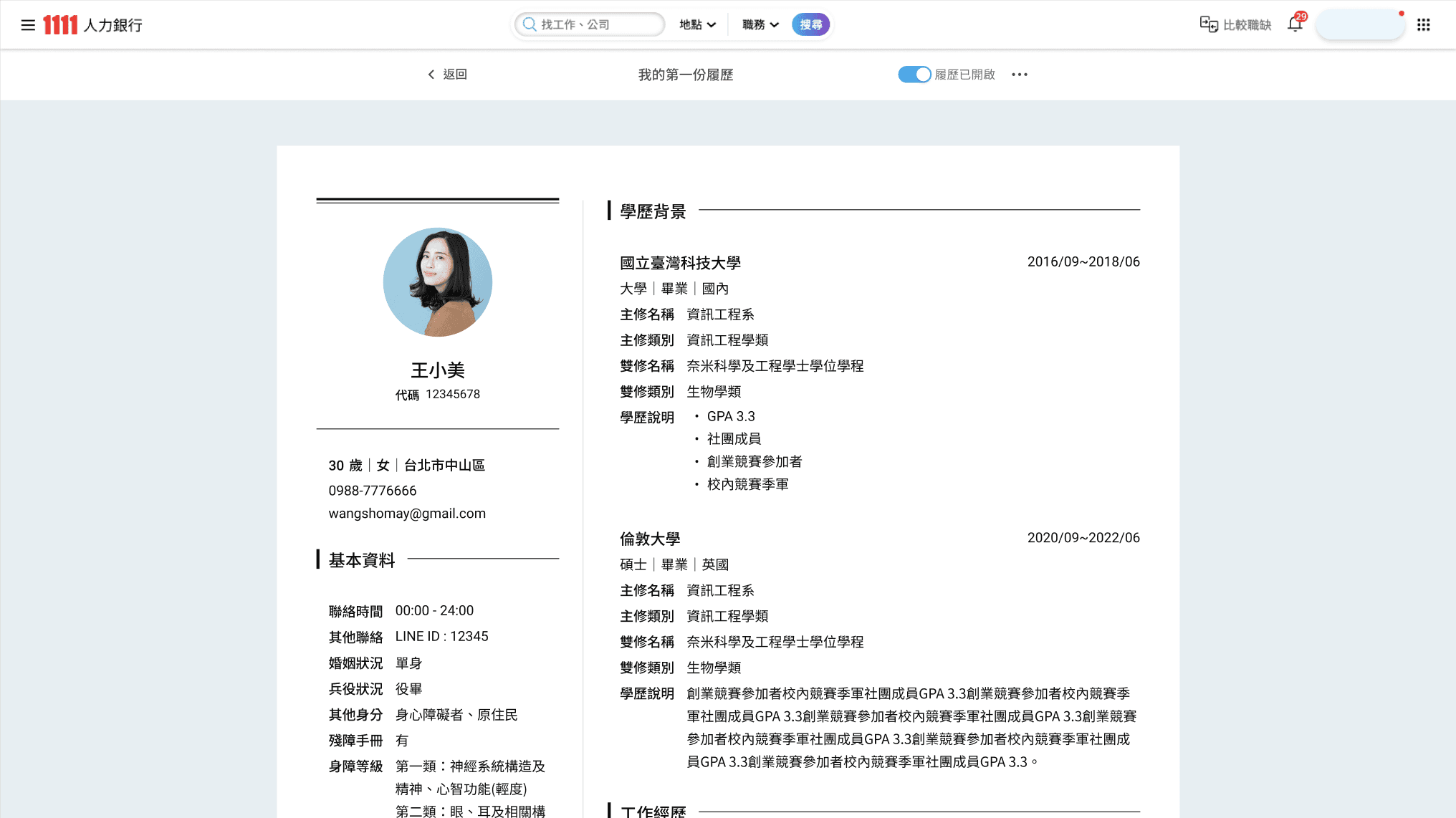
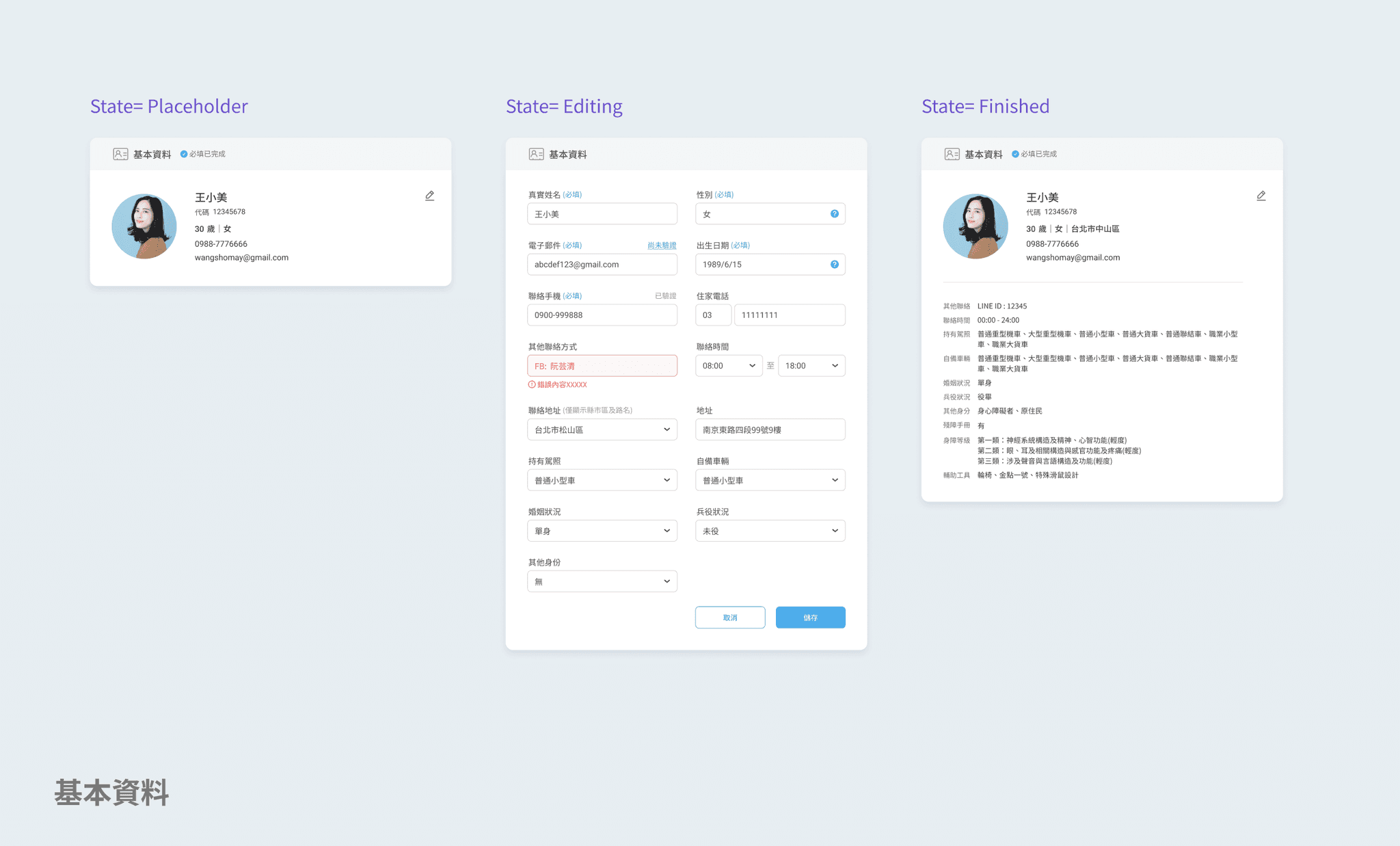
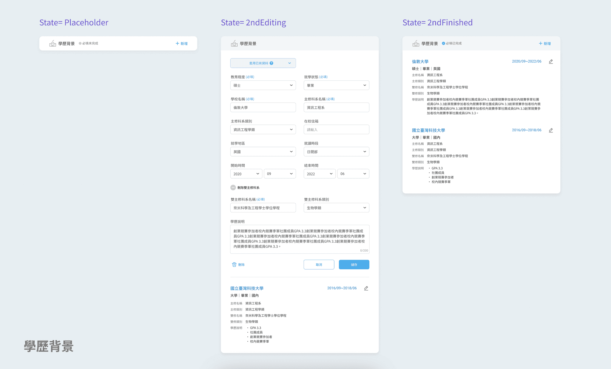
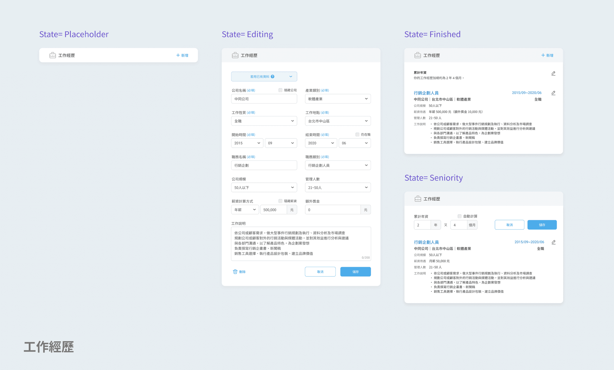
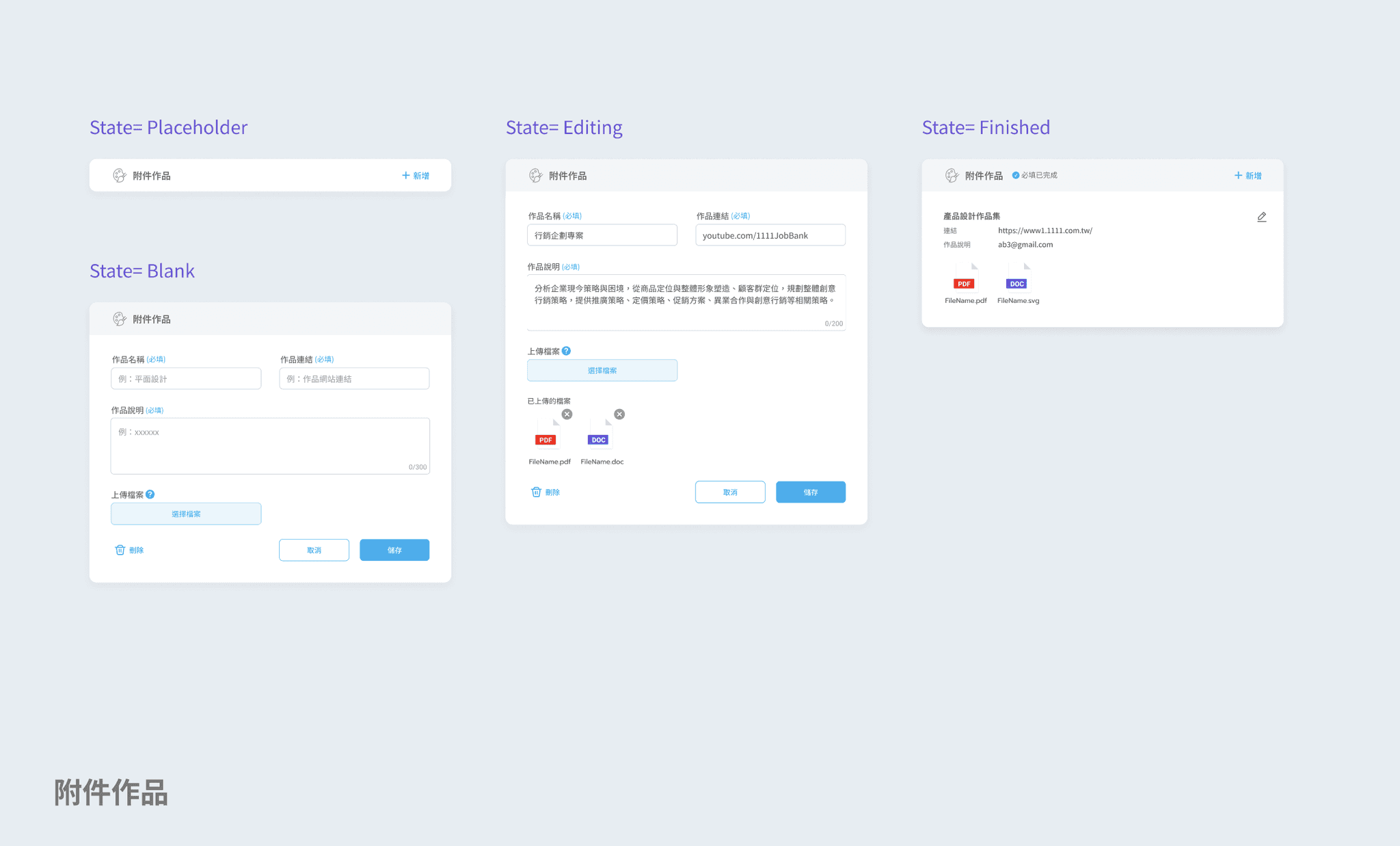
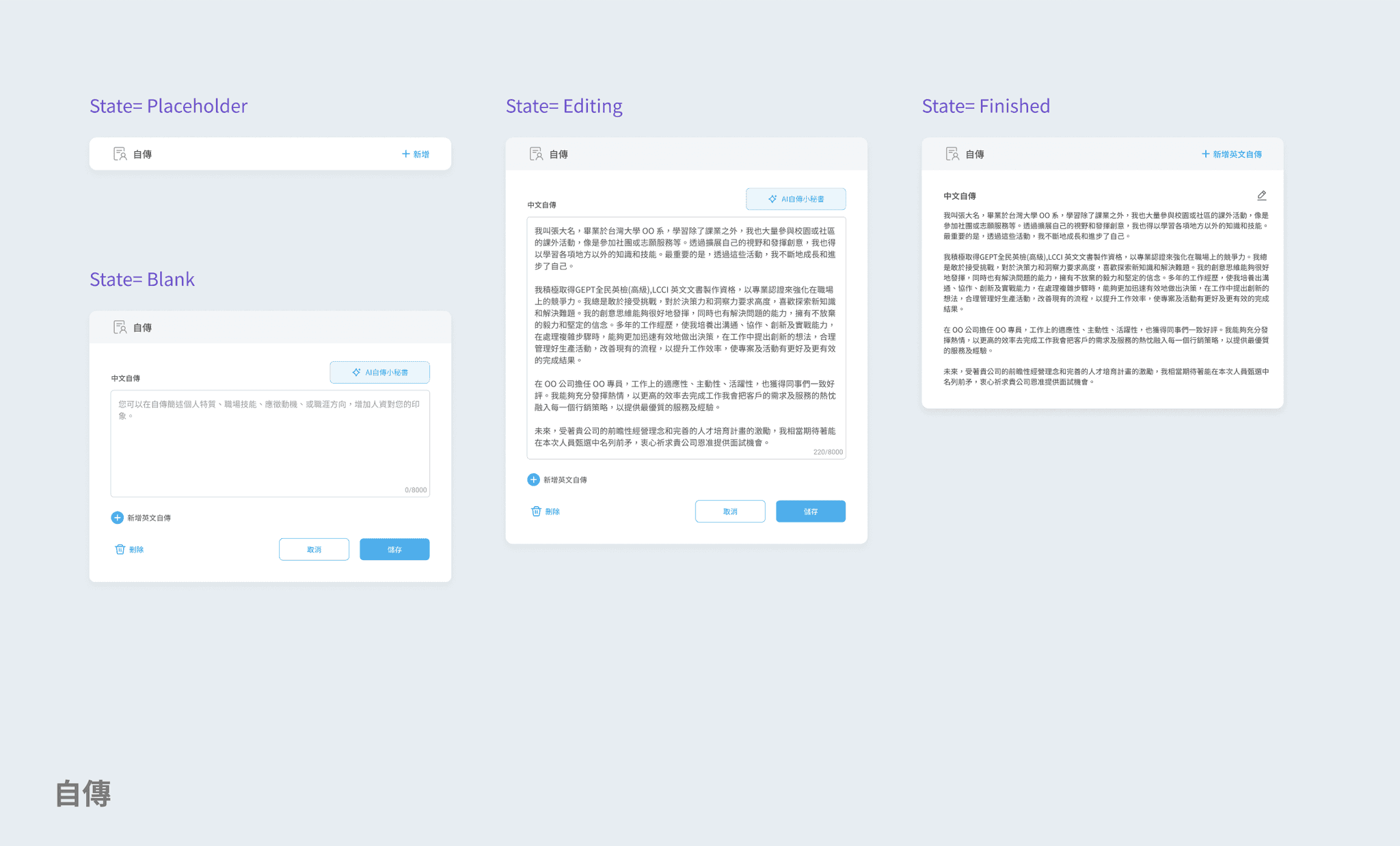
Intro of fill-in sections & properties (v.3)

Problem

The original redesigned resume completed by the outsourcing team, but internal engineering and PM discovered so many problems so that it was necessary to lock down the development, prioritize the problems, and solve them one by one. At the same time, we discussed how to find the shortest path to catch up the launch DDL.

After the fail of launched of the original reversion in April (I don’t know the reason), Ver.2 & 3 redesign start immediately, the main purpose is to link the originally redesign back to the old version of the website, and continue to optimize the resume editing experience during it.

Goal

For Ver.1, we optimized the editing flow mainly by visualizing the steps and status clearly to let user know exactly where they are and what is next.

For Ver.2, we were promoting the service of "Editing CV first for quick apply, then continue to finish the whole resume", focusing on simplifying and minimizing the steps and fill-in forms.

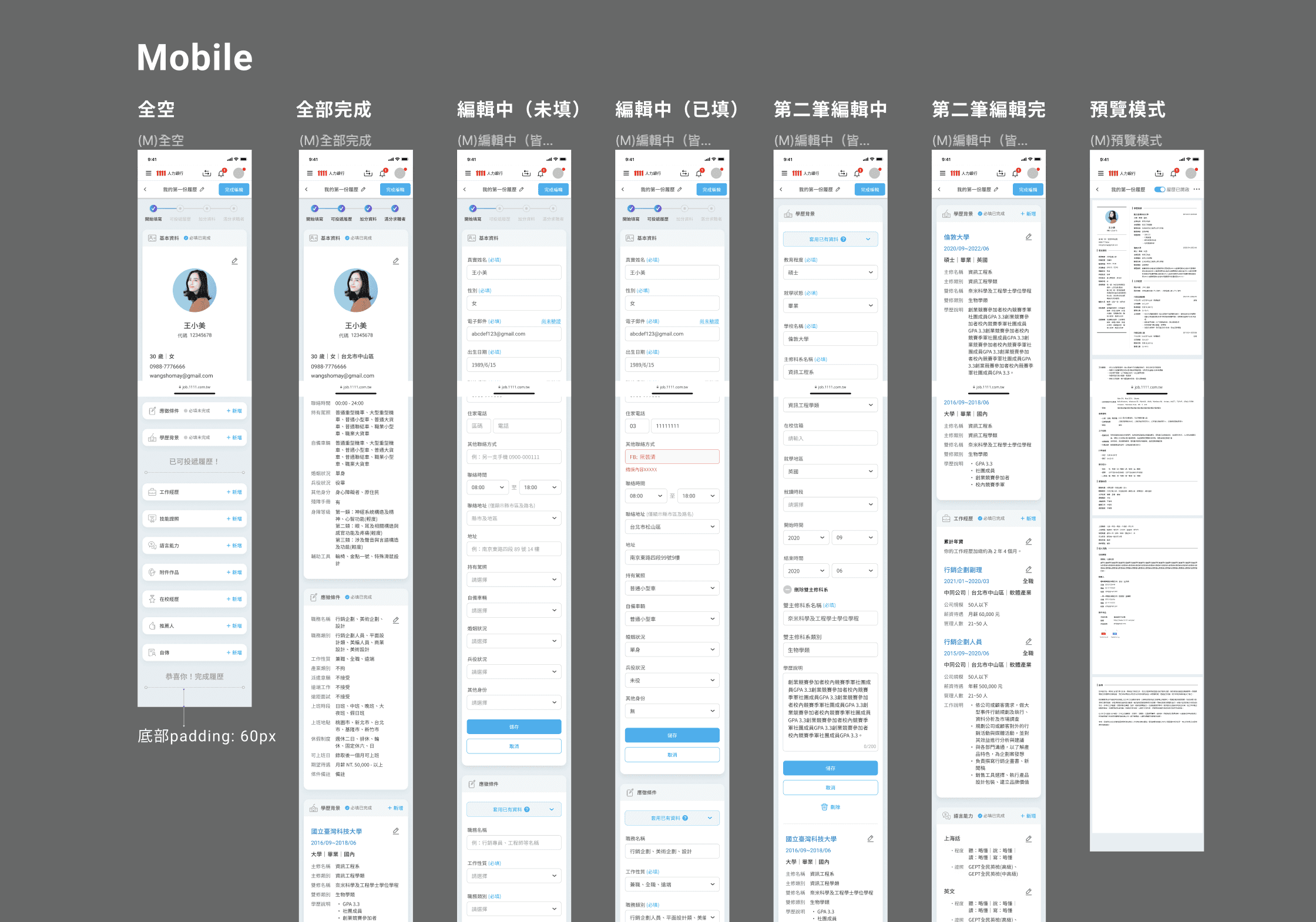
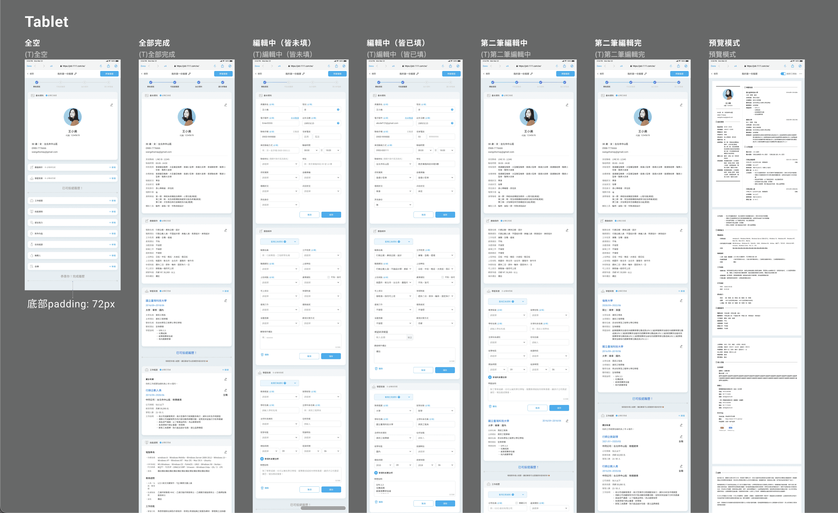
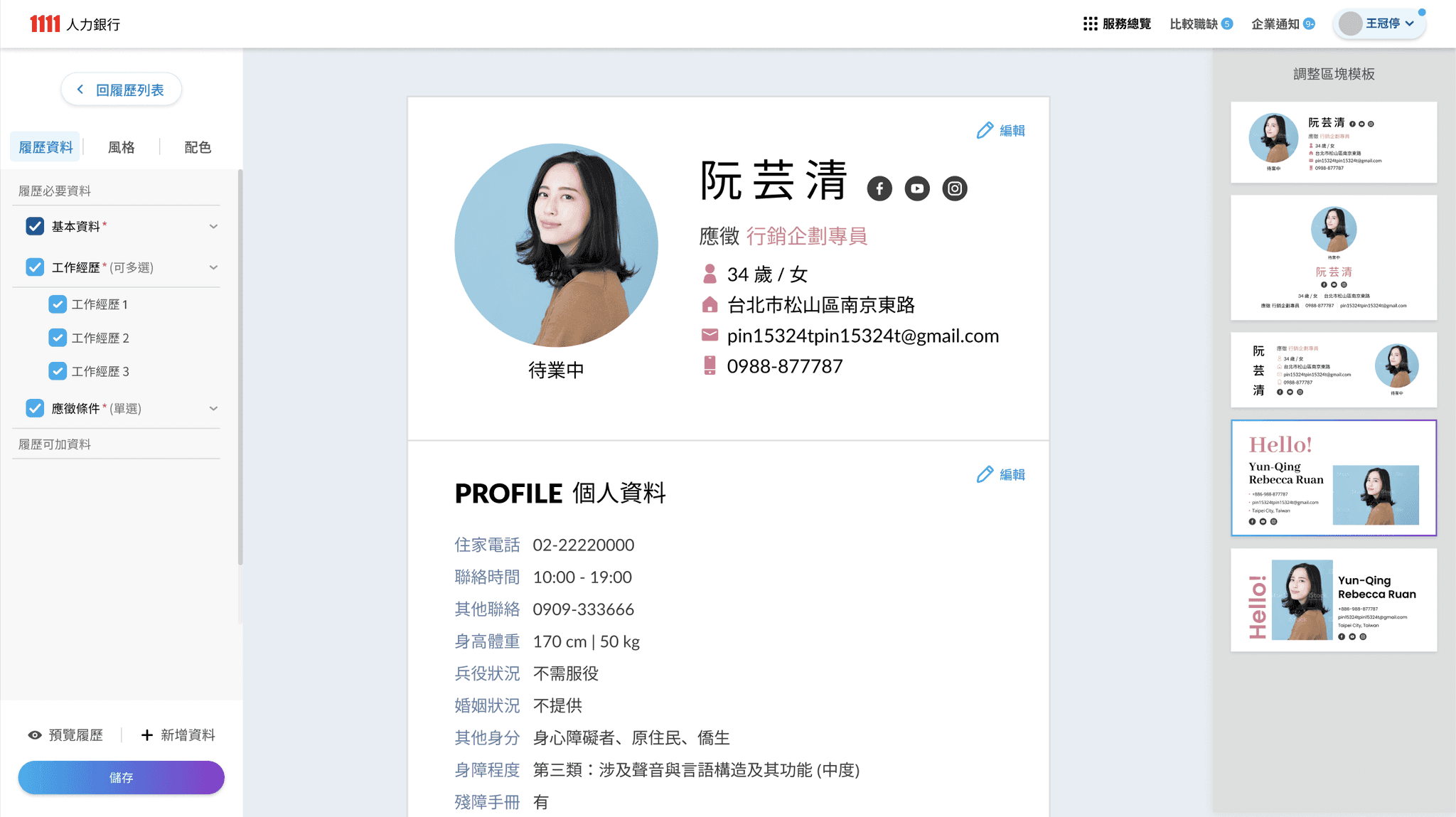
For Ver.3, aiming to modularly display categories of forms at once and hierarchically, let user can quickly switch between preview and filling mode to help improve efficiency and reduce uncertainty.
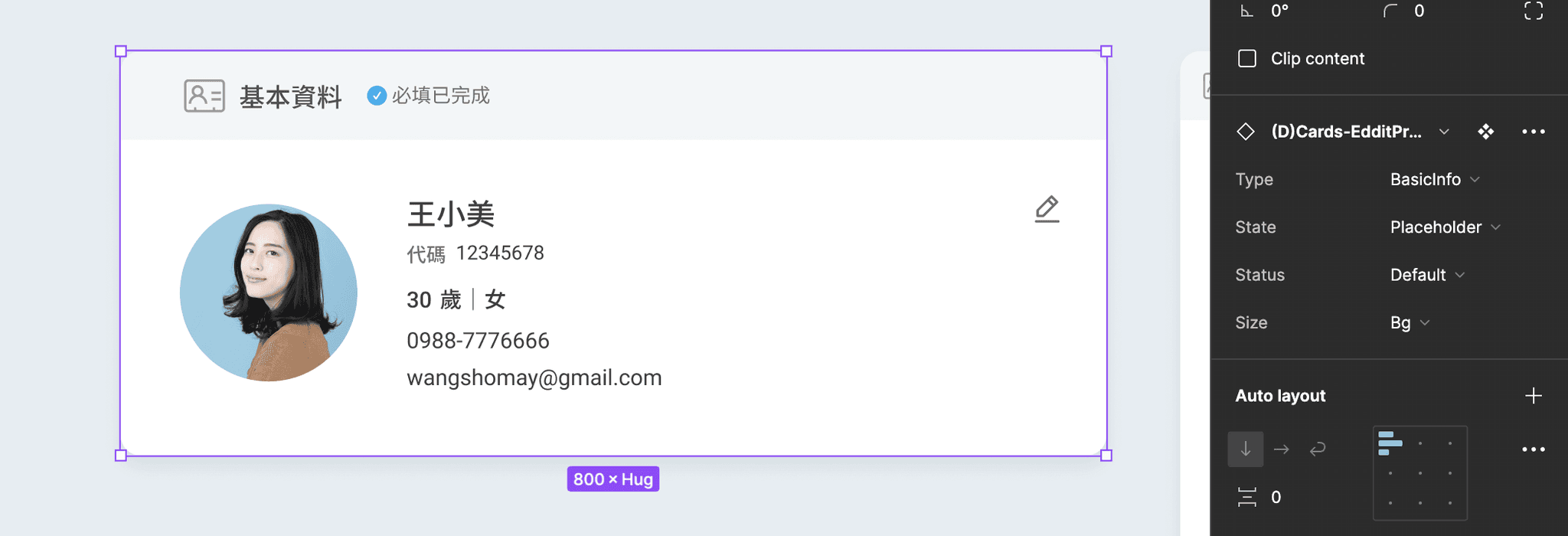
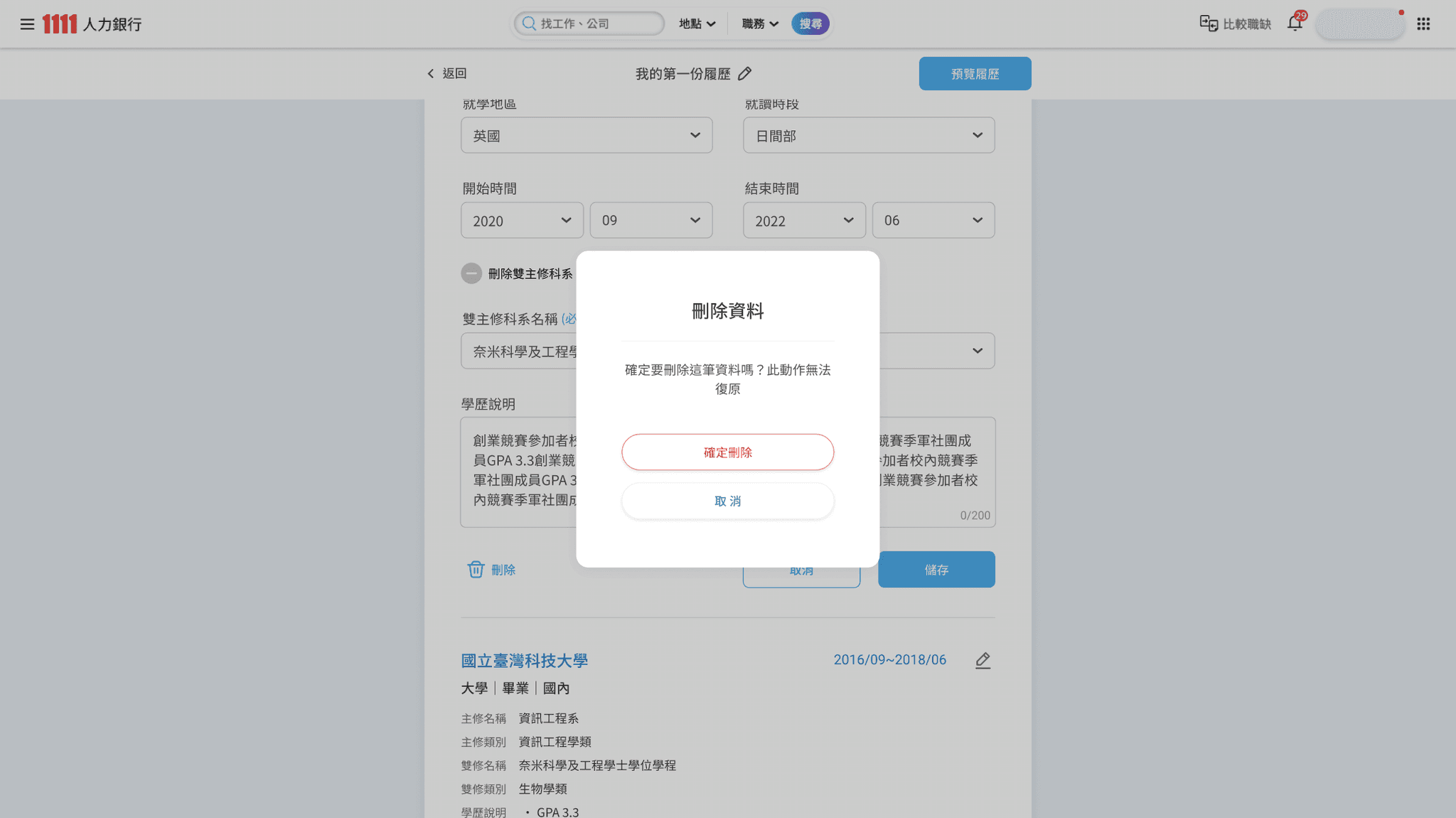
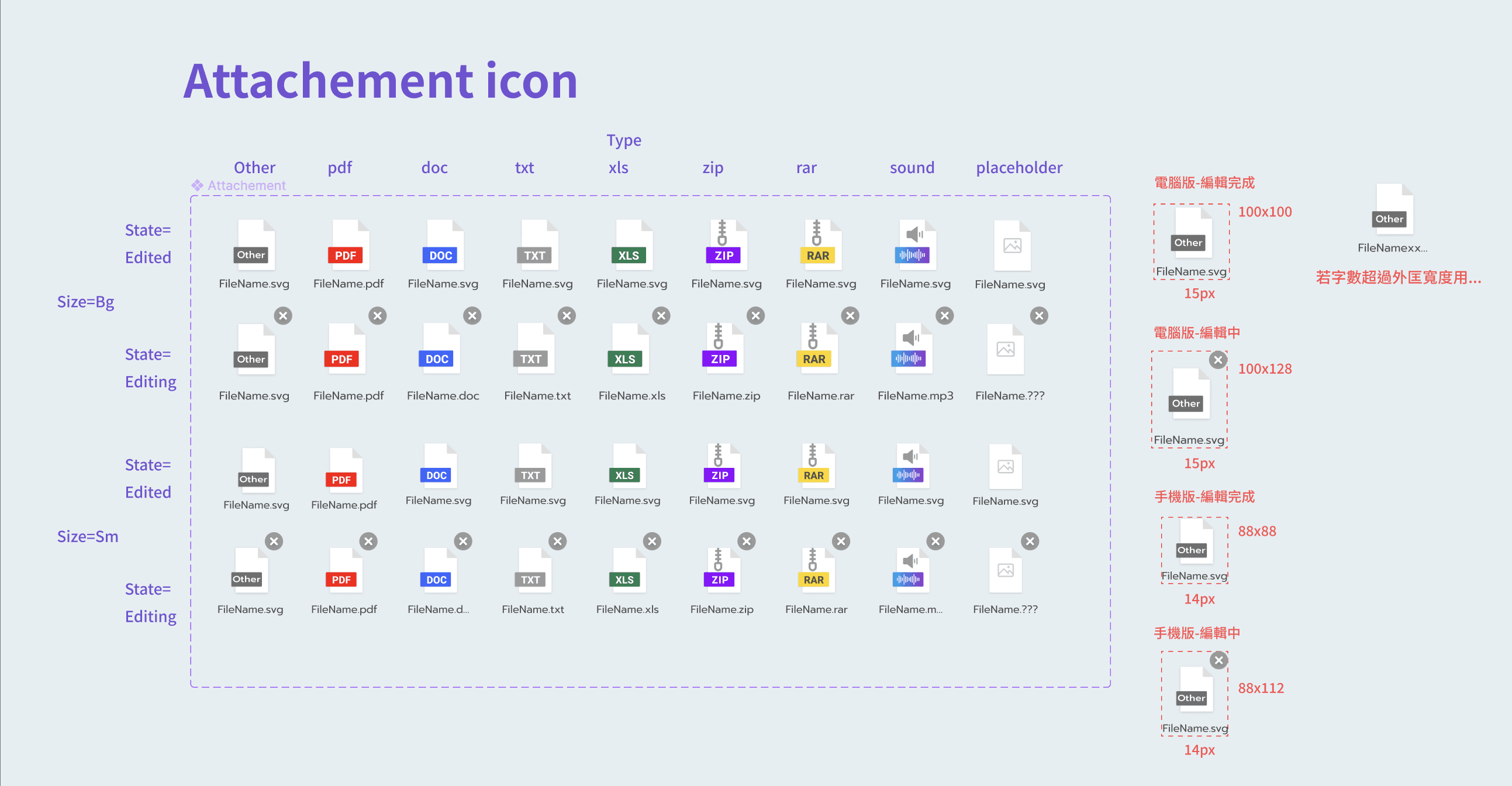
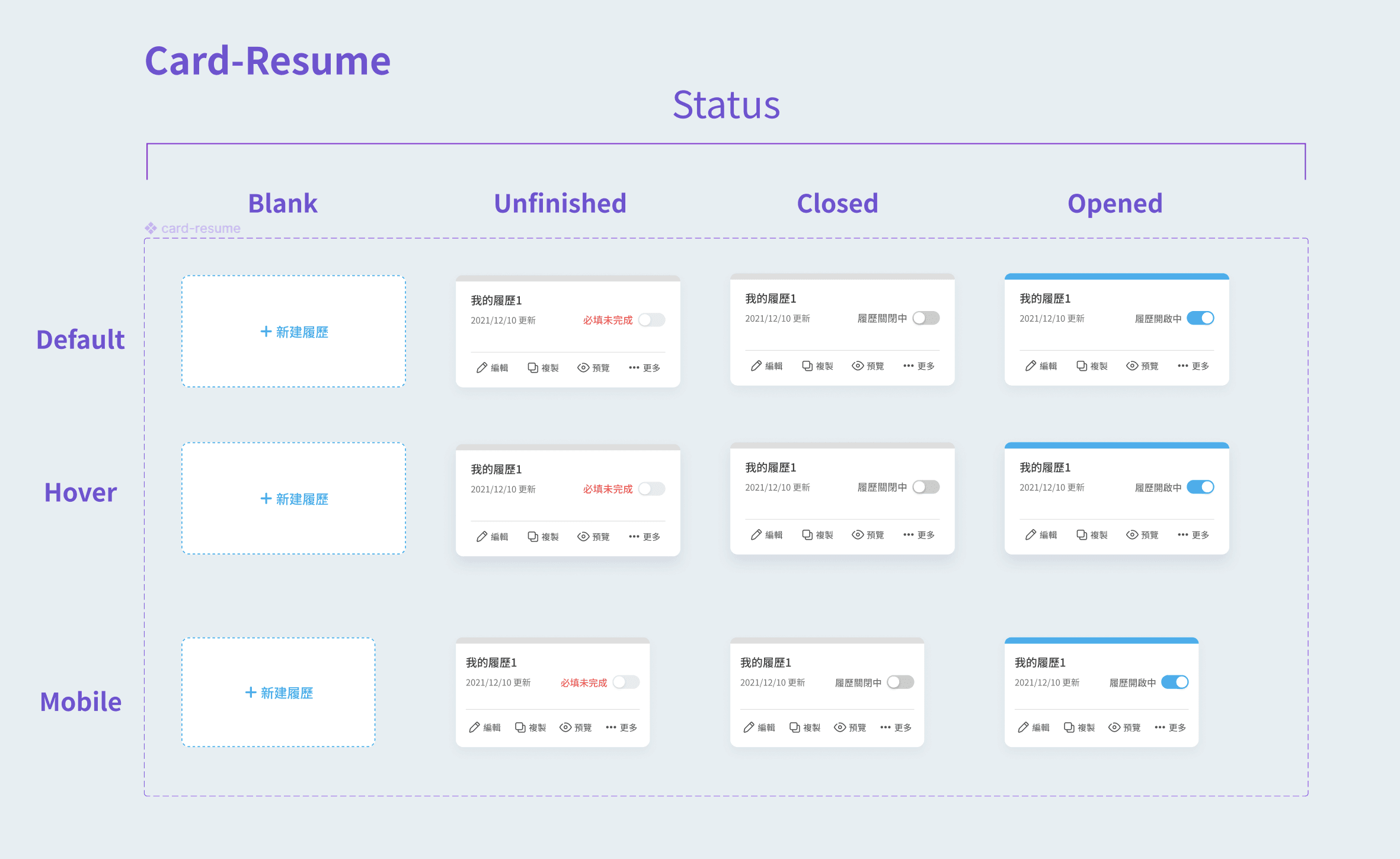
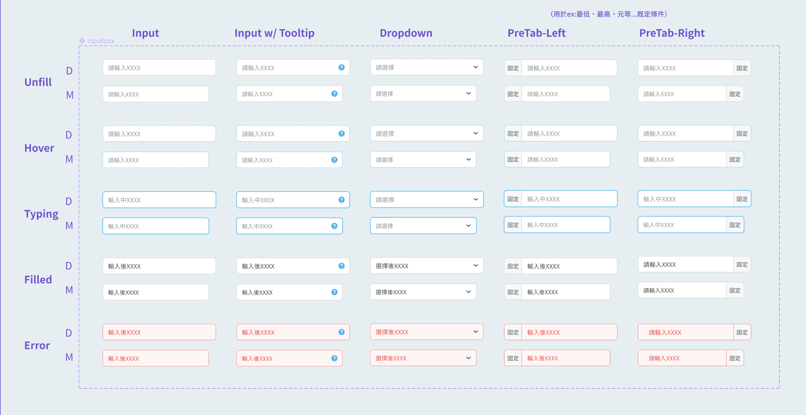
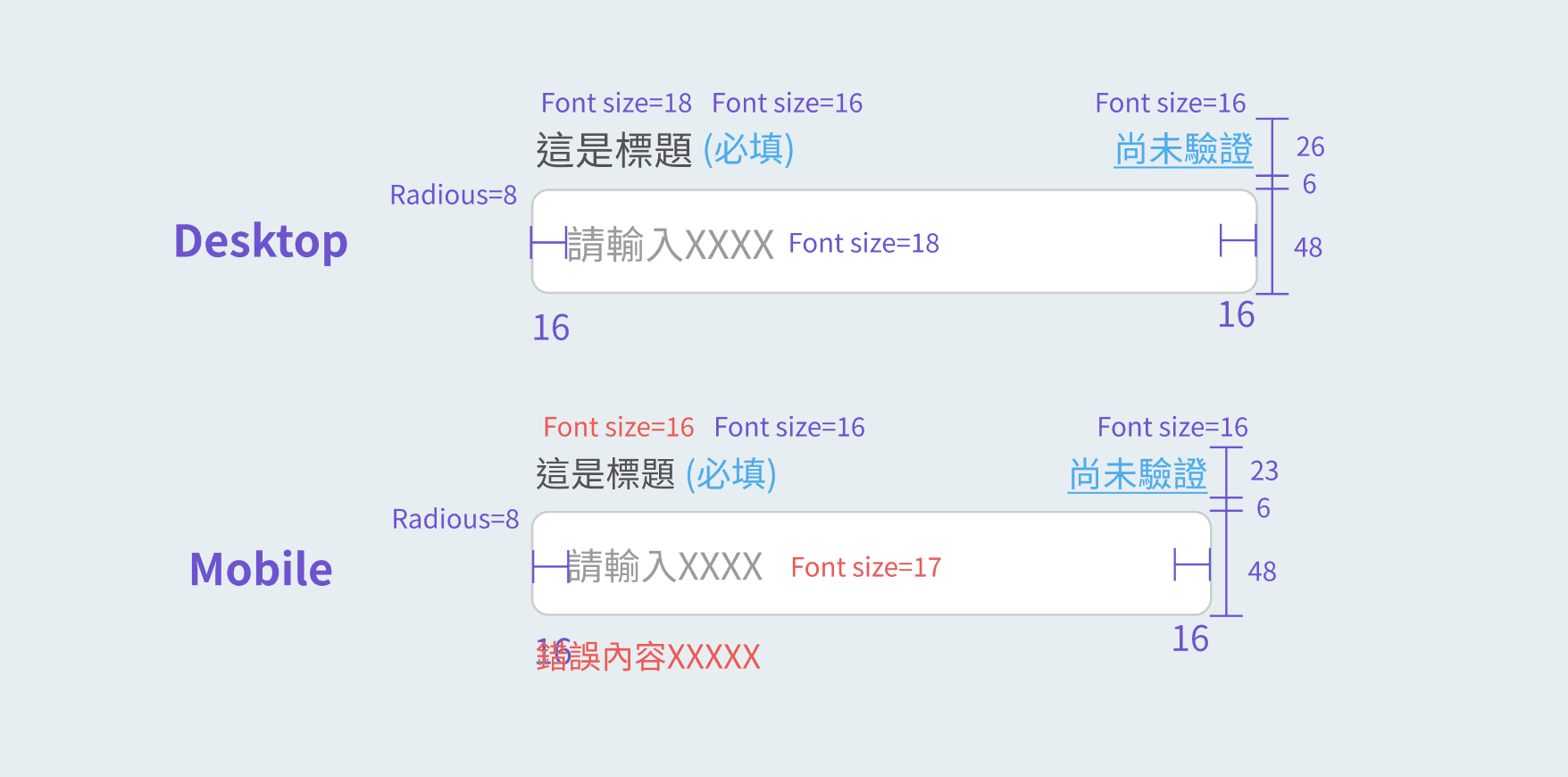
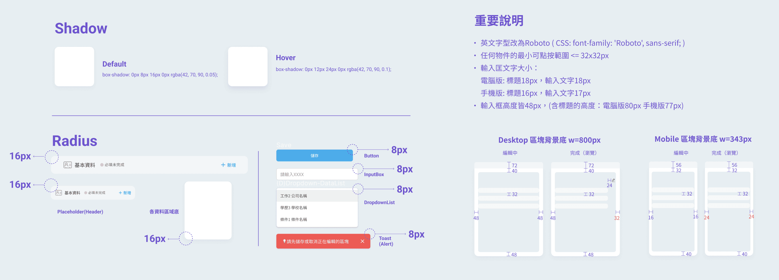
Variables setting

for Type, State, Status and Size

When there are many types and states of interaction, using Figma's variable function to set the properties is necessary.
The image below is the whole picture of all properties of info fill-in forms.

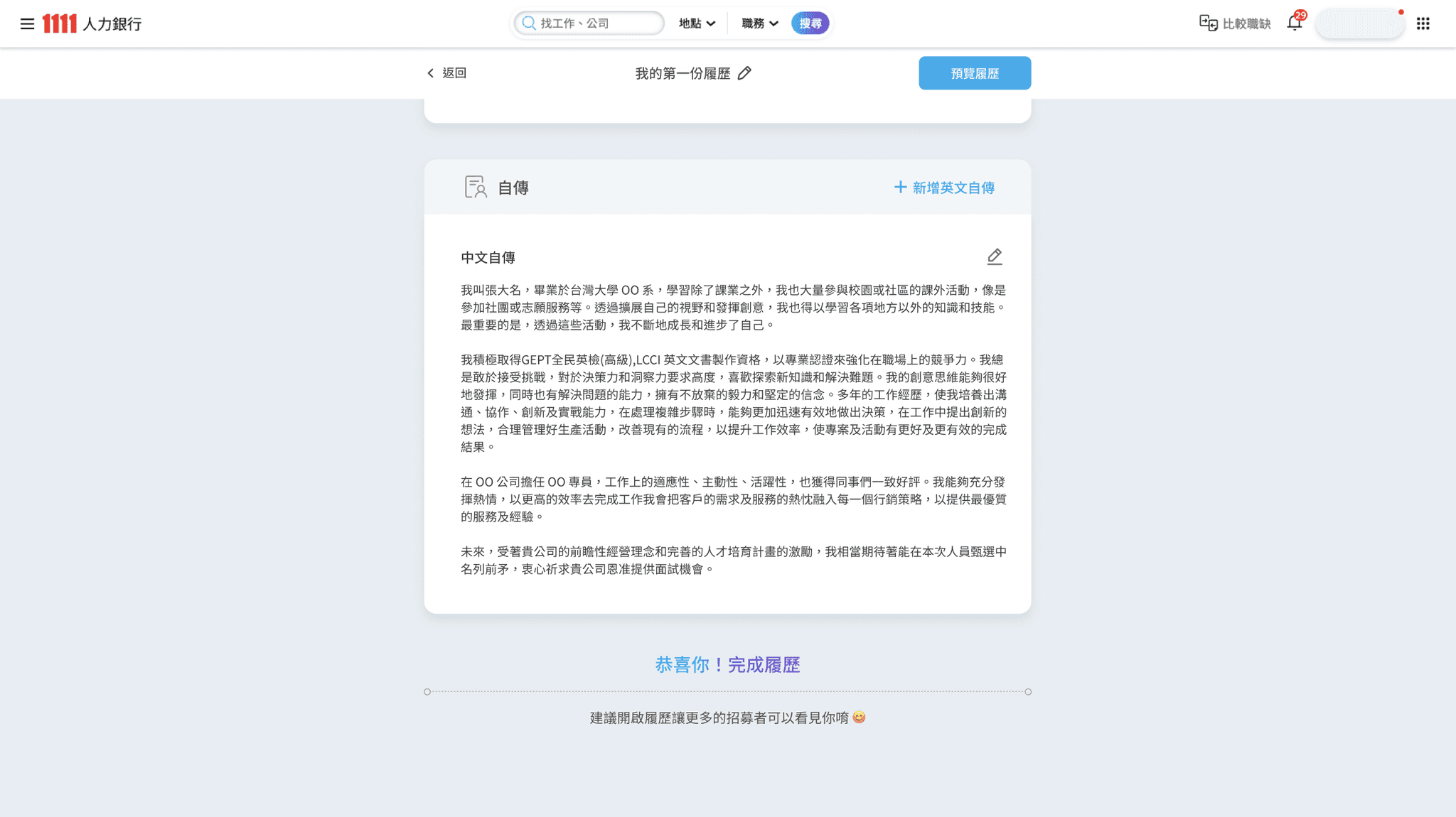
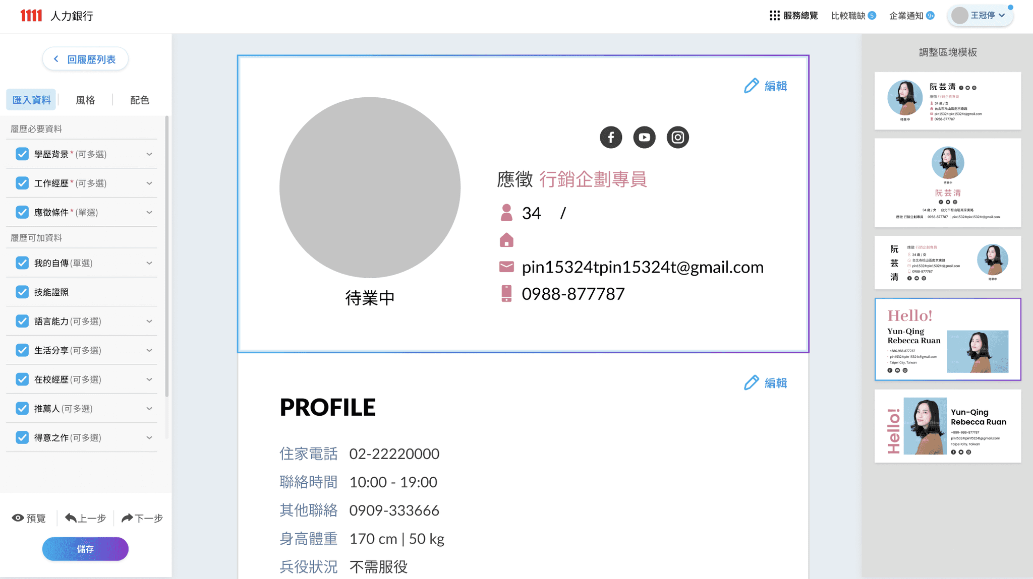
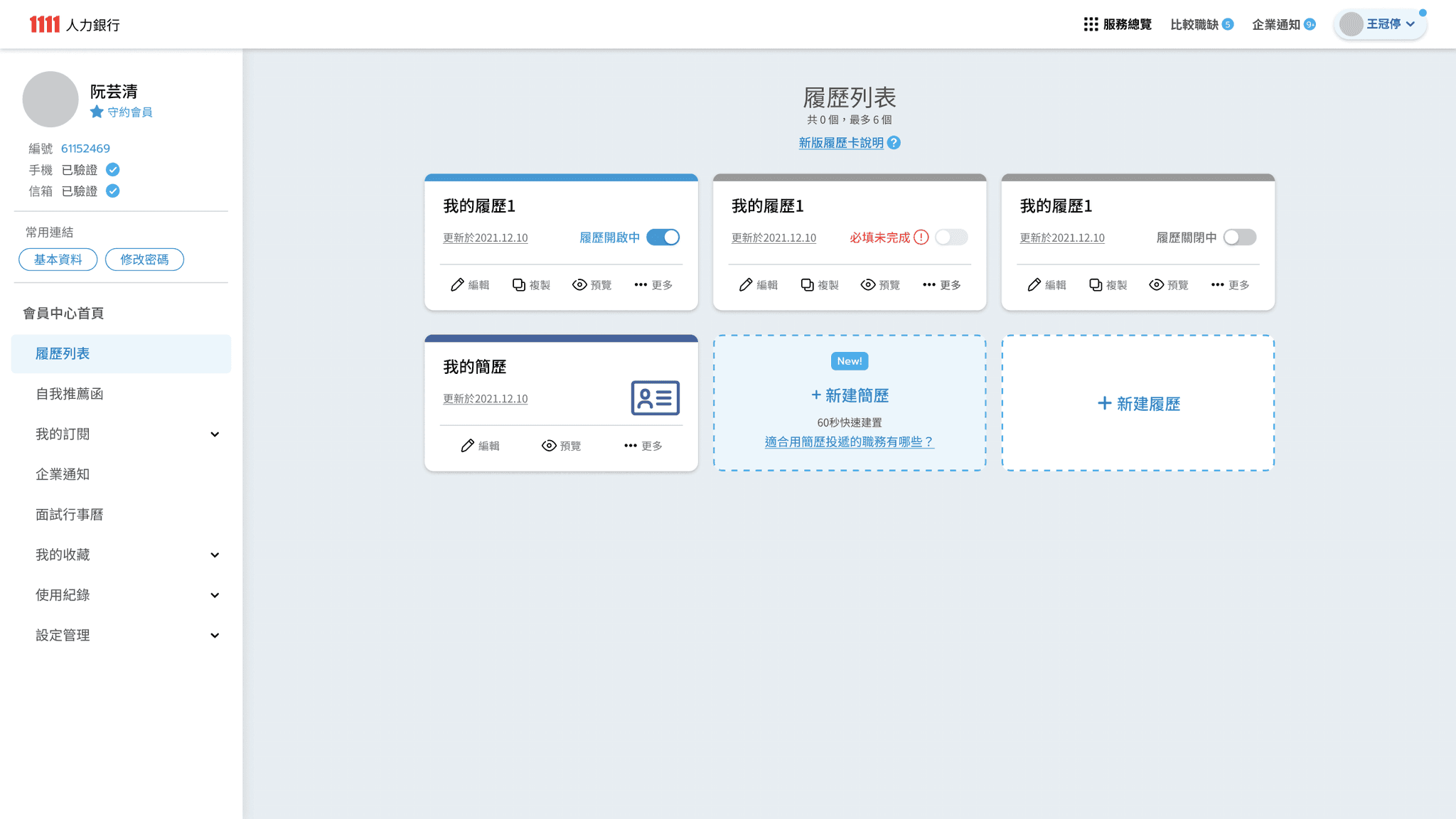
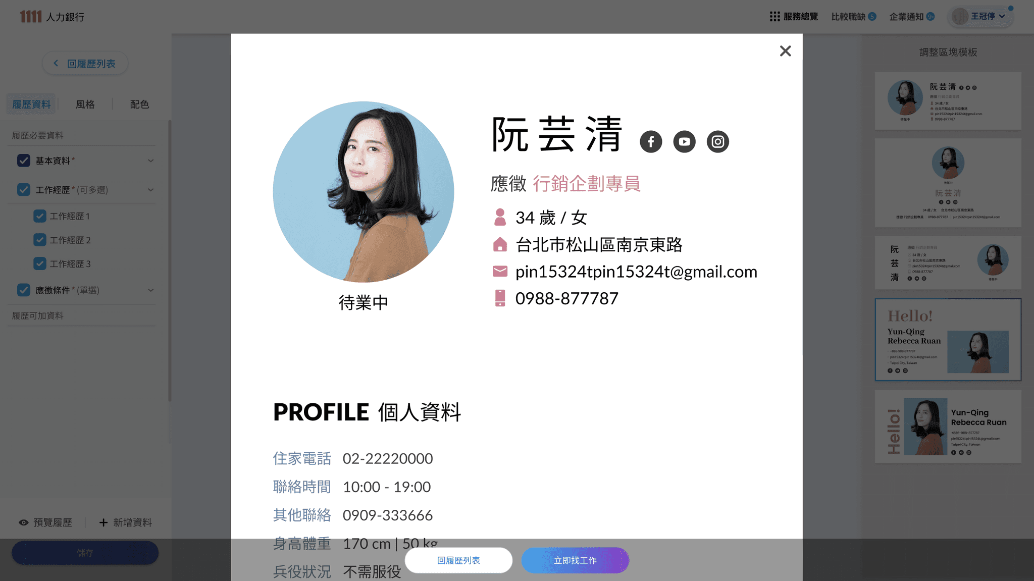
CV editor- Official released & Handoff

Cause the CV editor release after I leave, there are several differences.

Cause the CV editor release after I leave, there are several differences.

The images above is the online version, and the images below is the ver.2 Handoff.
(the redesign of CV editor was based on modal for easily switching.)

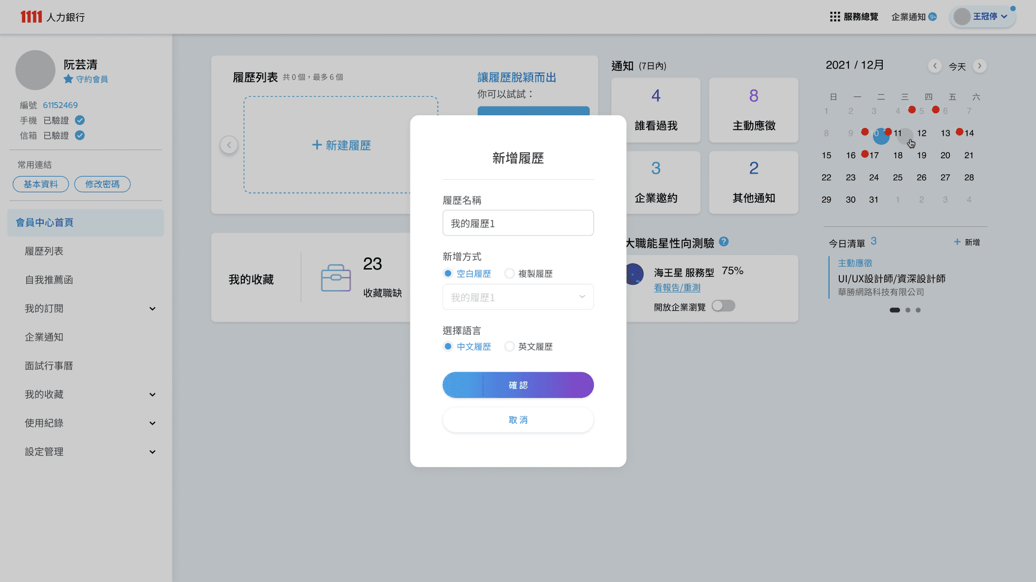
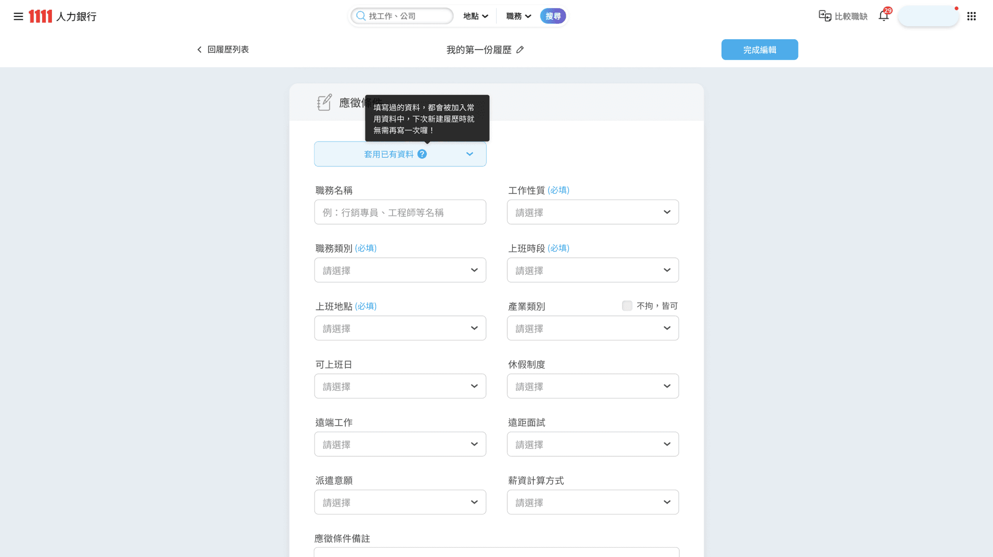
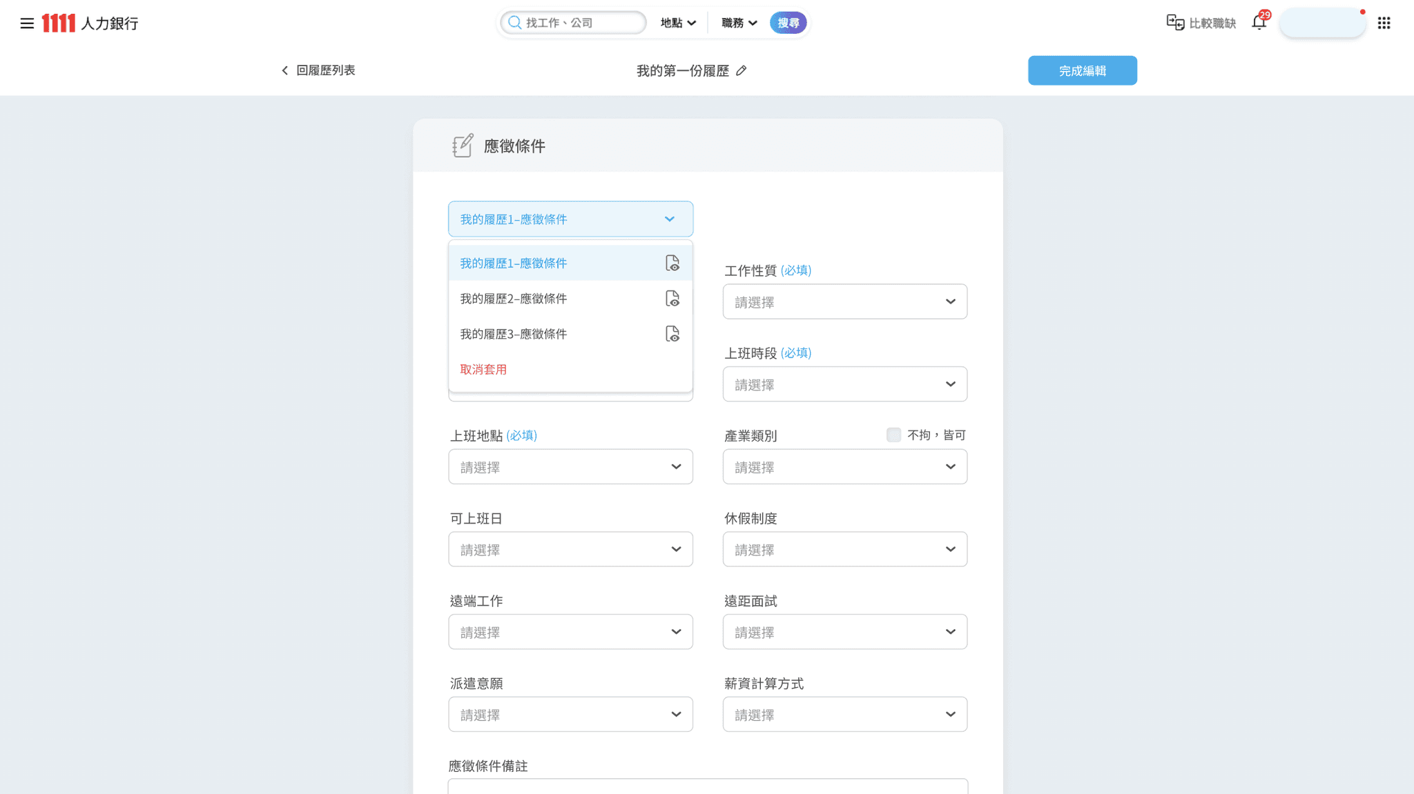
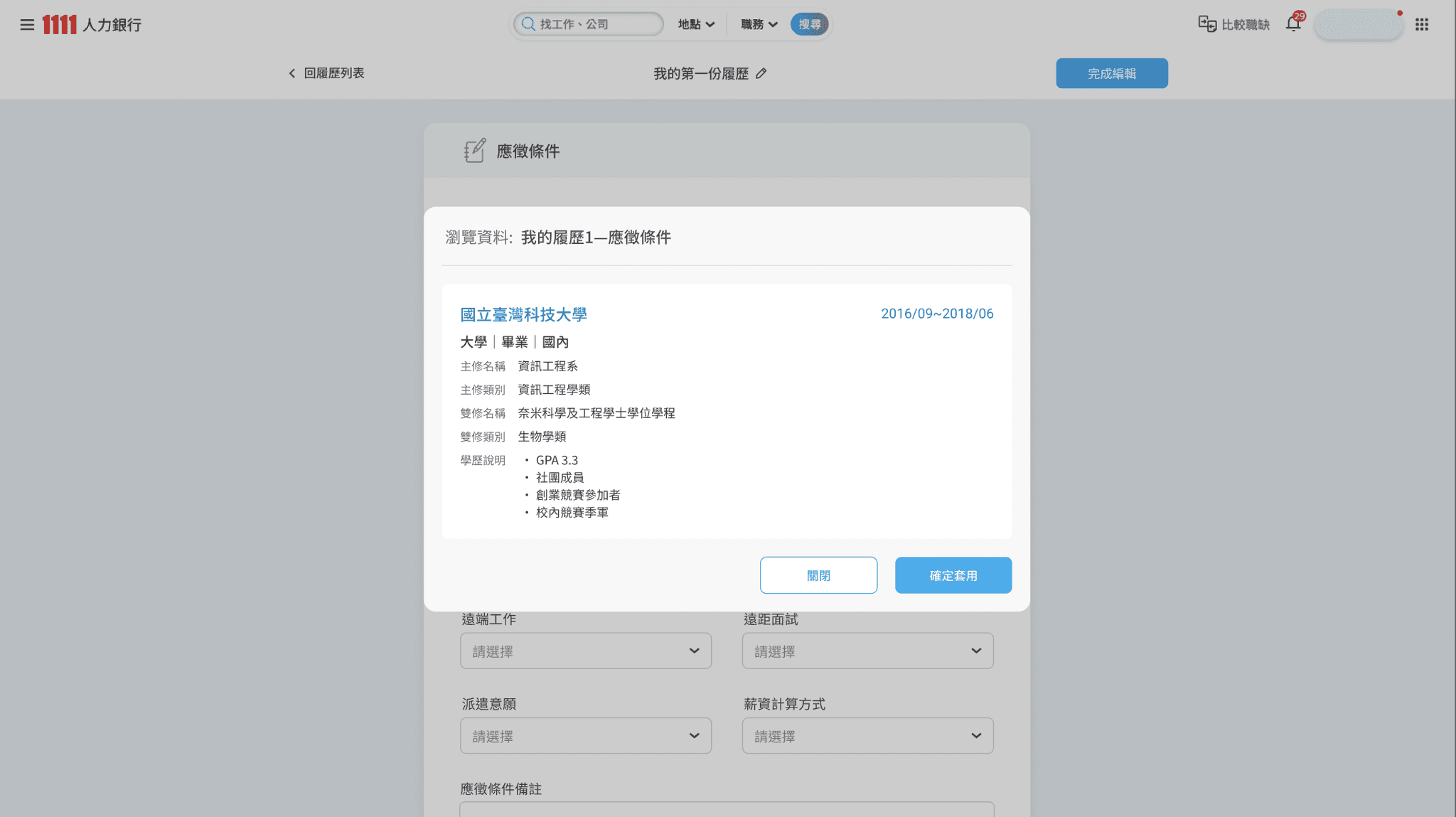
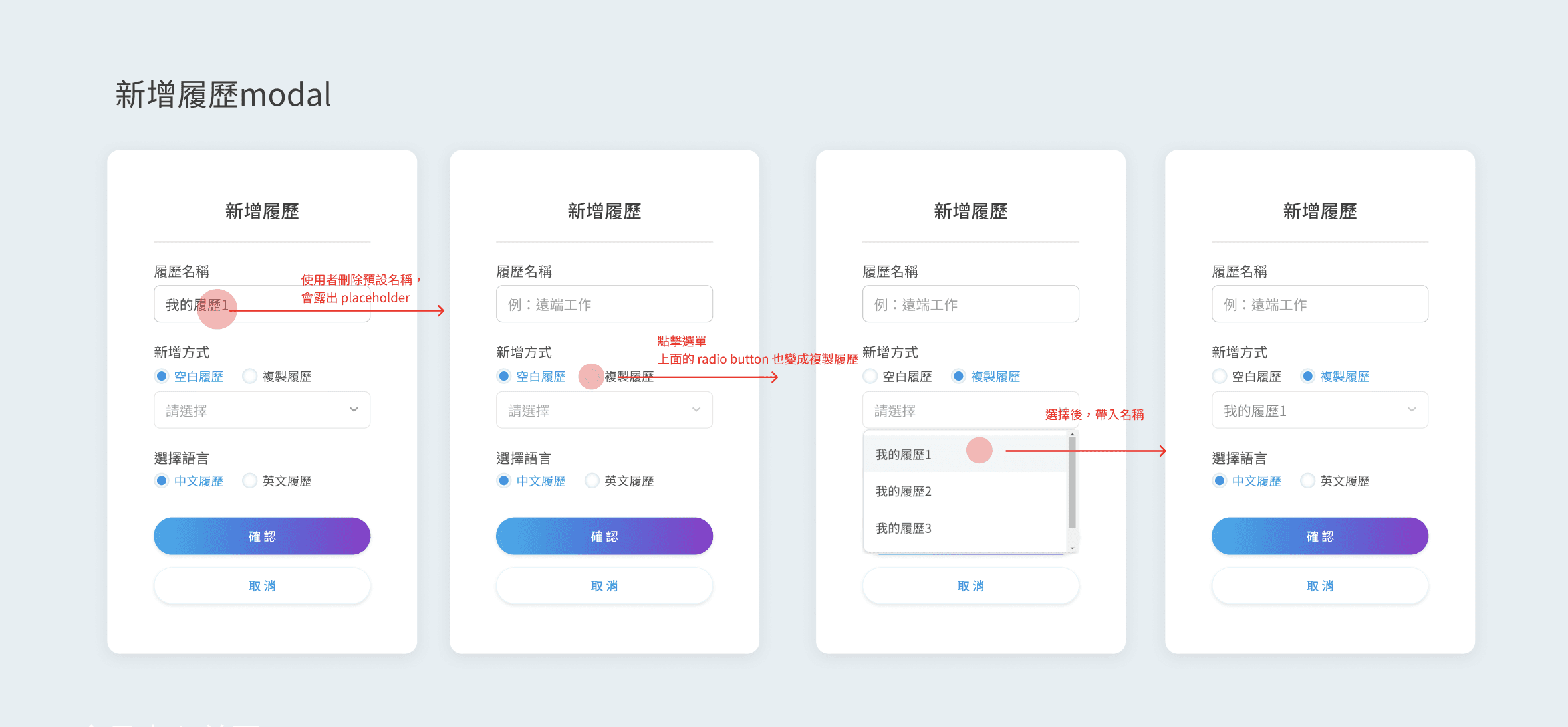
New feature: Apply previously filled data
Intro of component annotations
  • Icons of uploaded file-

    Carefully adjust the position and distance between elements to achieve the clearest and most concise recognizable icon.

  • StepBar

    The current step and remaining steps are displayed at the top of the screen,
    as well as whether the resume can be applied, giving the user a sense of certainty.

  • Card- Resume

    Display the resume editing status with eye-catching text and color hints,
    and use switch to adjust the public status.

  • Iteration of Card-Resume

    The resume card has gone through many iterations, focusing on clearing the editing status and put secondary functions into "more" (expanding the Dropdown List) to avoid cluttering the surface.

  • States of Input form

    Design corresponding Input form styles for diverse and rich fill-in conditions to clearly distinguish different criteria visually, making identification and interaction more intuitive.

  • Clear annotation of Input UI

    Mark the size, padding, and gap of each component in detail
    to reduce the difference between front-end development results and design Handoff.

  • Clear annotation of overall style

    Setting the guidelines that can affect overall visual,
    e.g. shadow, radius with hierarchy, minimum clickable area, font size and padding.

  • Display UI mockup with interact flow

    e.g. Present and annotate the flow of creating new resume

  • Made a complete inventory of all filling mechanisms of the old version

    that everyone can comprehensively review and redesign them (spontaneously)

  • Quickly come up with the wireframe of the sections resume for discussion.

    Avoid spending time on UI adjustments and intensively discuss the resume editing mechanism and interaction first.

  • While making the computer version UI mockup, sqeeze time to produce the main interactive process of the mobile version for SA to check the feasibility.

  • Mobile version of resume editor

  • Tablet version of resume editor

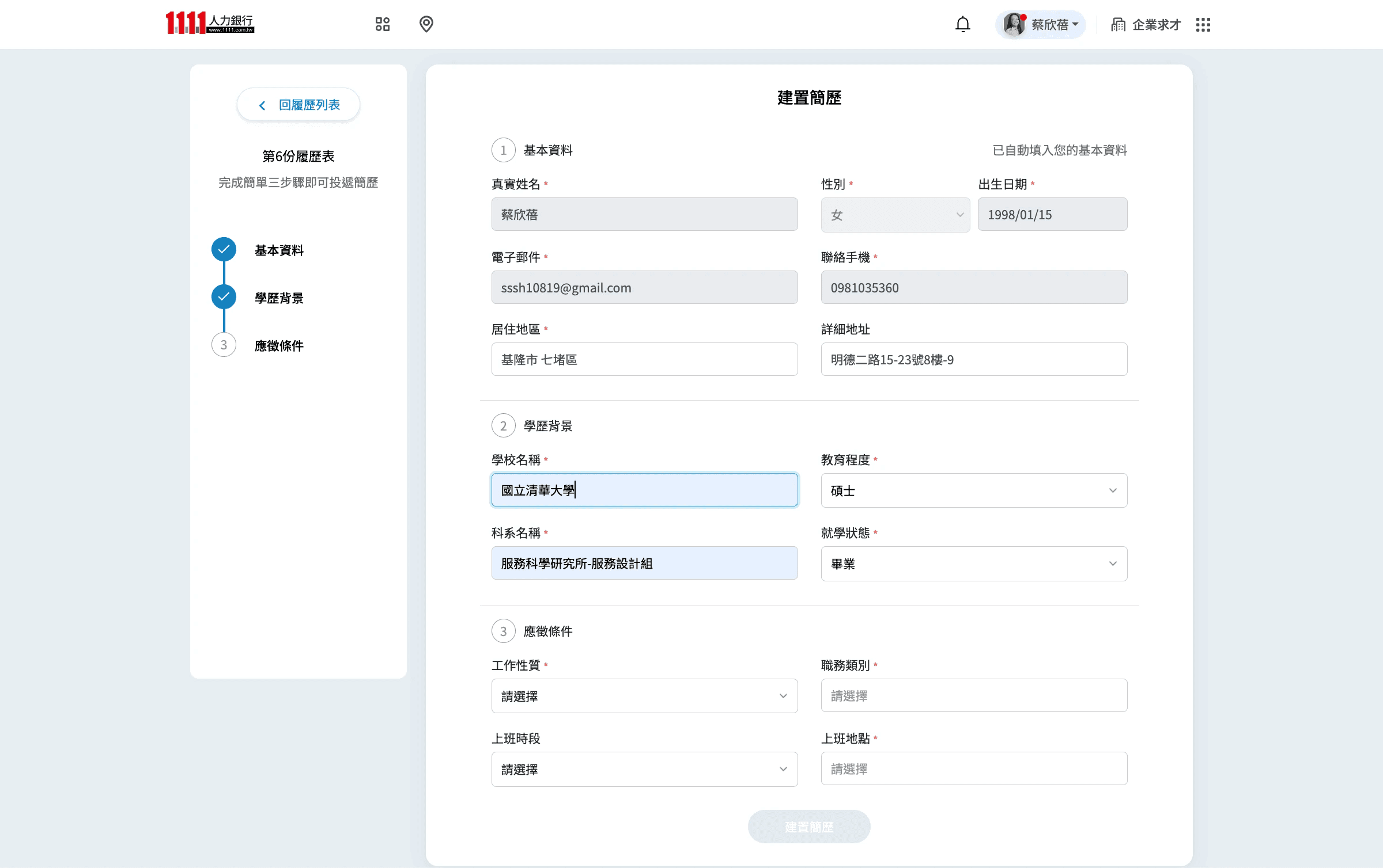
Resume design reversion in April- Ver.1
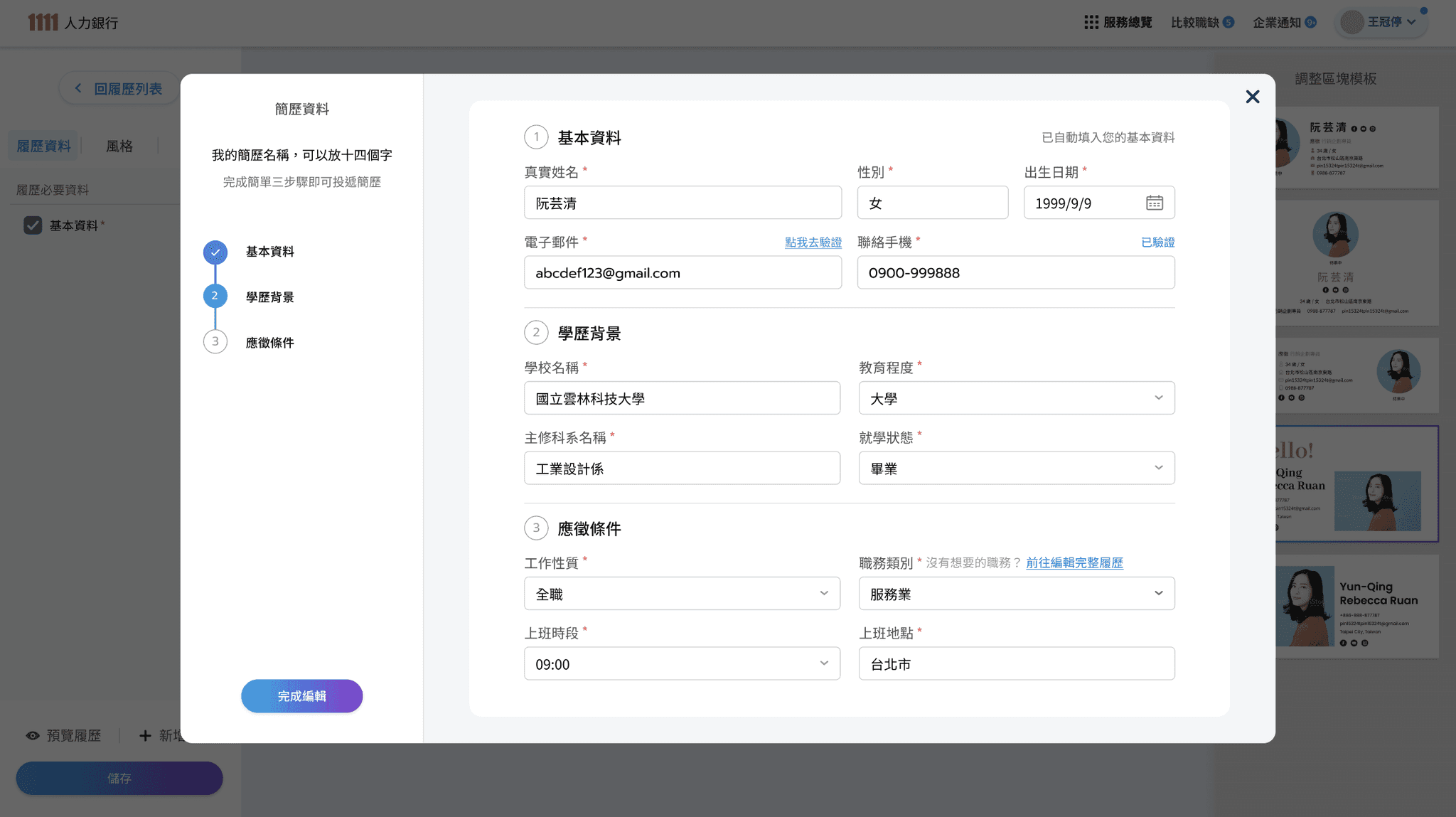
Resume design revision in April- Ver.2
- Data editing changed to Modal
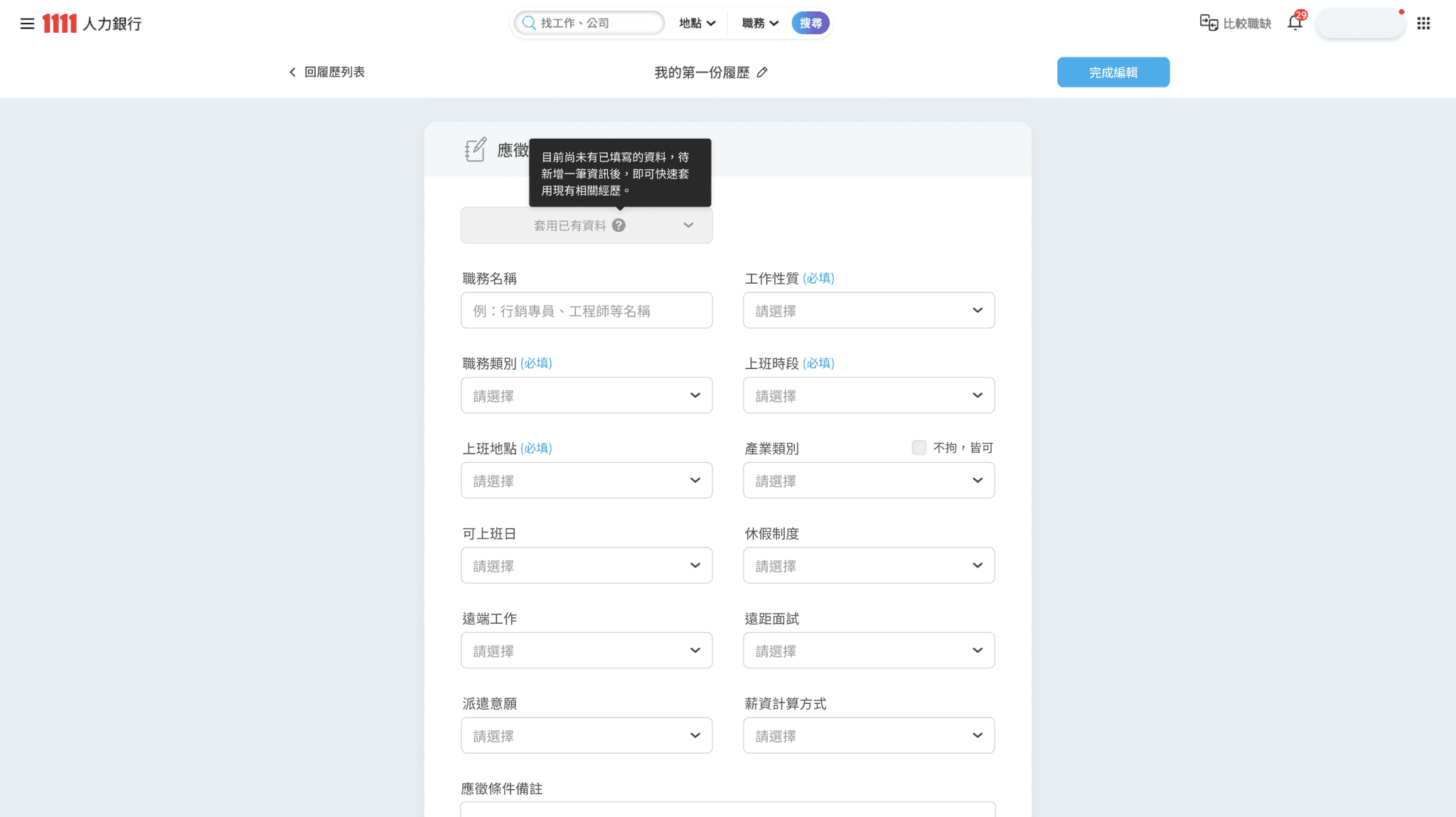
Resume design revision in April- Ver.3
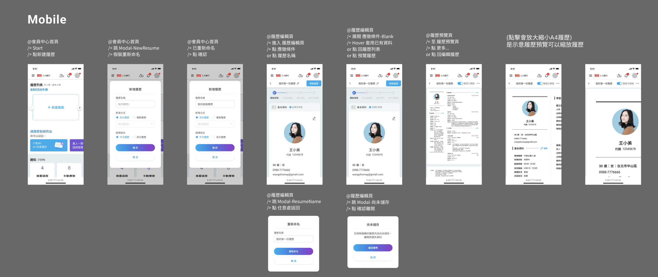
- Main process of mobile version
Tablet main screens

Learning

Don’t discuss without pictures

There are old versions as reference, but when there is a lack of specification documents and wireframes from PO&PM, the designer should quickly produce wireframes so that the effective communication can start.

Train a brain with extremely clear, logical and strong memory.

The real situation is usually that the requirements are confusing, there are frequent modifications, additions and deletions, so I learn to clearly record discussions and decisions. (I was jokingly called the little secretary because I took the initiative to take notes.)

Be brave to let my solutions be heard, discussed and implemented.

Team often in a situation where it was difficult to decide or find solutions. Although I am still a rookie, I still actively express and visualize the solutions I think are possible, and they have been successfully accepted and implemented many times.