NTHU Field Cast
Design & layout theme are established and continued to be used.
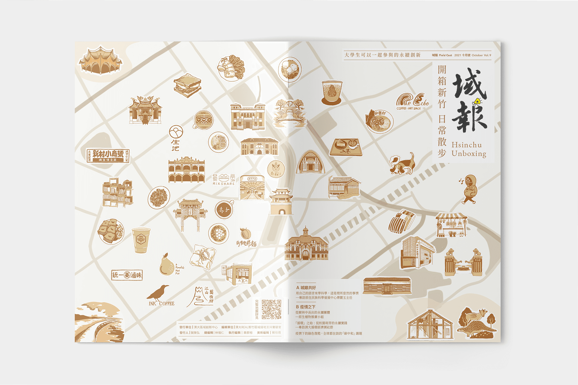
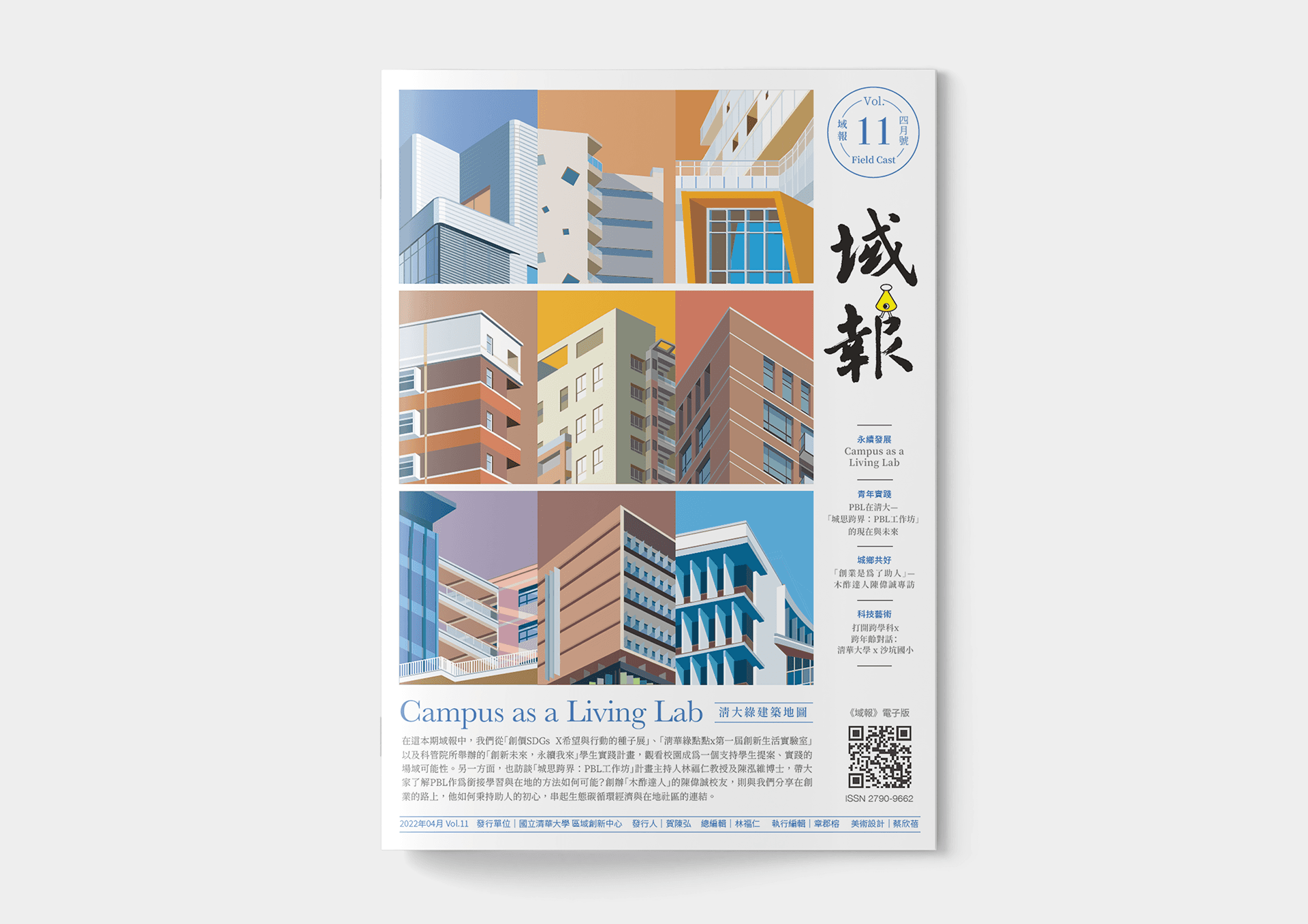
Design for FieldCast Newsletter (Vol.5 ~ Vol.11), and redesign the logotype & cover illustration.
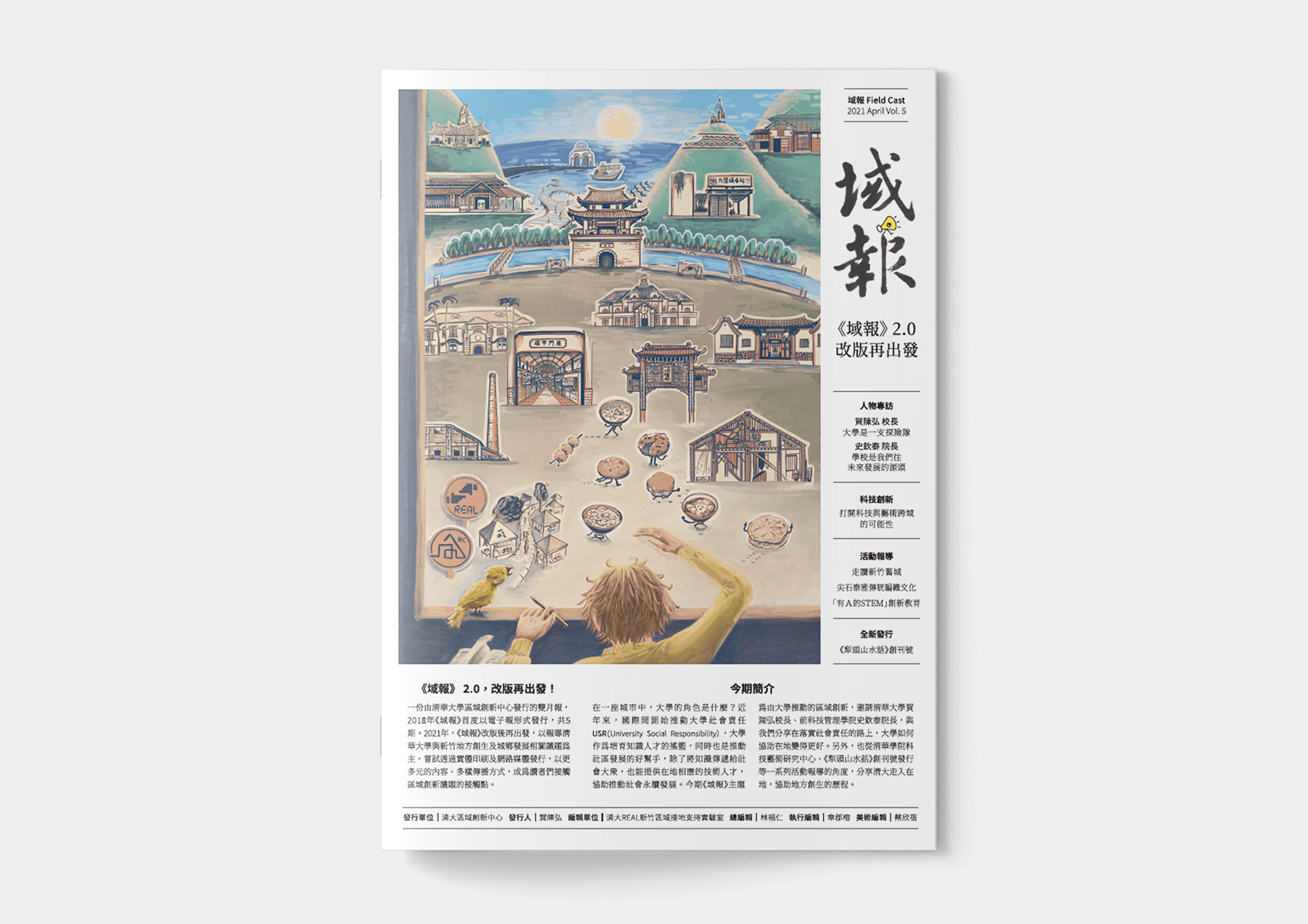
Vol.5 ~ Vol.11 Field Cast
Intro
We covered NTHU's SDGs advocations and issues related to urban-rural development and social practice in Hsinchu, Aim to providing diverse communication channels to engage readers with regional innovation topics.
Role
As the Art editor, I responsible for logo/ logotype redesign, layout design, cover design and illustration…all visual elements, except for photos and images provided by subjects. and producing mementos for activities.
Challenge
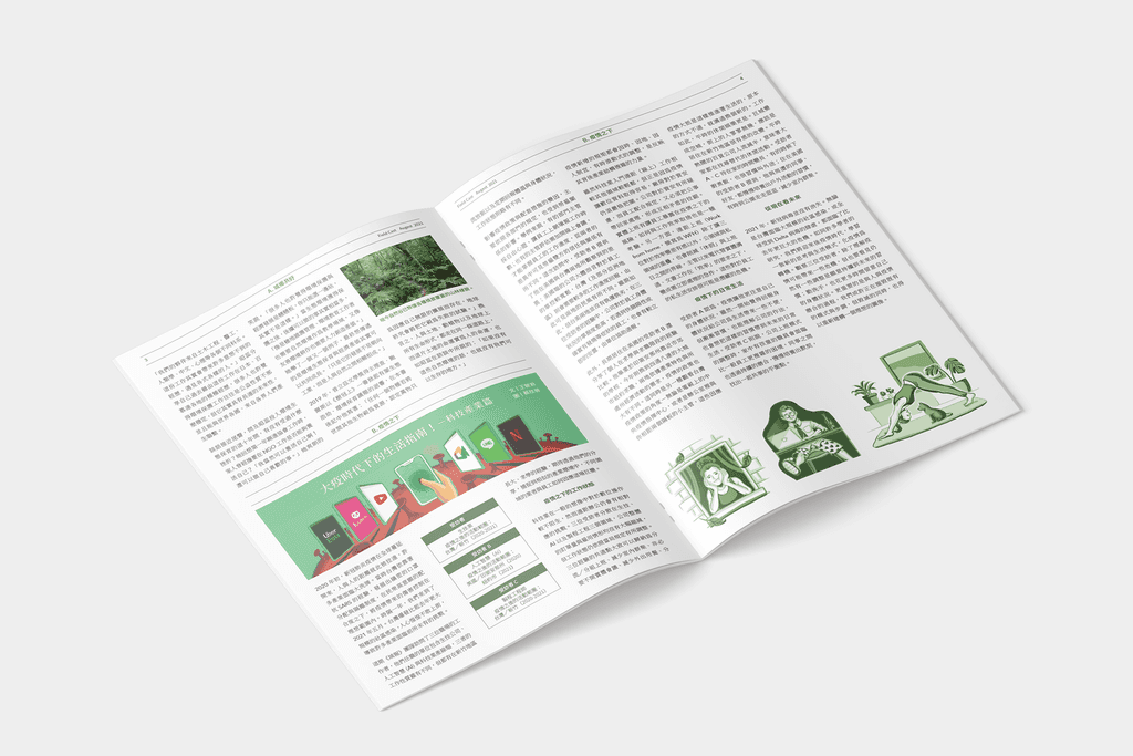
The words in the articles received from editors were usually too much. How to use layout within the limited number of pages to trade-off between rich content presentation and white space was a big challenge.
Results
After countless attempts on layout, my accumulated experience has gradually improved the quality of design; the relevance and creativity of the cover illustration was affirmed by readers.
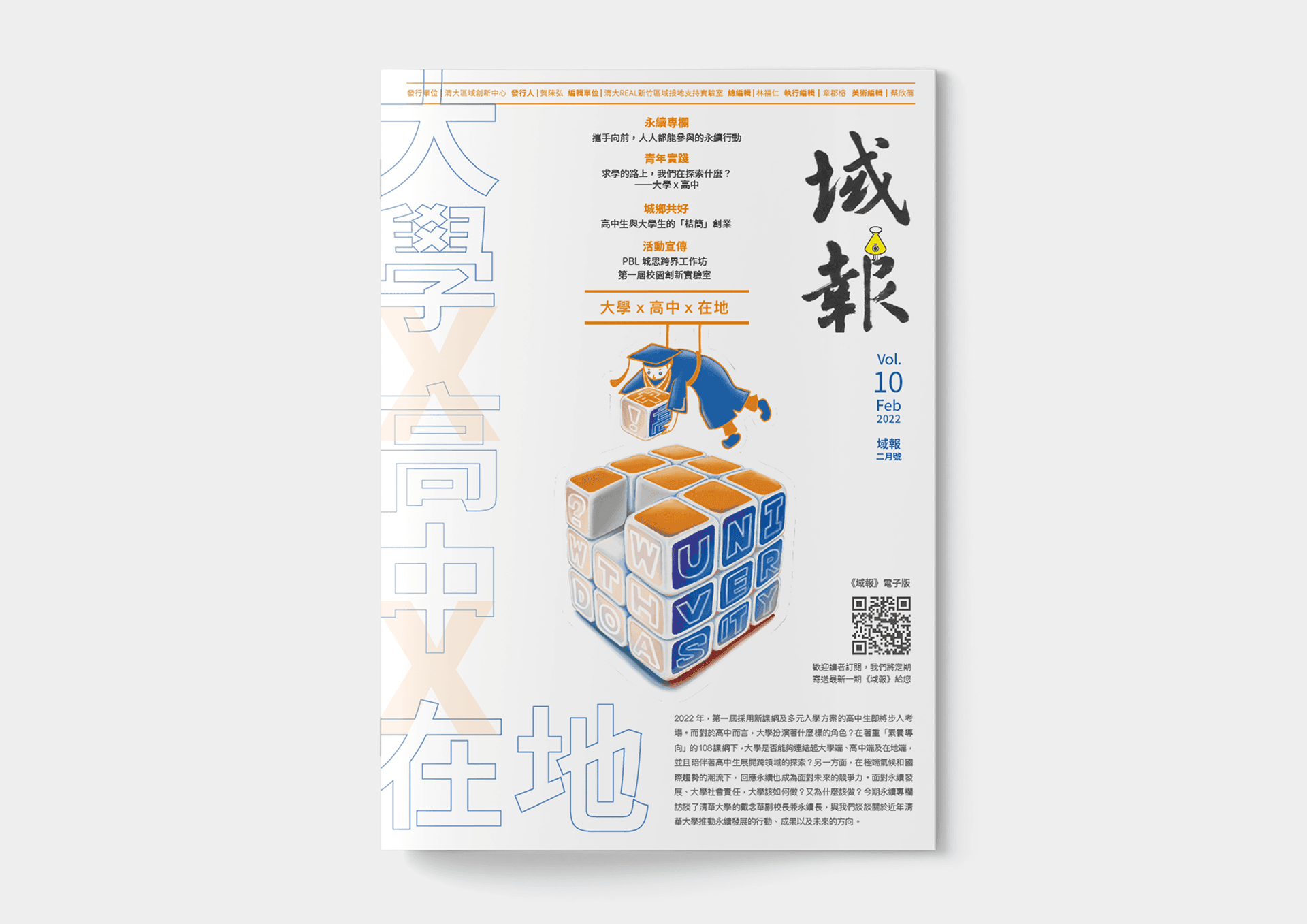
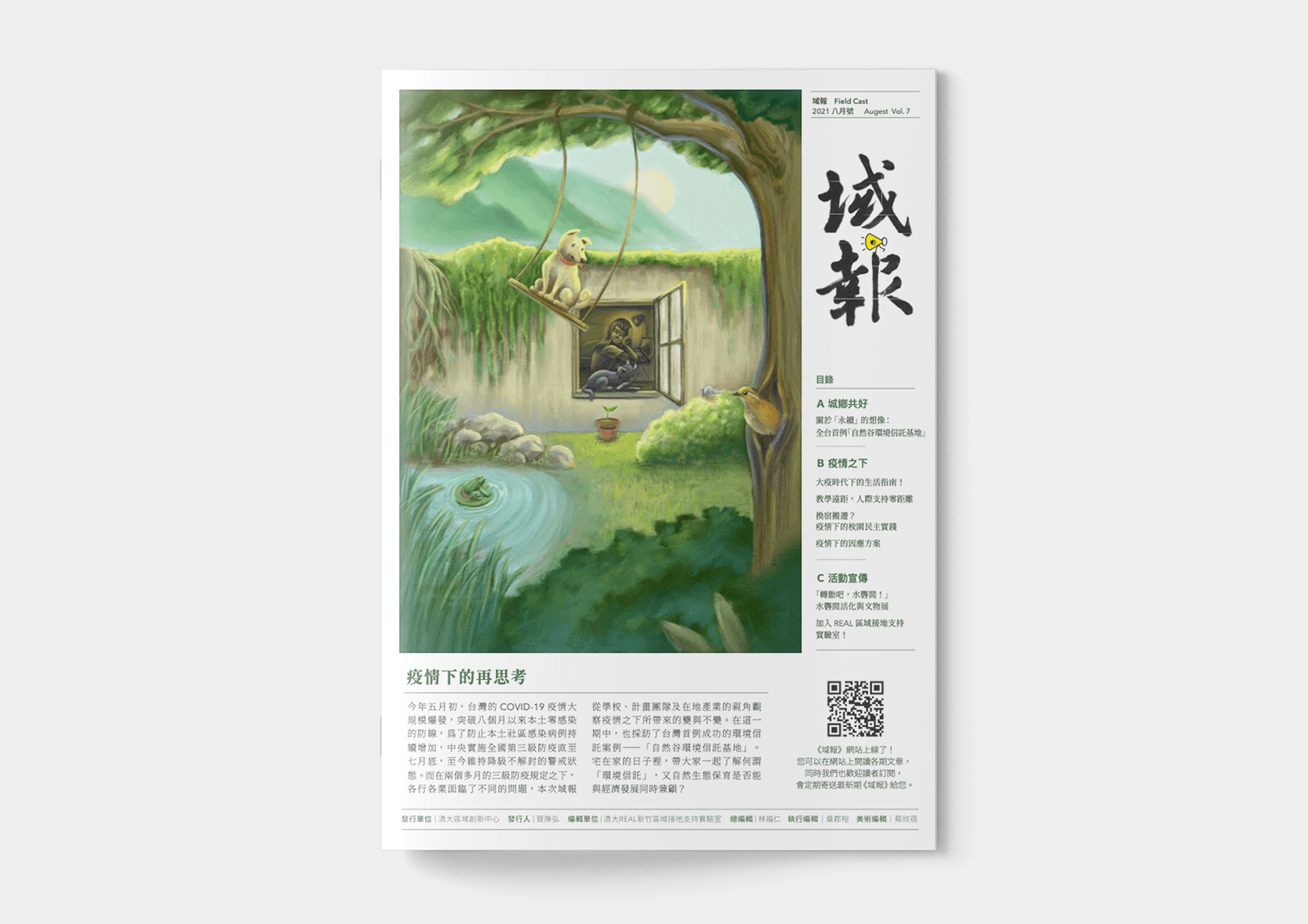
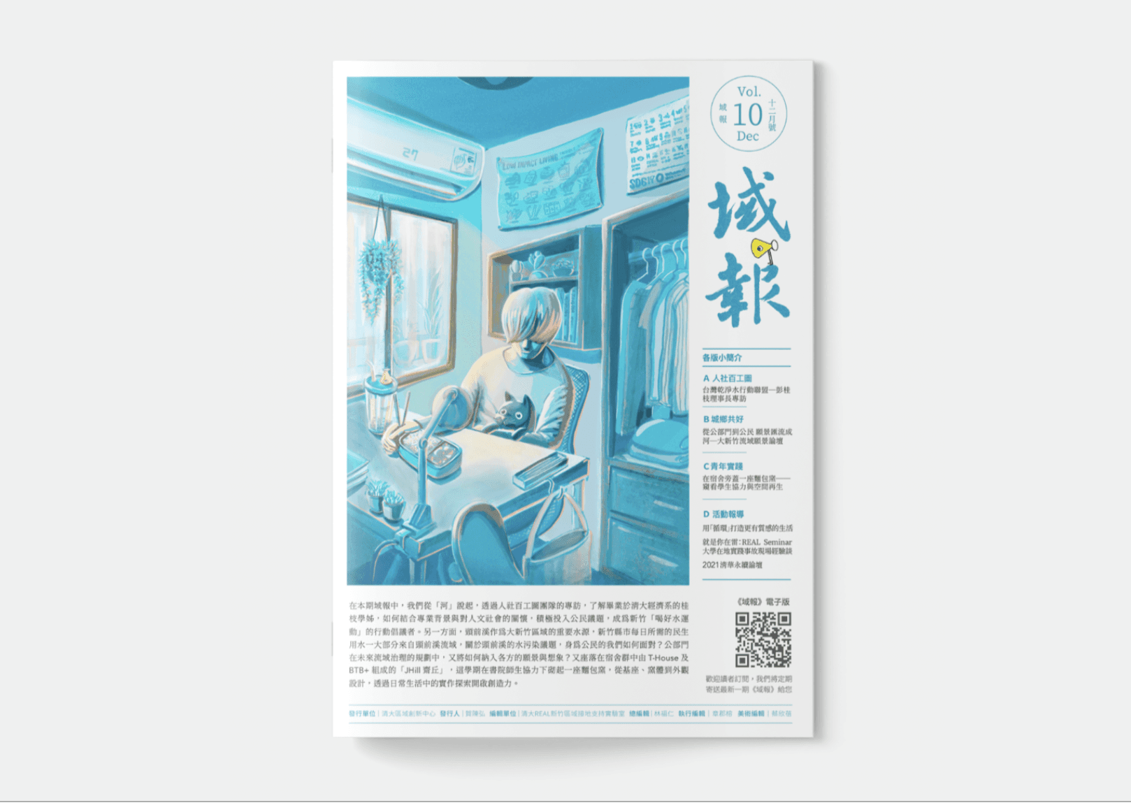
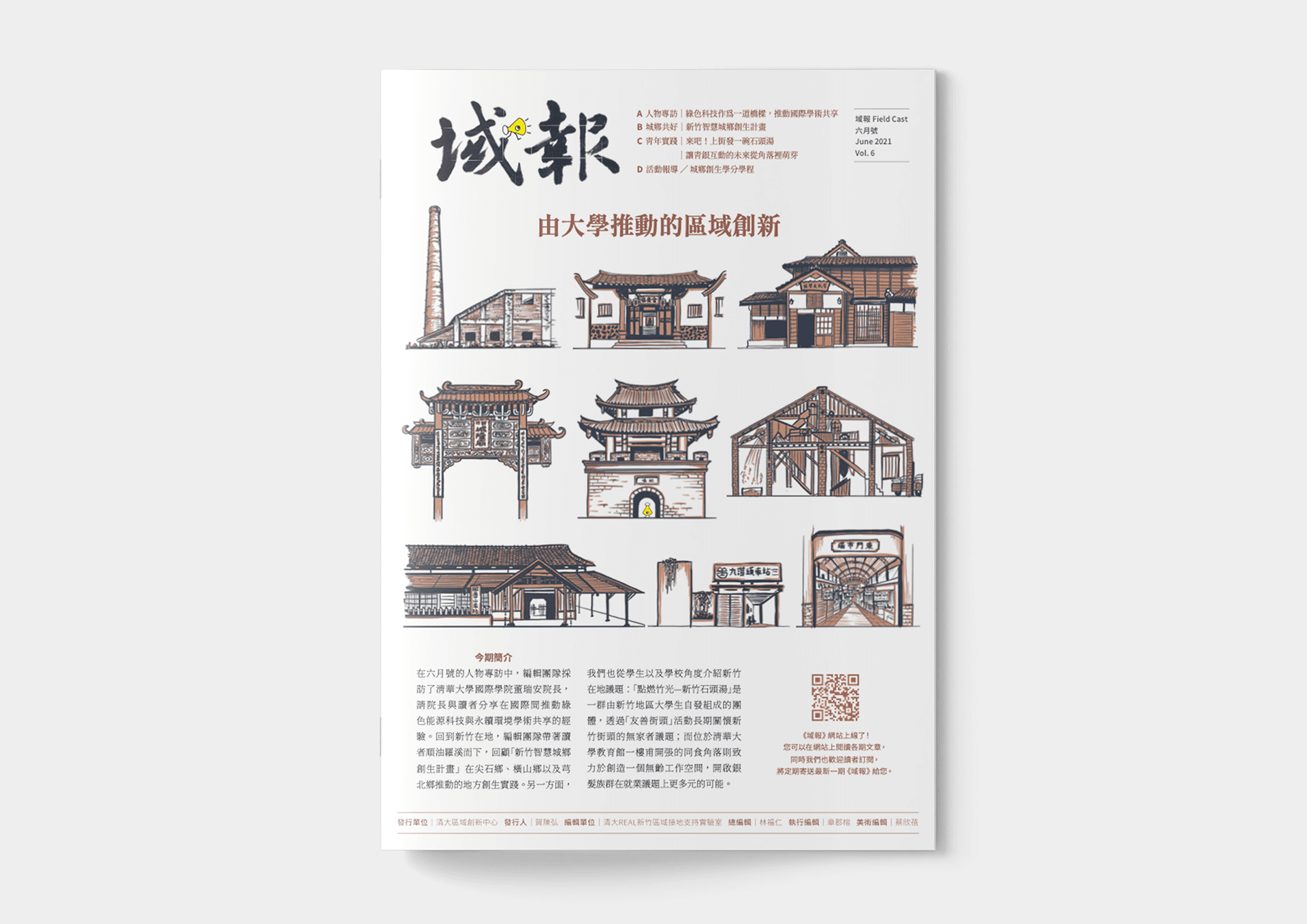
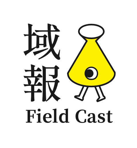
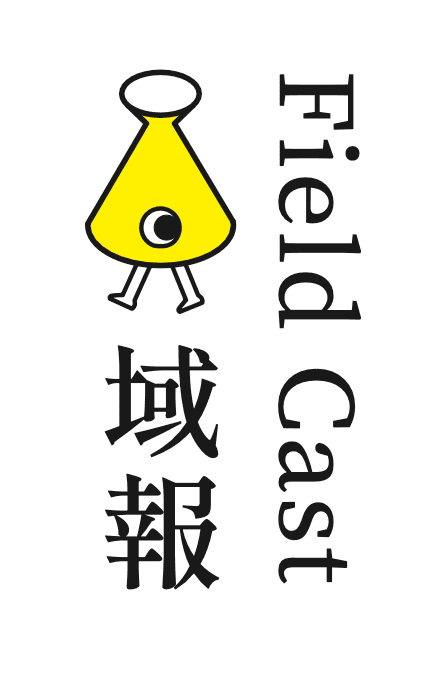
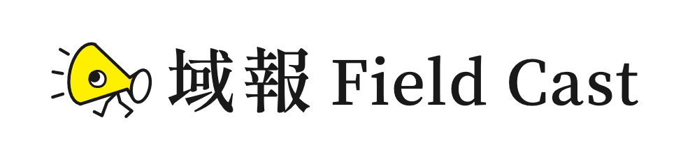
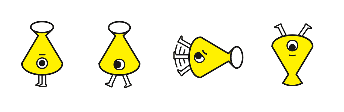
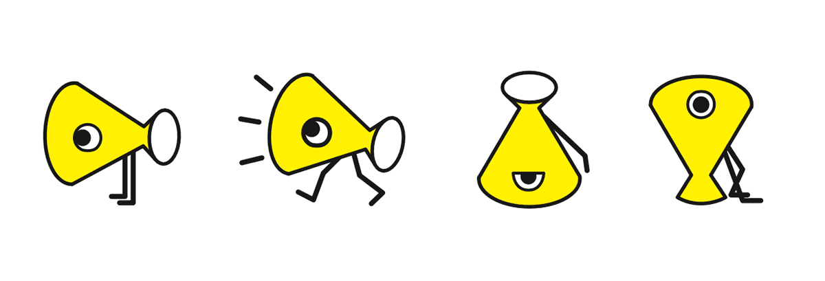
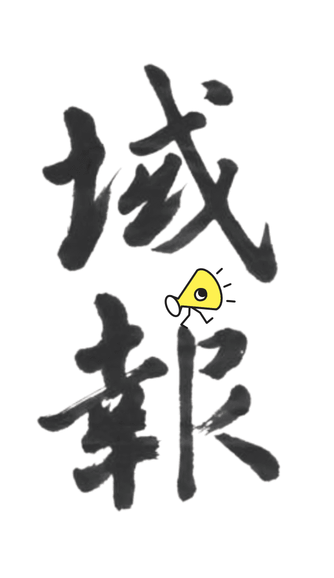
Logo redesign
The logotype was redesigned with the revision of newspapers. An anthropomorphic loudspeaker was created base on the needs and imagination of the chief editor.
Compromise
The chief editor wanted to use the calligraphy inscription of an honorary professor in NTHU as the Logotype, so I combined the designed logo with his calligraphy word.
Learning
Properly present content visually
Learn to match the cover illustrations with the theme of each issue, without deliberately maintaining my create style.
Racing against publish DDL
The design duration is often compressed due to the complexity of interview and editing. Also coupled with discussions, I need to be faster on design.