

JobBank Home Page- Official Redesign
Redesign the homepage under high constraints.
Devoting to reducing the gap between developing results and UI mockups.
I have practiced a lot in resilience and patience.
Role & key partners
Me- Product designer
manager- Sr. Product designer
PM & SA
Front-end Engineer
Supervisor- Design director
Collaboration
ver.1~3- design independently.
ver.4,5- coop. with manager.
ver.6- spec. work ( 各自製作比稿 )-> then coop. with manager.
Responsible
UI mockup & Hi-fi prototype for presentation & Quality Control.
Intensively discuss & reports to manager.
(Initiative) Documenting record of discussion details and results.
Intro of Sections
Background
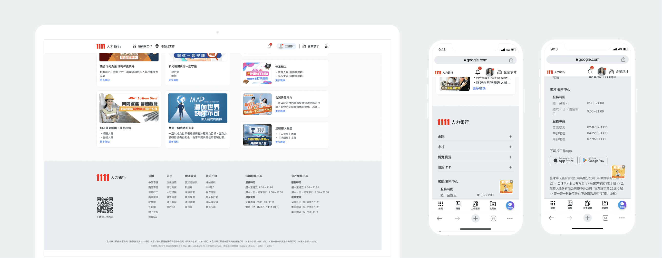
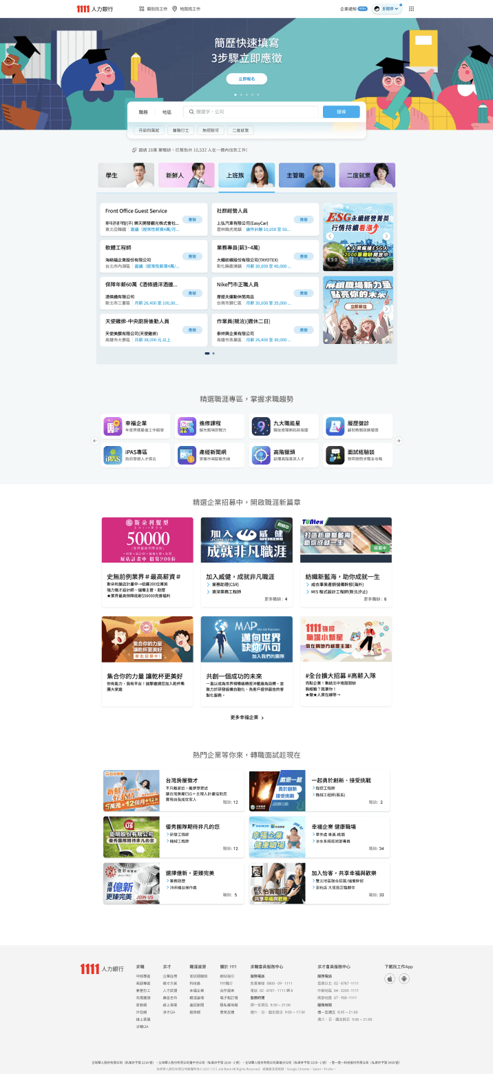
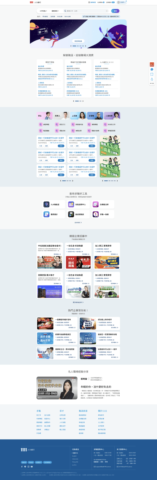
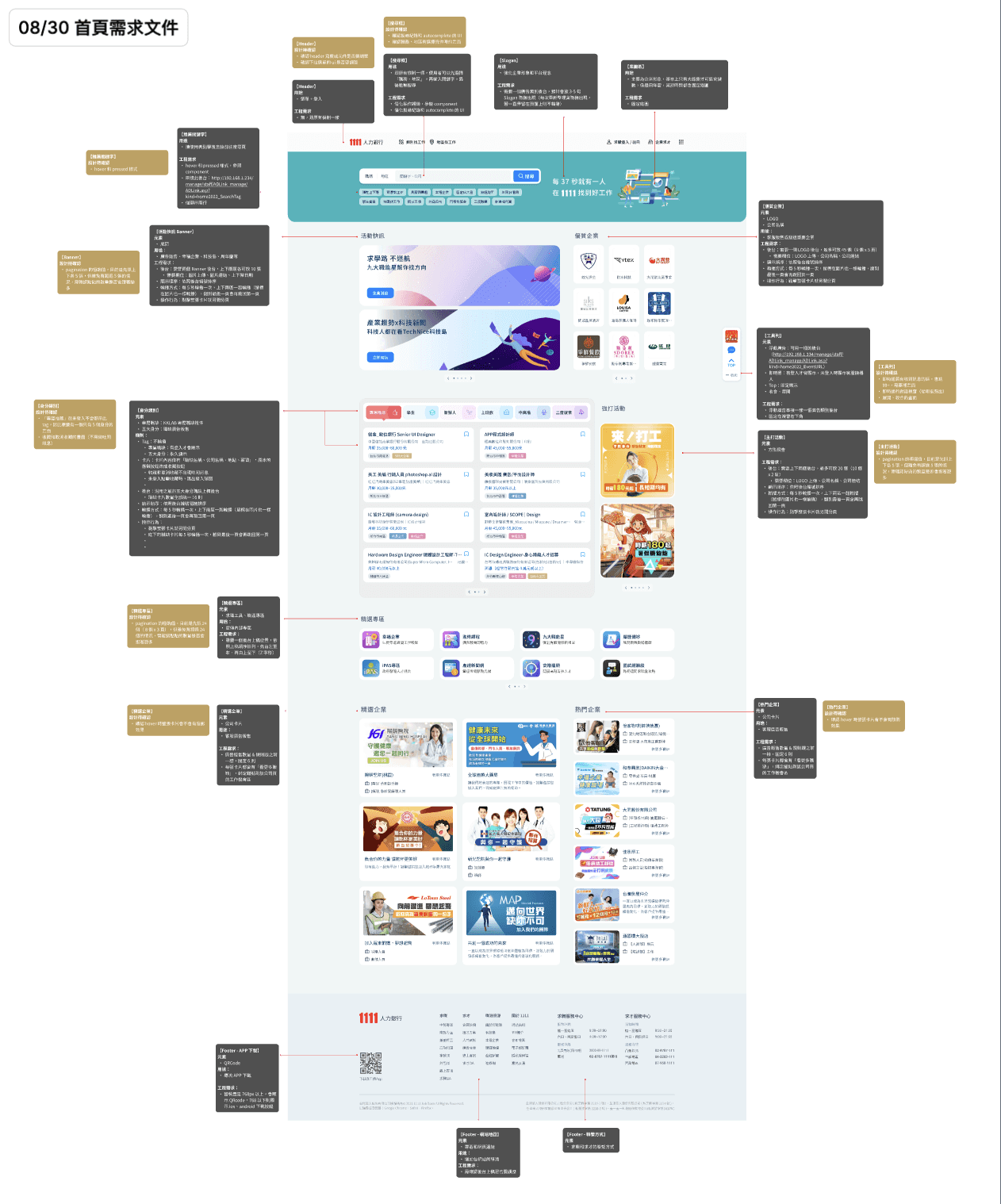
After the last revision of the entire website failed to go online due to programming issues, the executives proposed to adjust the interface and composition of the Home page many times.
Challenge
The Homepage is mainly composed of Ads, nearly all blocks have been finalized and limited in what information will be displayed. The UI design can only be based on the wireframe discussed by the executives.
Problem
Since most images are external Ads, the visual style and consistency can't be controlled, and the order of the info blocks can't be changed, so how do we set the visual standards?
Goal
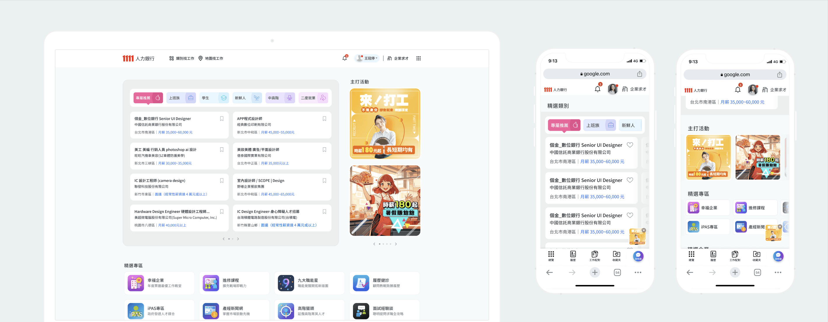
The main request from the executives: "It's better that the more information the user can see on the first sight."
The key of design: It can be assumed that numerous companies and their Ads images will make the page very "diverse and colorful", so the UI framework must be as clean & minimalist.
Focusing on the size setting of components, and the relationship between their position to control the visual weight, and design UI delicately to present clear hierarchy and reading guidance.
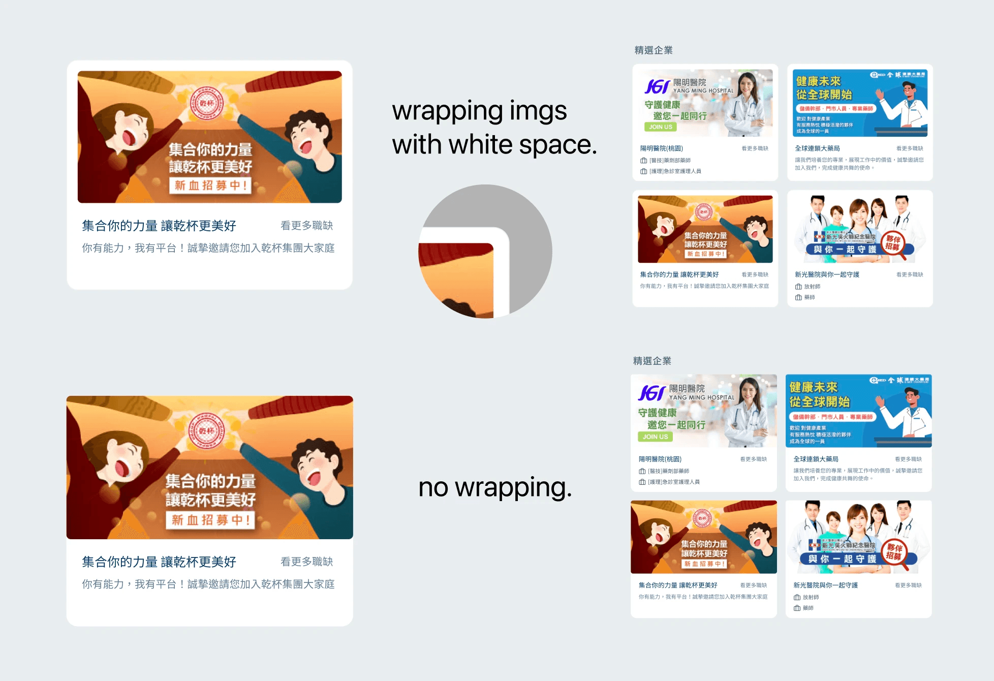
Key UI concept-
Using white space and wrapping to reduce the visual weight of each image.
If the images' visuals are uncontrollable, wrapping them with white space can reduce their visual proportion and weight. When there are more images, it can effectively reduce the dazzling feeling, and make the interface less cluttered.
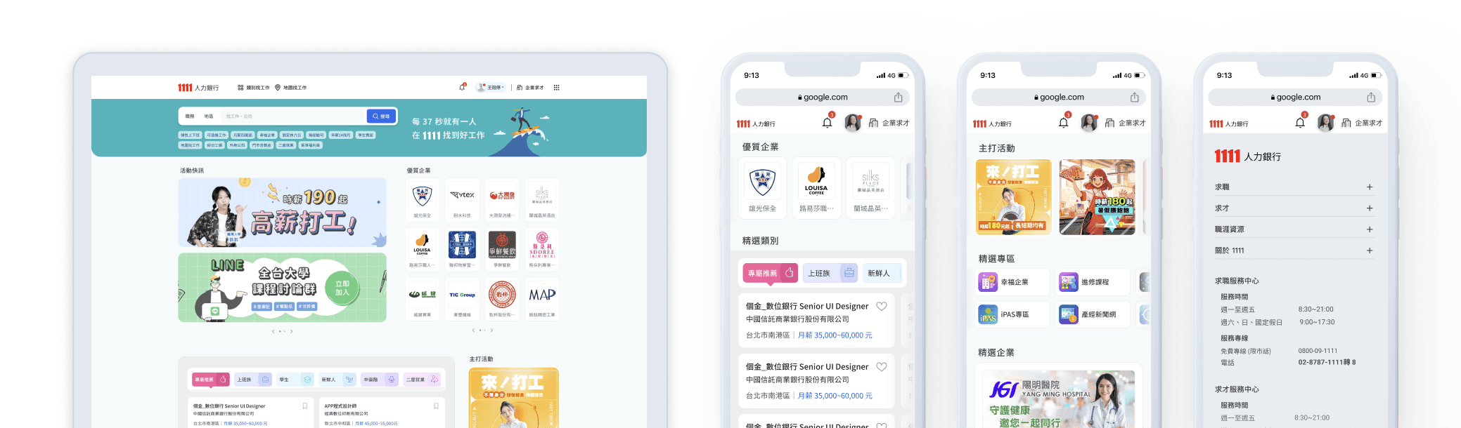
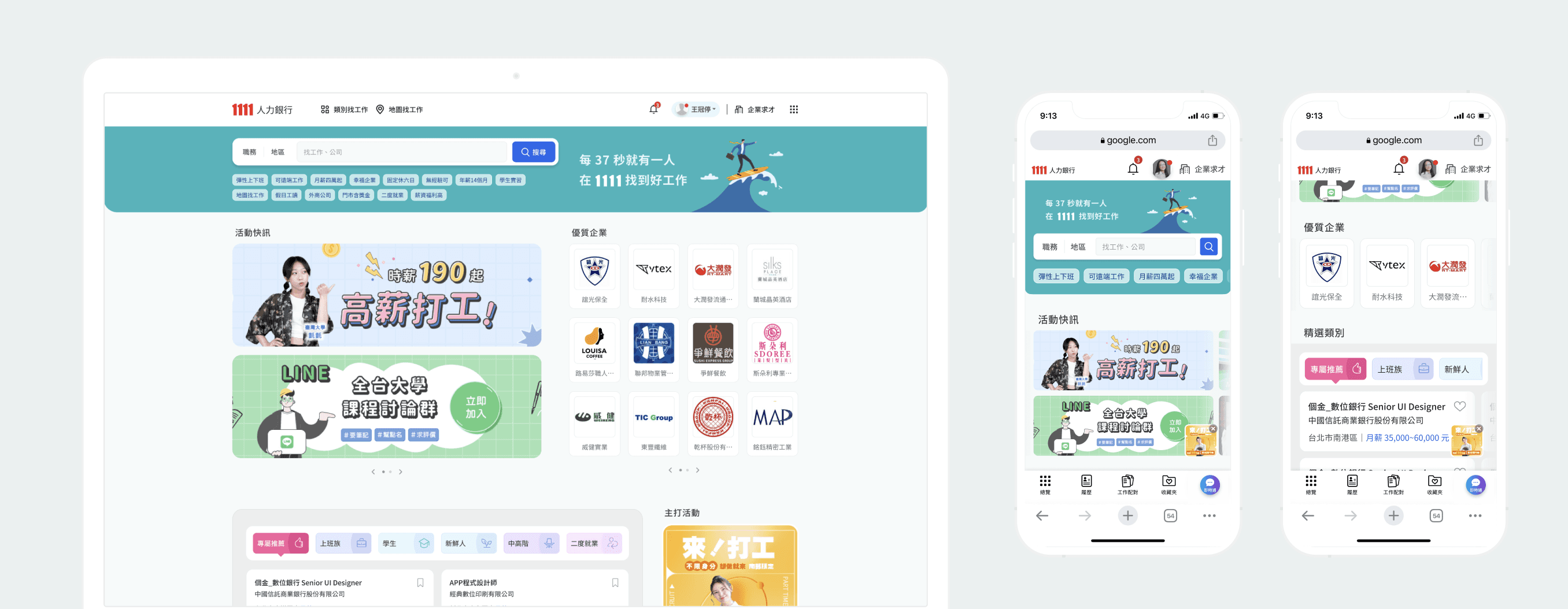
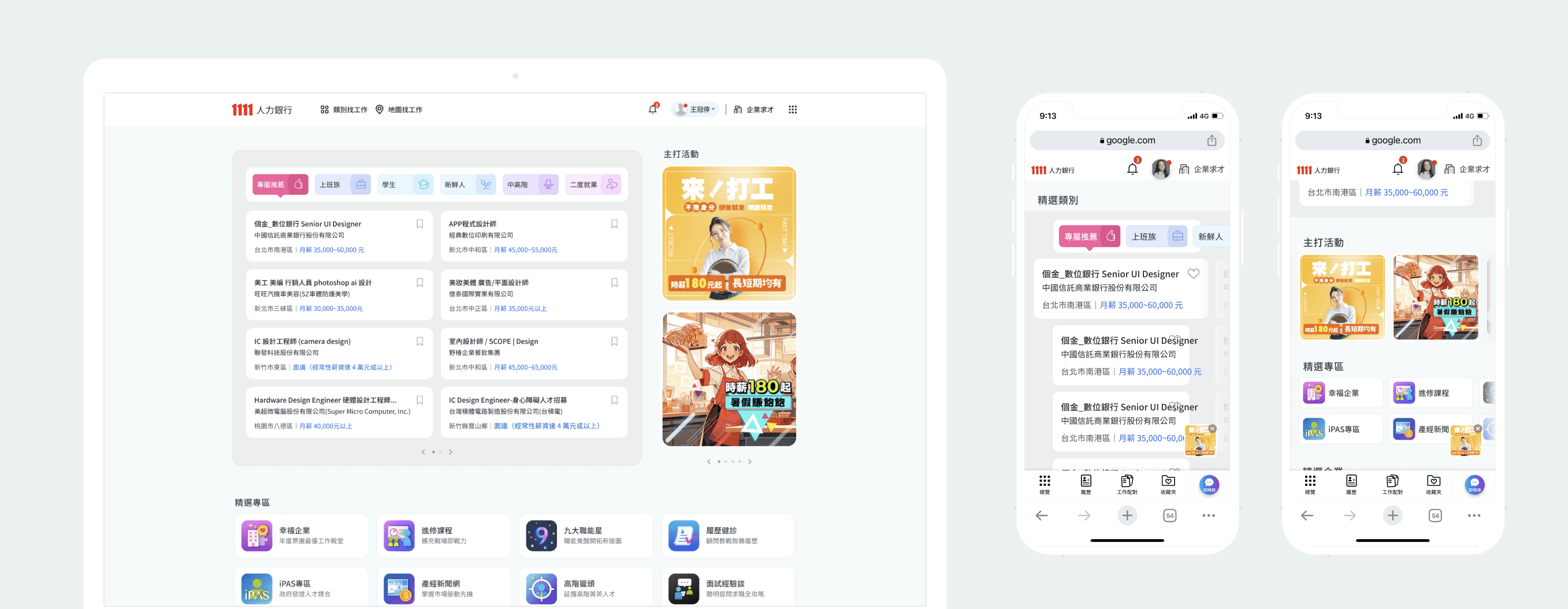
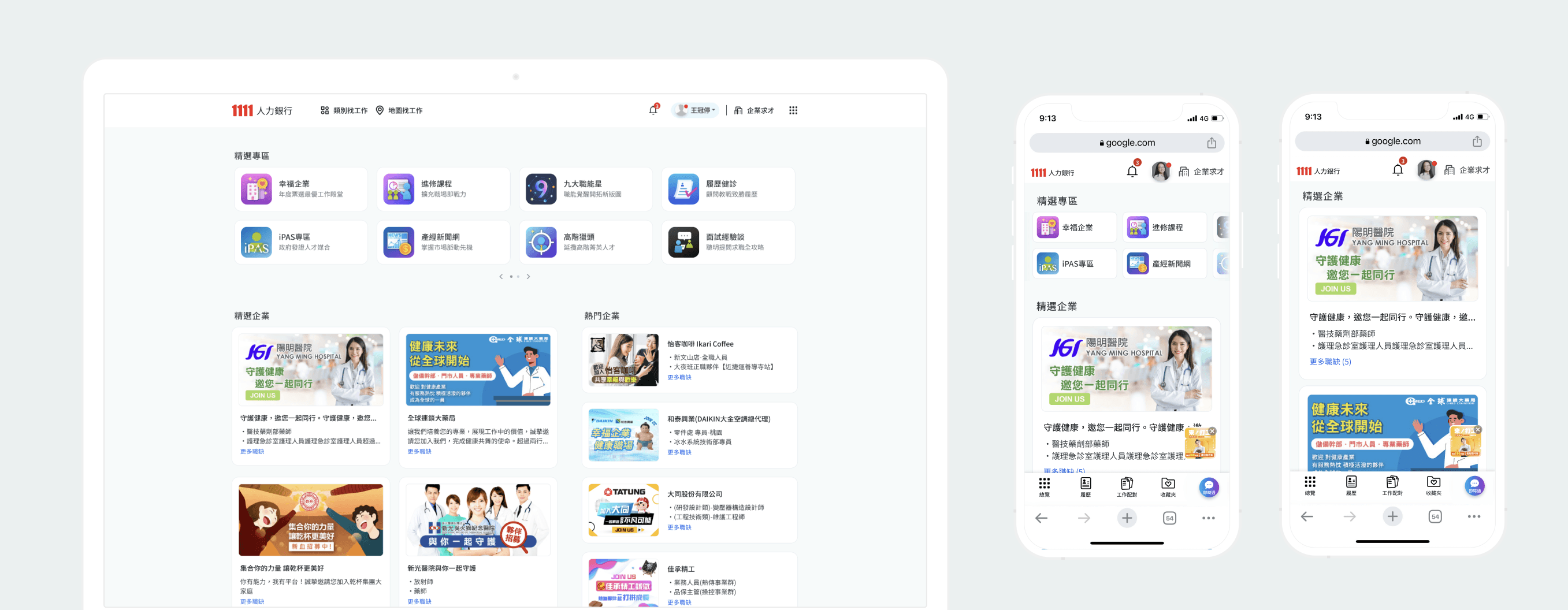
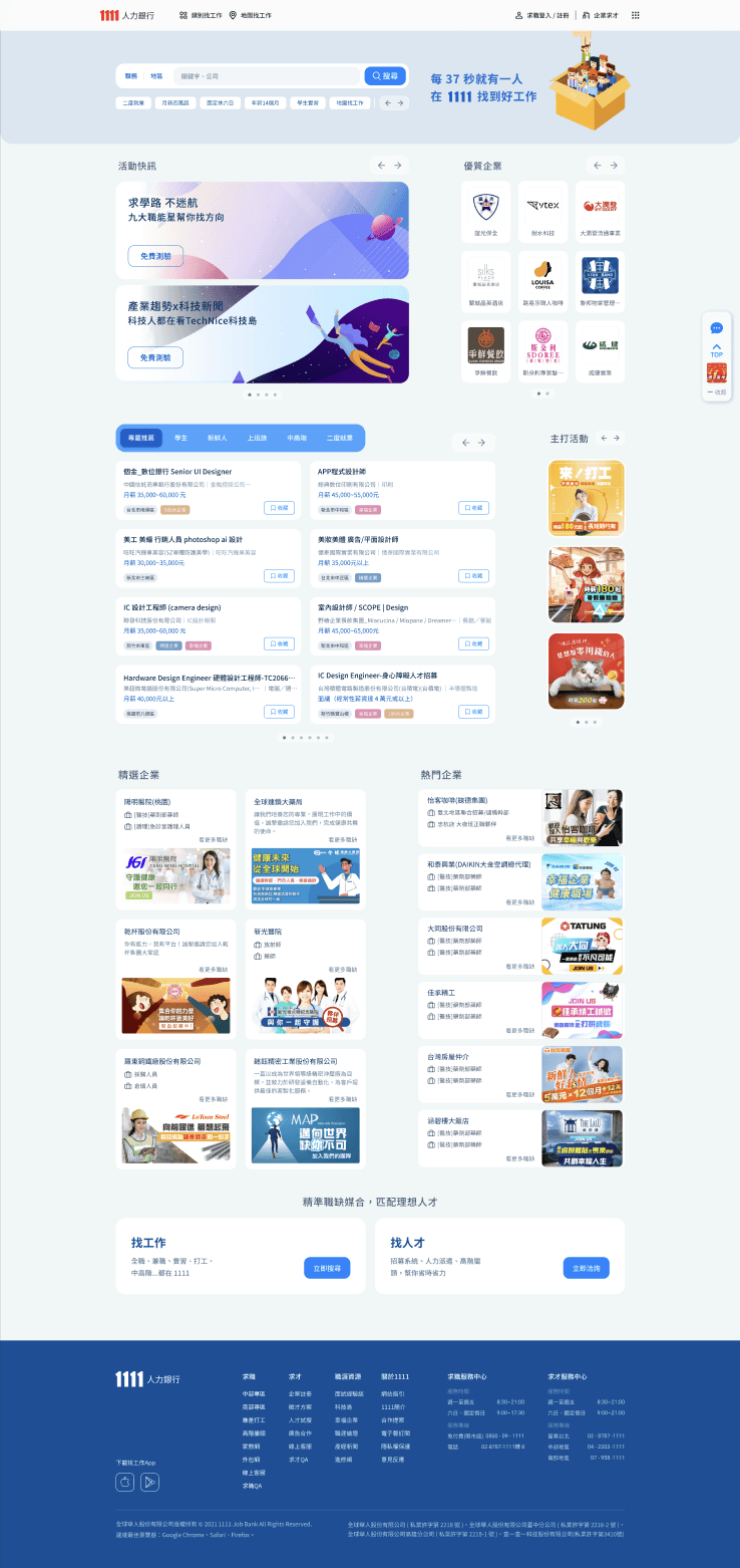
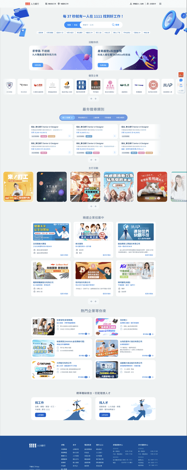
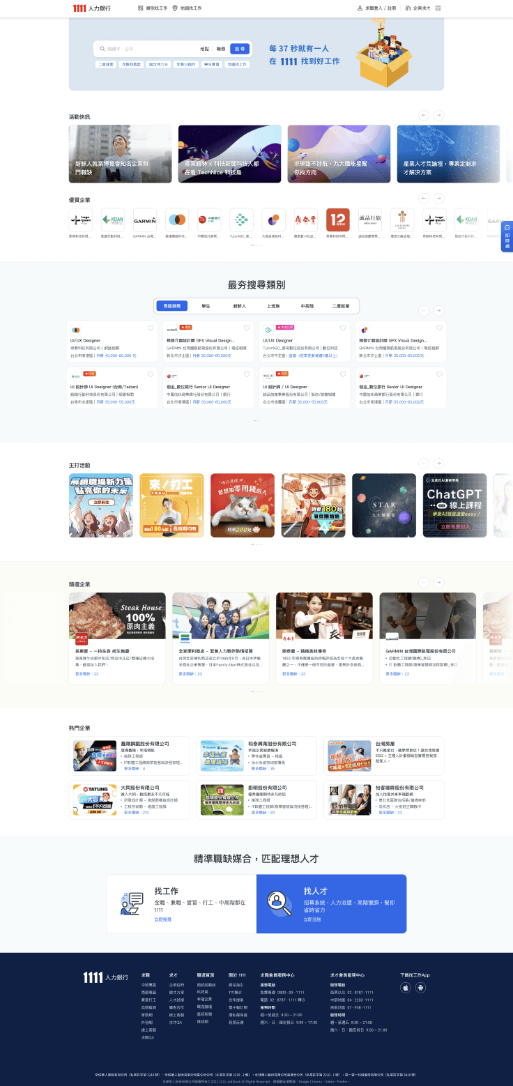
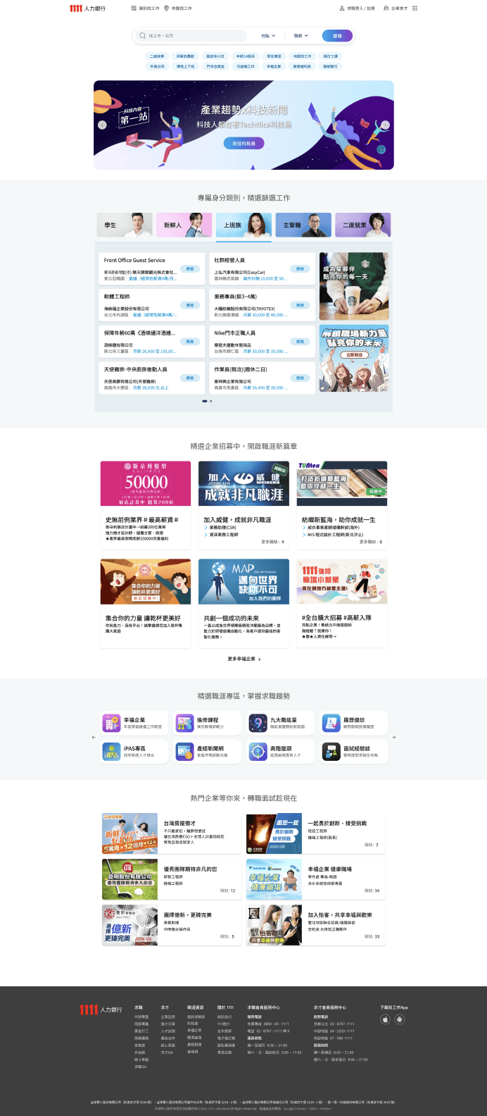
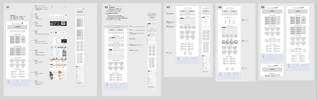
6 reversion of Home page redesgin
My reflection
After the spec. work(比稿) review by executives, they confirmed to use of my version mainly due to the more varied layout.
After adjustments and revisions by various key stakeholders, I found that the final design was like a fusion of ideas and decisions from them.
I learned that when a product involves huge stakes and a long-established business model, the role of design is bound to be very small. It is important to continuously adjust the cooperation method and mentality.
Learning
Focus more on provoking the purity of design under high constraints.
Although the design was carried out under extreme constraints, the opportunity was focused on setting and carving UI details with all strength.
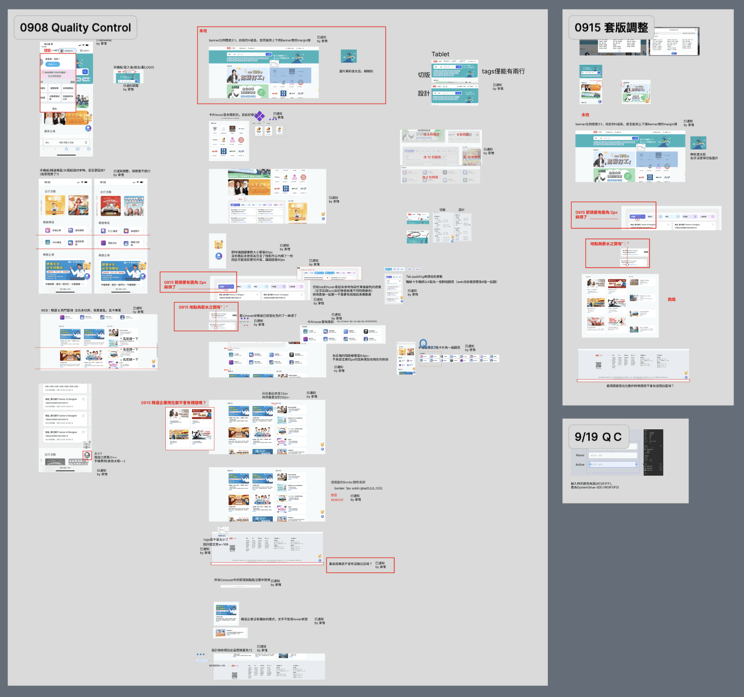
Promote complete development as much as possible under limited communication channels
Under the tight schedule, the QC was conducted multiple times after the front-end dev. was completed, we marked nearly 96 points that needed to be modified, to promote each other to be as perfect as possible.
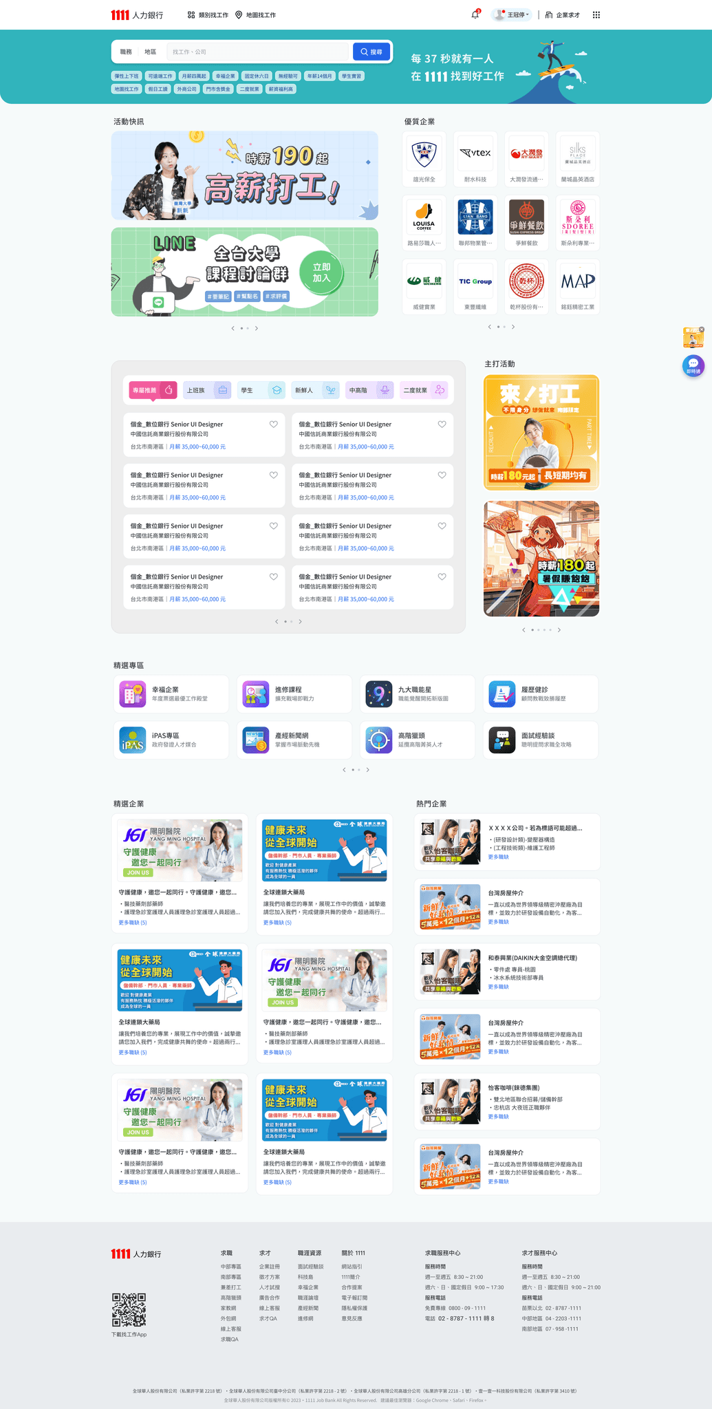
Some intro. of design progress
The iteration of versions of Wireframes
From the wireframe proposed by the PM, we can see that everyone is very troubled by "what information must be / can & cannot / suitable & inappropriate be displayed on the homepage.
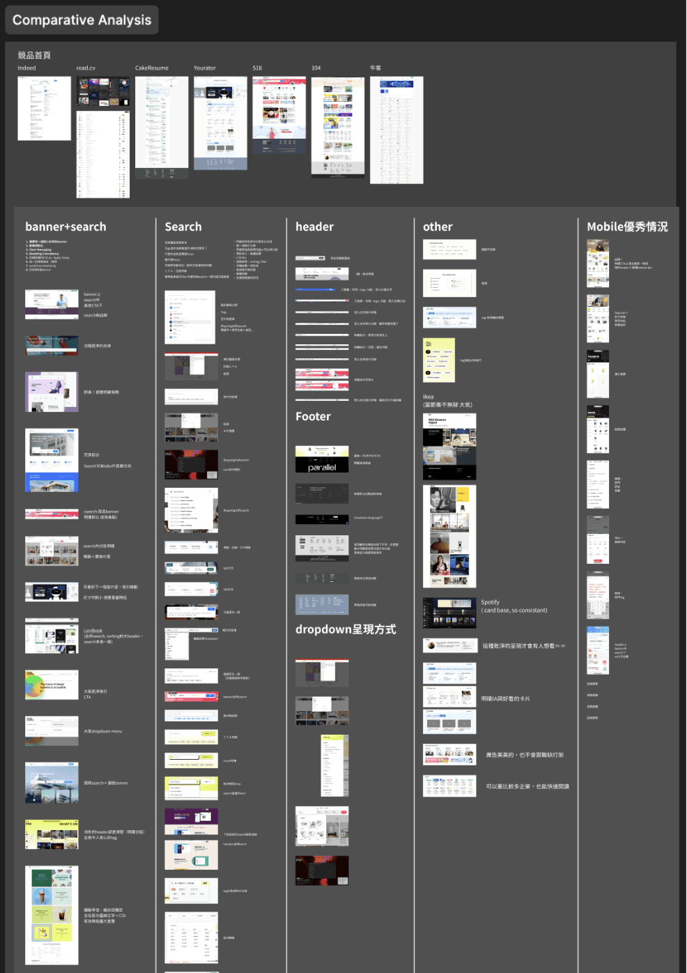
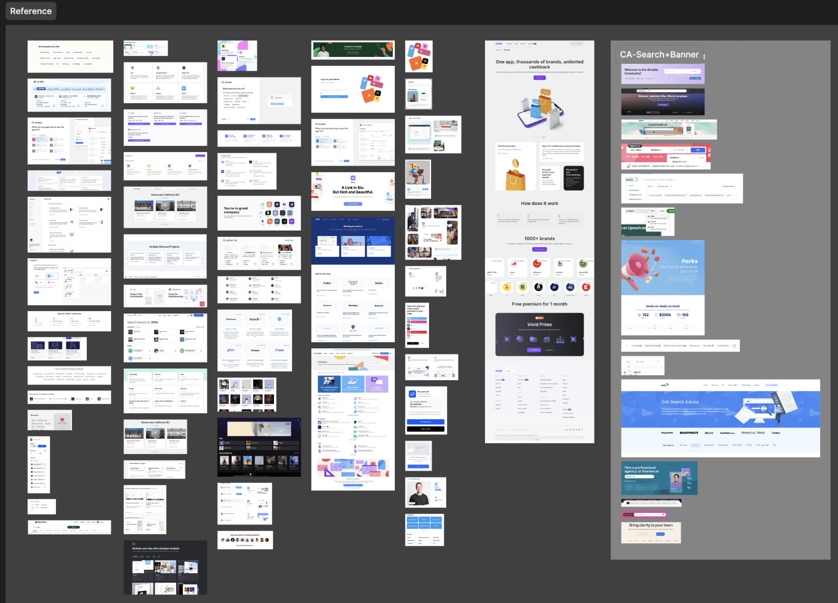
Before design- Comparative Analysis
Conduct reference collection and comparative analysis on the overall homepage and each info section. I have learned a lot from this continuous collection, and know more about why the world’s well-designed homepages are good and useful.
The iteration of the section-
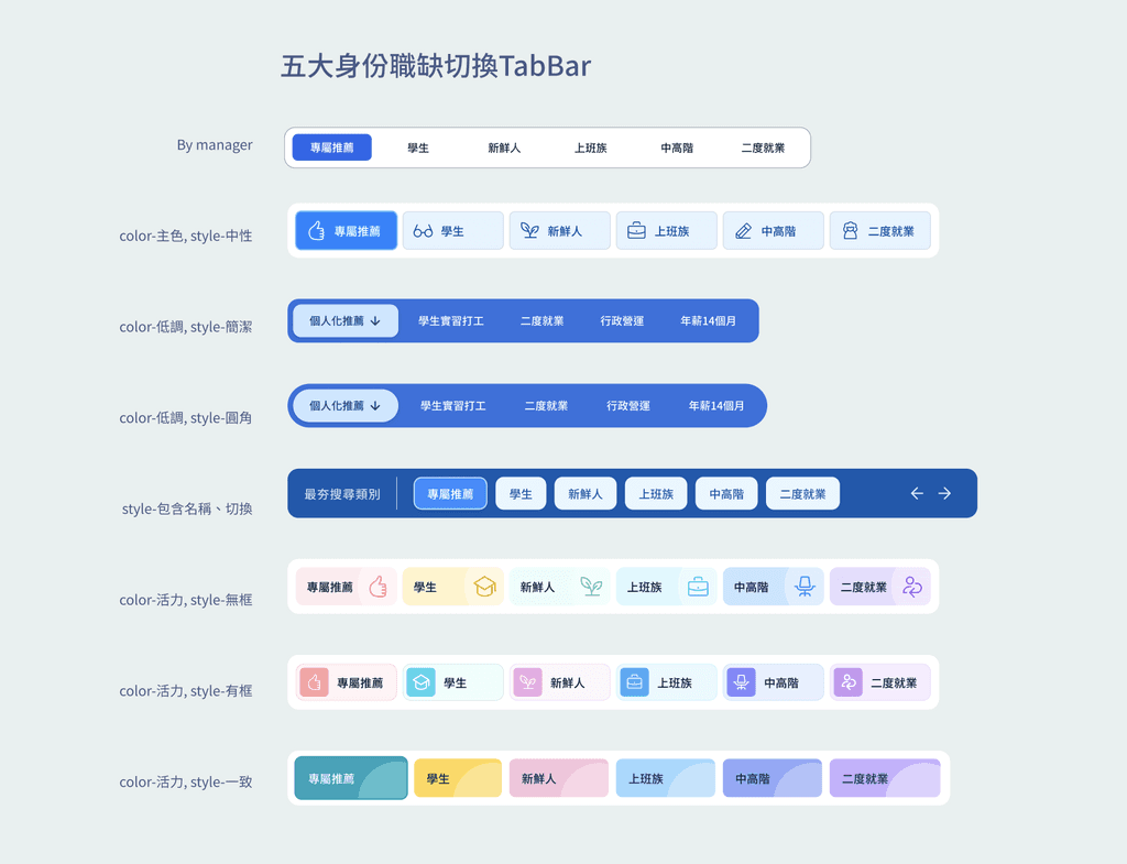
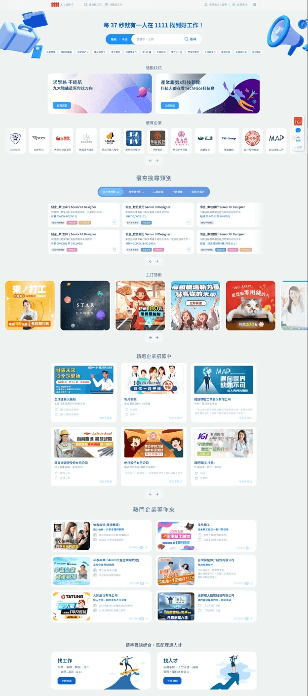
TabBar and Cards of 5 Job Types
As key sections, the layout of job cards, cards deck, and the style of the switching (TabBar) are constantly iterated under strict inspection.
I am still learning how to communicate better among these differences to reach a consensus that is more beneficial to the goal.
The executives chose the version with multiple colors to distinguish work identities because it is more colorful and energetic.
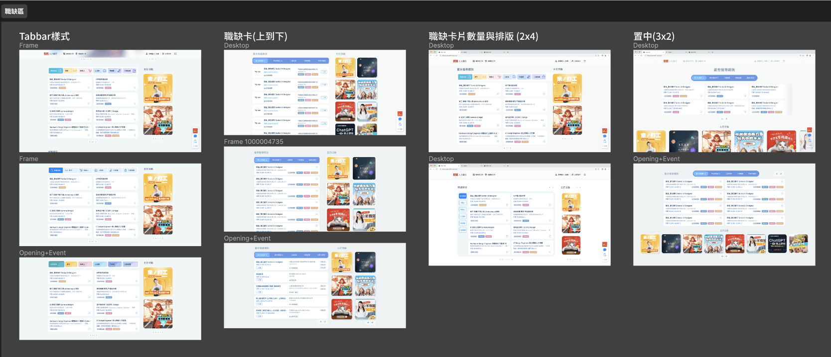
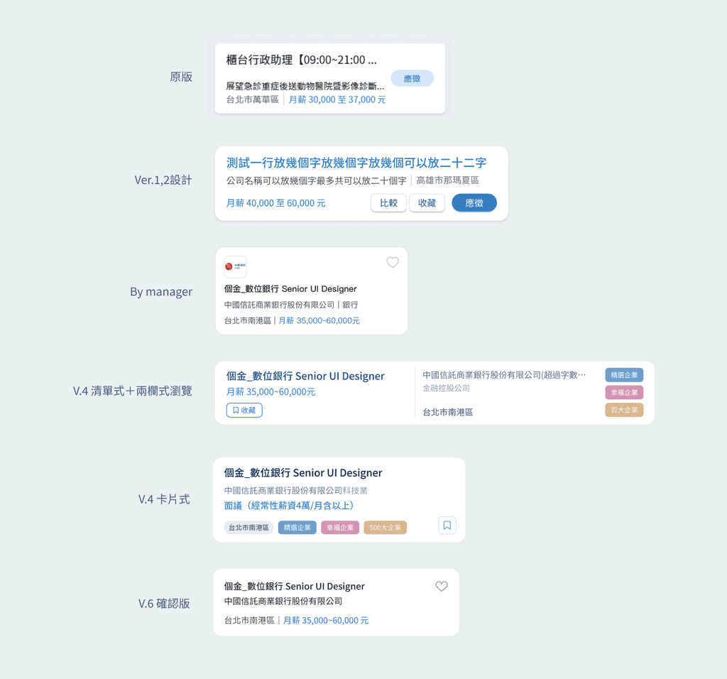
The iteration of Job cards
The redesign of it has been a major focus, but there has been no consensus on what information should be included and how much should be display on it.
Therefore we done a lot attemps on the layout of it for executives to choose.
Mainly learned how to design the delicate relationship between layout and the number of words, font size, and RWD that affects the whole.
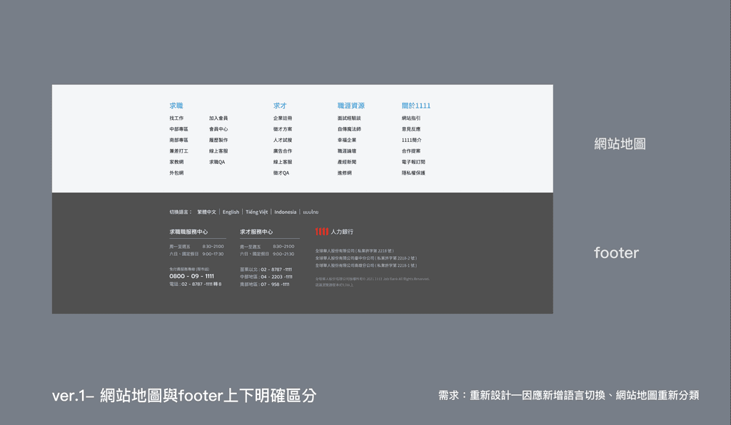
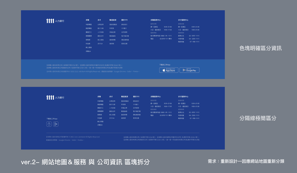
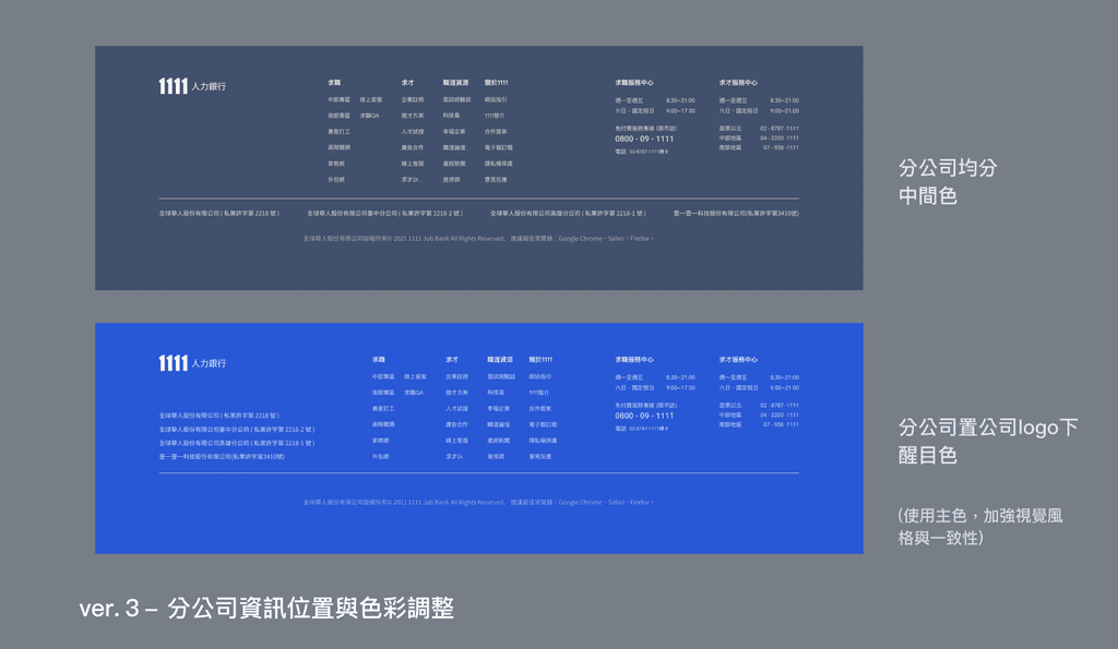
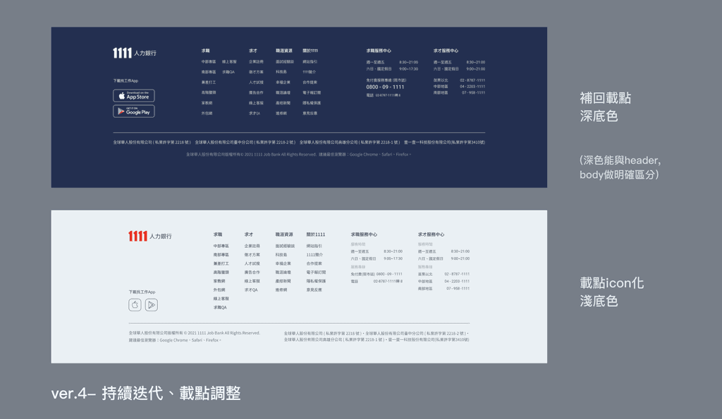
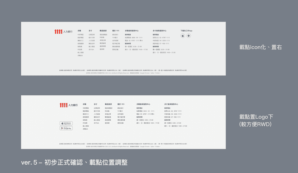
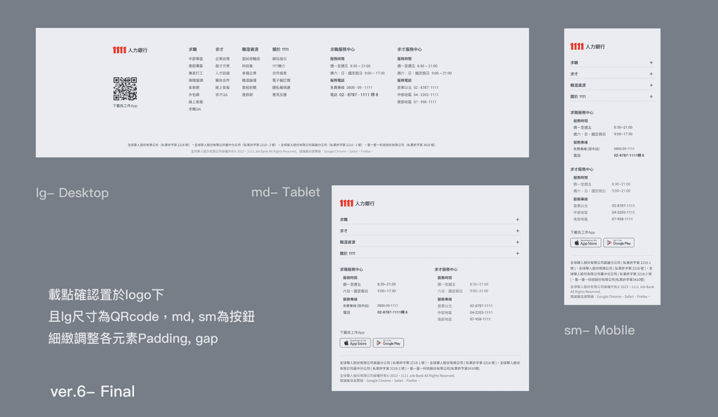
The iteration of Footer
Focus on information grouping, layout, and the use of color to prioritize information presentation.
The iteration of ver.4- speculative works (比稿)
The executive wanted to have multiple versions to choose, so manager and I design one version independently.
However, during the first alignment discussion, we found that the layouts of our design were similar and no clear differences.
Therefore, I designed the 2nd version and deliberately differentiated the layout style from the original.
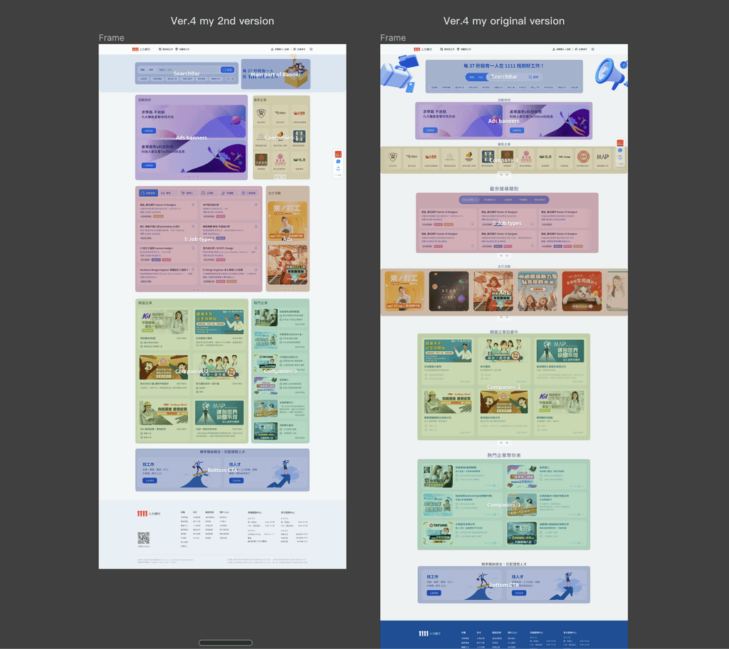
The overall layout iteration
- Comfortable vs. high information density
The original overall layout was centered and loosened, and use single row of tickers to show numerous Ads.
In order to propose a layout that is different from manager's, I designed a new layout with the goal of "the more info blocks can be seen at a glance, the better"
The new layout places info blocks as densely as possible and arranges them in a left-right rhythm.
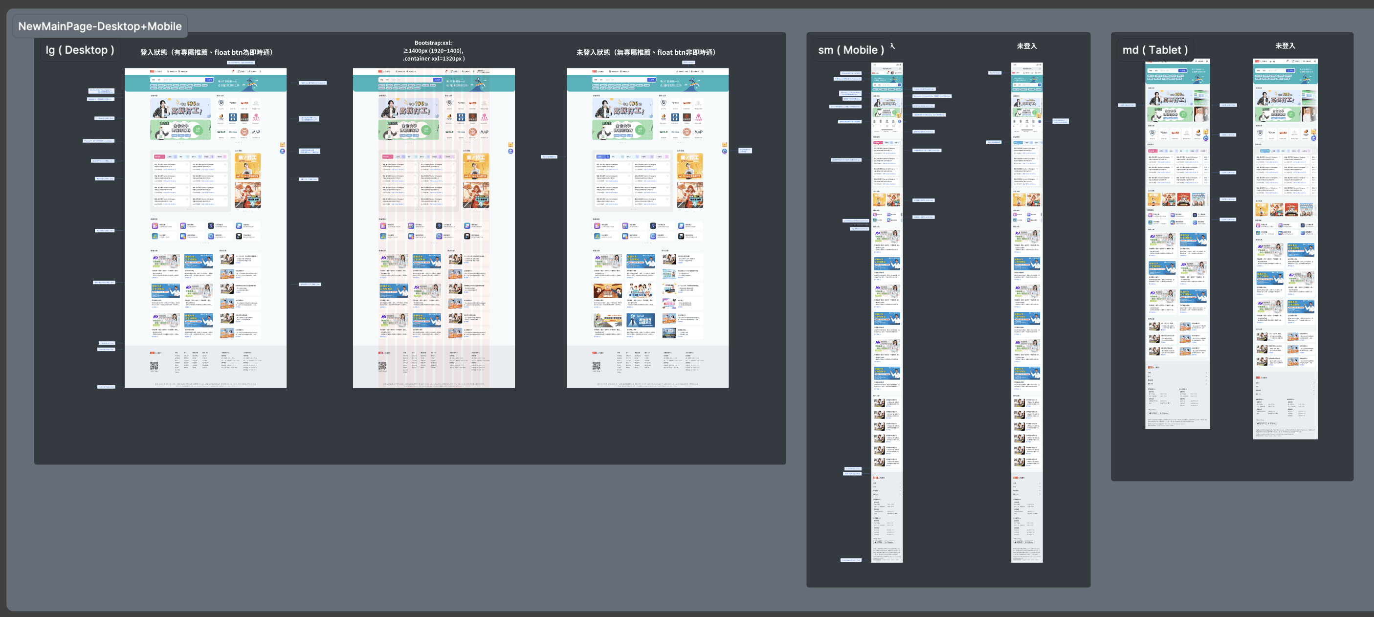
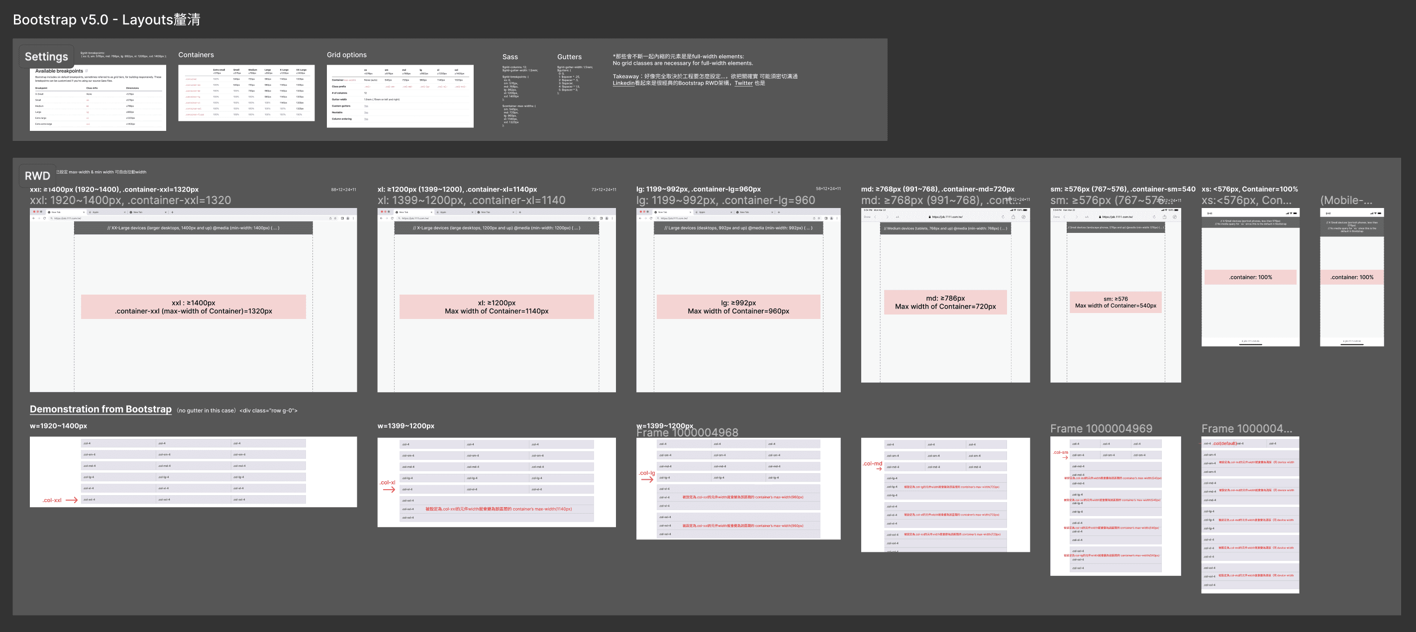
RWD- follow the settings of Bootstrap v5
3 main device-Desktop, Mobile & Tablet, and annotations like grid layouts, size changes about padding, gap, Rel. rate, corner radius and Img. size… all UI details have been mark out.
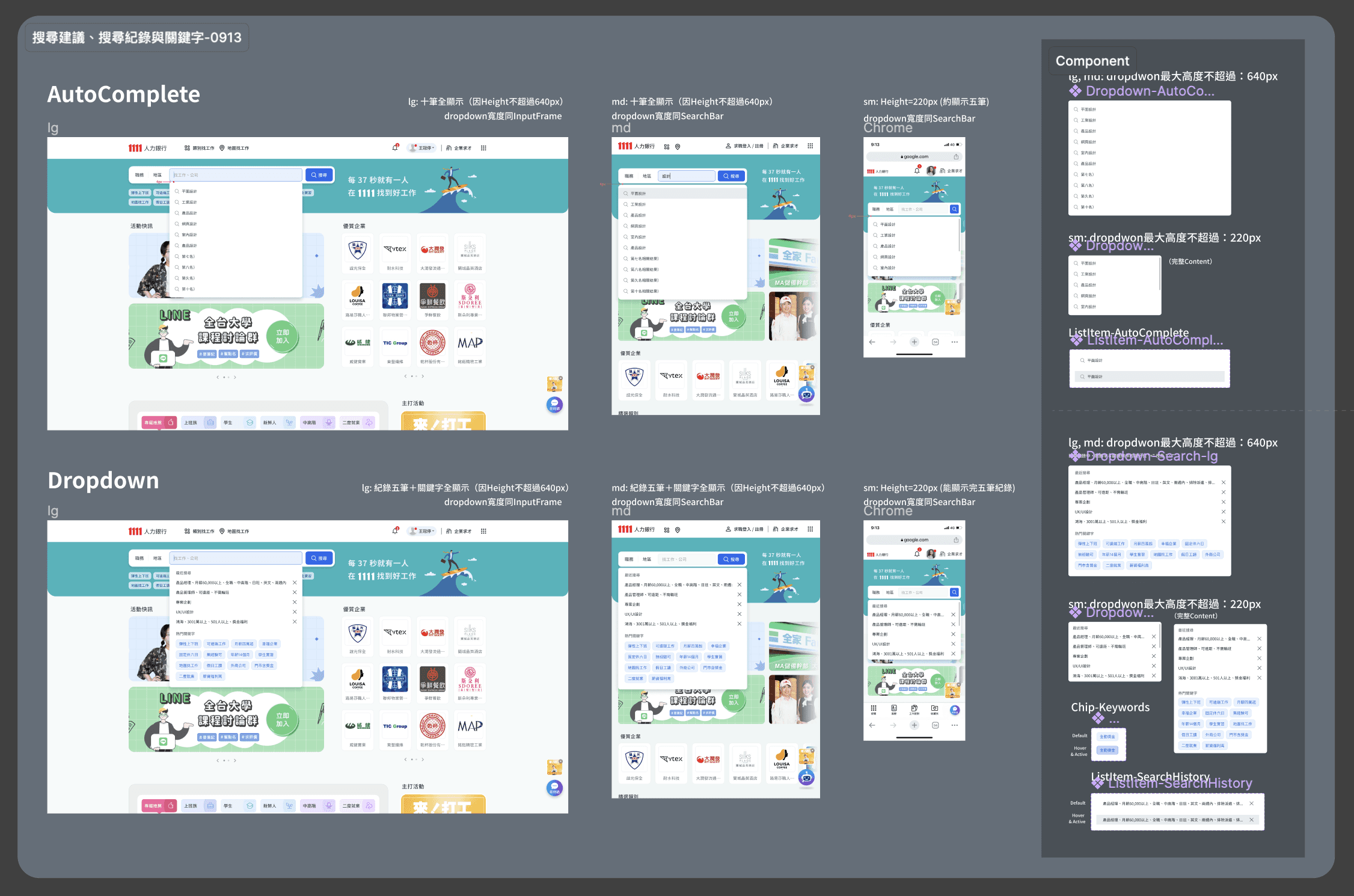
Design & annotating of searching functions.
Searching func.- Autocomplete & dropdown menu- RWD and annotation (e.g. about hover, overflow and chips)
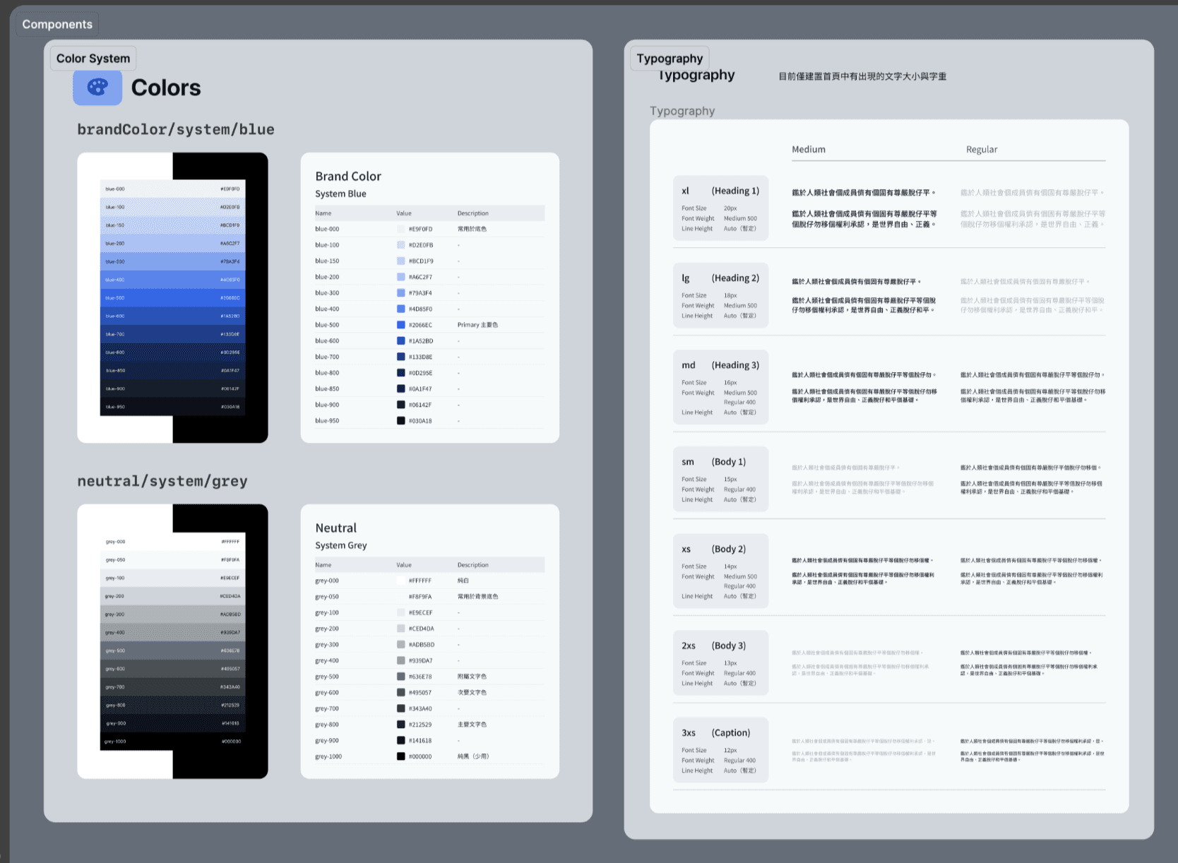
Building the Design System
Design System built for the home page revision (there was no previous D.S. before this.)
Manager and I, we spent a lot of time researching & building color systems and typography that are visually comfortable and clear and can be widely used.
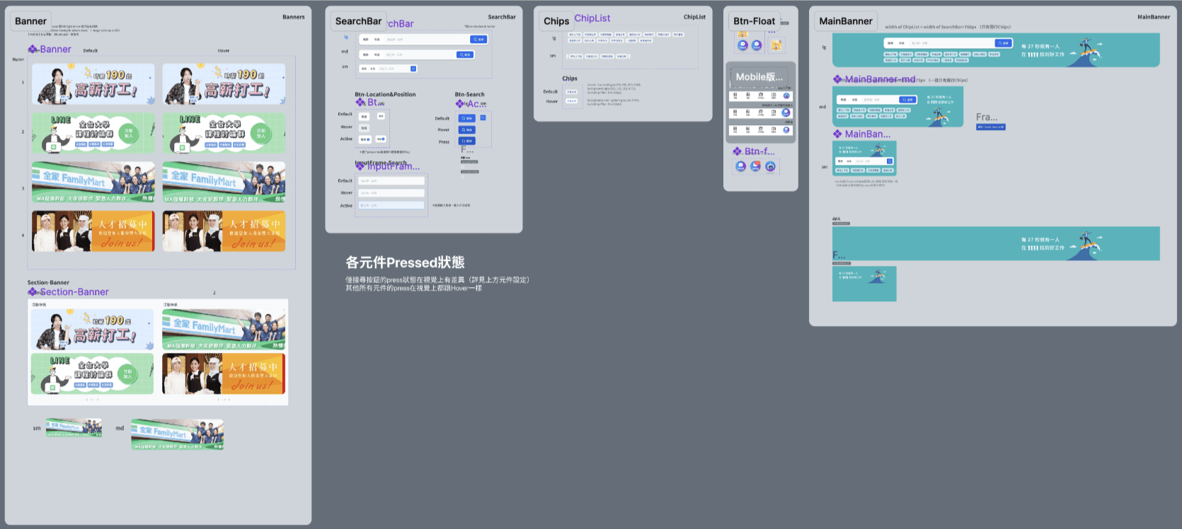
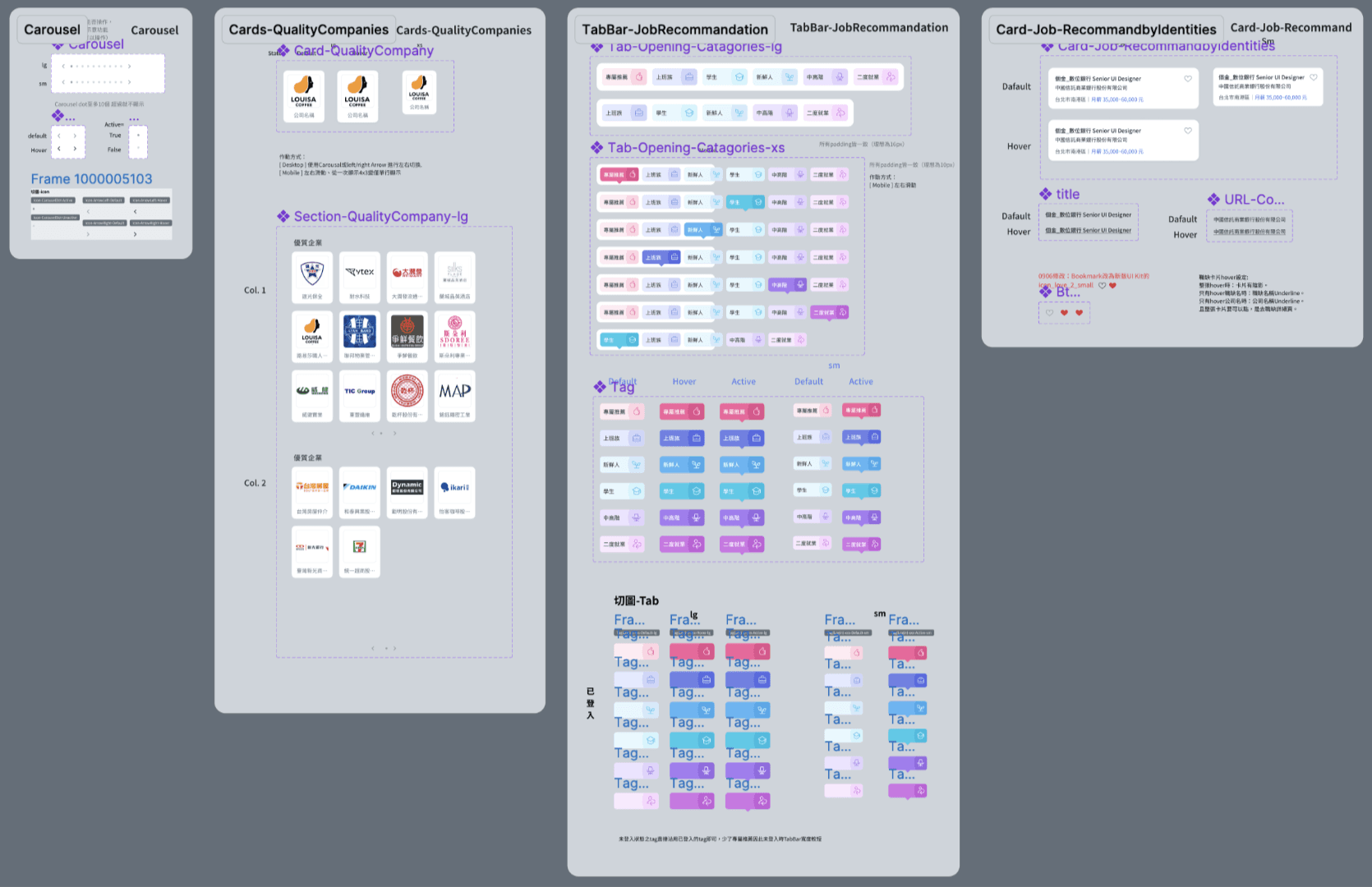
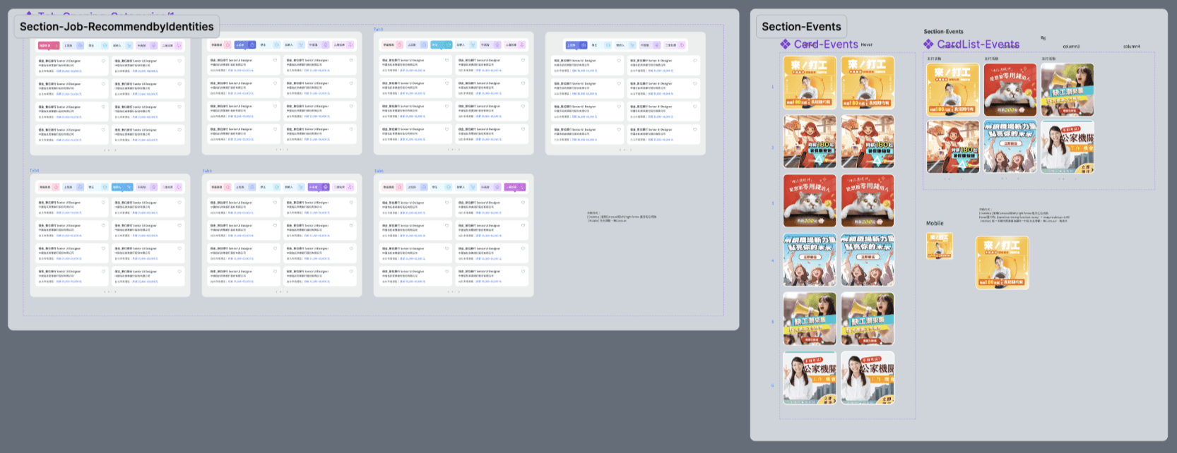
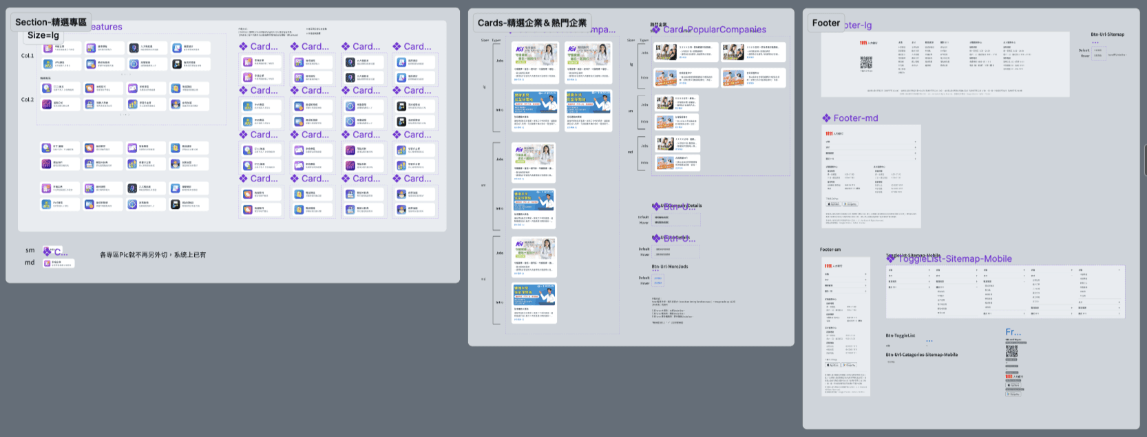
Complete annotation of components
Components were carefully build and annotated completely.
(e.g. I generate the codes of more detailed shadow and card UI value for develop.)
Helping the writing of PRD & attentive QC & respond to urgent needs after launch.
We helped PM and SA to write the PRD (the part of details of UI),
and dedicating to do quality control of the result of front-end developing.
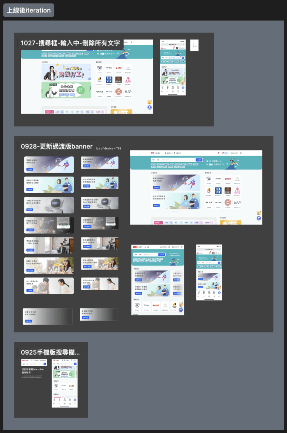
and quickly respond to the urgent needs after launched. (e.g. new banner, add more information of job… )
Next iteration of this case introduction
Introduction of 1~5 reversions of Home page redesign, demonstrate flexibility and agile design capabilities in response to company needs and decisions.
Comparing original Home page and new one, so as competing products like 104, 518, CakeResume and Yourator.